You place a pink bow beside Monday’s plans, then its ribbon tails overlap the appointment below. A prettier page still needs room to write. When choosing coquette digital stickers, I look at the shape of the loops, the length of the tails and whether the surrounding artwork leaves enough space for actual plans.
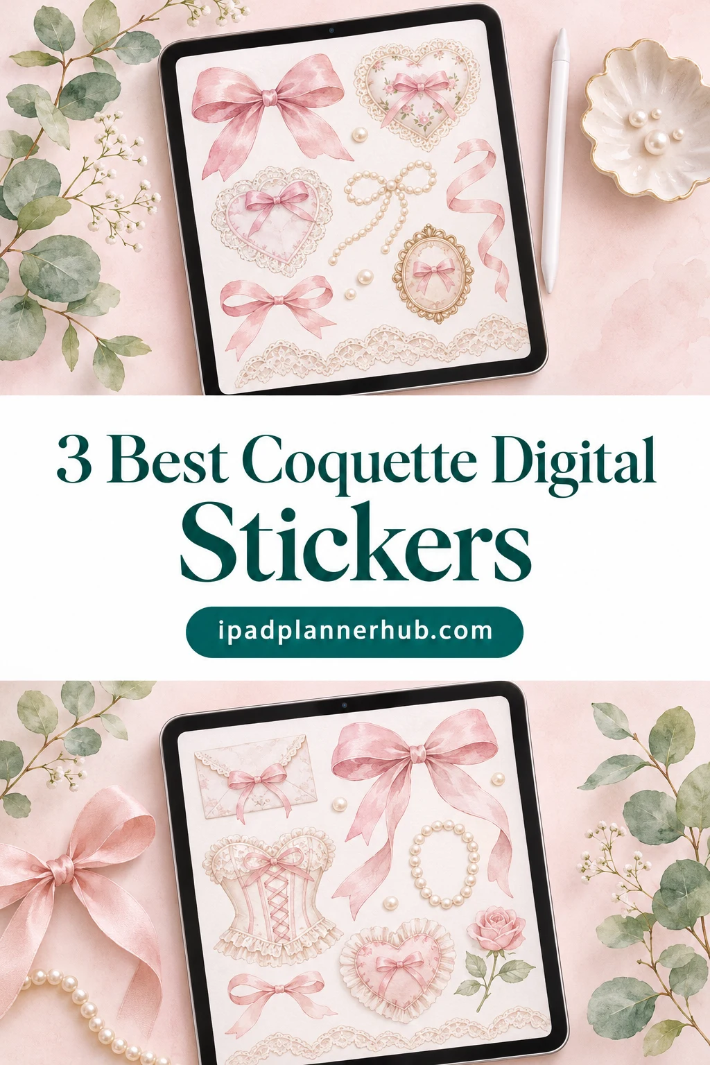
These three Creative Fabrica collections take different routes. One stays focused on pink bows, one mixes ribbons with everyday planner illustrations, and one adds blue-and-pink floral frames. All three offer transparent PNG artwork for GoodNotes. They add decoration to a planner you already have; none includes a promised prebuilt sticker book.
What I looked for in coquette digital stickers
My starting point was a visible ribbon or bow motif, rather than color alone. A pink heart can fit the aesthetic, but it will not replace a set of ribbon accents if that is the reason you are shopping. I also wanted a meaningful choice between collections, so the three picks have different page-design roles.
- A clear bow connection: ribbon shapes are central to the first collection, part of the planner mix in the second, and combined with flowers in the third.
- A usable digital format: the listings specify transparent PNGs and name GoodNotes. Print and craft uses appear too; those uses do not make the collection a ready-made digital planner.
- A useful distinction: the mixed set adds decorative lettering, while the floral set gives more space to frames and bouquets.
- Enough visual evidence: I reviewed all 19 public previews across the three selected listings, including the mockups. I have not purchased or installed the paid files.
3 Best Coquette Digital Sticker Collections
TL;DR: Choose the 16-bow bundle for repeated pink accents, RimzStudio for coffee and planning motifs, or the floral collection for blue-and-pink frames.
Quick Picks
- Best for ribbon-only collection: 16 Coquette Bow PNG Bundle
- Best for everyday planner mix: Coquette Planner Stickers Hand Drawn Png
- Best for floral frame alternative: Coquette Bow & Spring Floral Clipart PNG
- 16 Coquette Bow PNG Bundle – Best ribbon-only collection
- Coquette Planner Stickers Hand Drawn Png – Best everyday planner mix
- Coquette Bow & Spring Floral Clipart PNG – Best floral frame alternative

Best ribbon-only collection
1. 16 Coquette Bow PNG Bundle
Best for: a consistent pink bow motif across weekly headers and journal corners. Designed by tweenytree23.
- 16 individual PNG design elements with transparent backgrounds at 300 DPI
- One additional EPS10 file containing the 16 designs
- Pink ribbon styles include long tails, loose loops and cherry accents
- PNG artwork for GoodNotes and Notability
This is my first pick for a page built around bows. The knots and tails vary enough to link several headings without repeating an identical accent. Keep the longest ribbons in a margin and the compact bows near small notes. The extra EPS is useful for a separate vector-editing workflow.
Best everyday planner mix
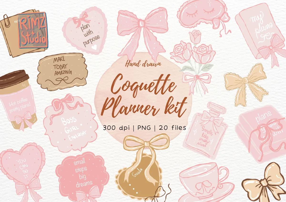
2. Coquette Planner Stickers Hand Drawn Png
Best for: combining ribbon bows with coffee, notebooks and decorative planning phrases. Designed by RimzStudio.
- 20 individual transparent PNG files at 300 DPI
- Soft pink and warm tan hand-drawn illustrations
- Gallery includes bows, a sleep mask, roses, coffee, a cup and a planner book
- PNG artwork for GoodNotes, Notability and Noteshelf
The coffee cup and notebook can echo the subject of a page, which gives this set a different role from the bow-only bundle. I like the warm tan accents against the pink for a quiet weekly layout. Some designs include small decorative wording; keep appointments and tasks in your own clear text.

Best floral frame alternative
3. Coquette Bow & Spring Floral Clipart PNG
Best for: romantic journal pages with blue-and-pink ribbons and an open framed writing area. Designed by Nam Tiwa.
- 29 transparent PNG elements at 300 DPI
- Individual ribbon bows, flower bouquets, floral frames and borders
- Gallery shows plain ribbon elements alongside bows tied around flowers
- Decorative PNG artwork for GoodNotes and digital scrapbooking
Blue ribbons make this a useful alternative to an all-pink page. The open frames could surround a monthly intention or short reflection, with room for your own writing. Flowers take up a substantial part of the set, so choose it for that romantic mix. The invitation mockups show composition, not editable text boxes.
Quick Comparison
| Collection | Visual direction | Files listed | Main limitation |
|---|---|---|---|
| 1. 16 Coquette Bow PNG Bundle | Pink bows and cherry accents | 16 PNGs + 1 EPS10 | Bows only; no planner icons |
| 2. Coquette Planner Stickers Hand Drawn Png | Pink and tan planner illustrations | 20 individual PNGs | Decorative wording needs space to stay readable |
| 3. Coquette Bow & Spring Floral Clipart PNG | Blue and pink ribbons with florals | 29 PNG elements | Floral emphasis; frame interiors are not form fields |
Choose by the part of the page you want to decorate
The easiest choice is not necessarily the pack with the most files. Think about the empty space on your page: a narrow margin, an open notes box and a full journal page call for different shapes. Match the shape of the artwork to that space before comparing file counts.
- A small header or corner: start with the 16-bow collection. Its compact bows can repeat as a theme, while long ribbon tails need more clearance beside writing.
- A weekly spread with several subjects: the 20-file planner collection offers coffee, notebooks and other illustrations as well as bows. Pick motifs that relate to your week instead of placing every design on one spread.
- A large reflection area: the floral collection has open rectangular frames and borders. Set aside a generous writing area first, then place a frame around it as decoration.
- A restrained all-pink layout: the first set keeps the motif narrow. The floral alternative introduces blue and more visual detail, so choose it because you want that change, not just the larger element count.
Buy for one primary role first. If your current weekly planner is already colorful, a small family of bows may be more useful than adding another family of icons. If you mostly keep blank journal pages, the larger frames offer a different kind of structure without supplying any actual planner functionality.
Three bow-led layouts to try
These are layout suggestions, not included planner pages. Use your own calendar, notes page or journal background. Keep your writing space visible as you place each image; the decoration should help you recognize the page rather than hide its purpose.
A quiet weekly page
- 1Reserve the planning area. Put your appointments, deadlines and task lists in their usual places before adding artwork. Leave the day headings readable and keep the central writing column clear. This gives you a practical boundary for the decorative elements instead of squeezing plans into whatever space remains.
- 2Choose one ribbon shape. From the bow-only collection, select a compact bow for a header or a longer ribbon for a side margin. Repeat a related shape only where the page needs a visual link. You do not need a different bow for every day to make the theme recognizable.
- 3Review the whole spread. Look at the page at the size you normally read it. If ribbon tails overlap a checkbox or compete with small appointment text, move the image into the margin or remove it. A single clear accent can carry the theme across a busy week.
A coffee-and-planning journal page
- 1Give the page a real subject. Write a heading such as a weekly reflection or a list of priorities. The everyday planner collection works particularly well when the coffee cup or notebook relates to the subject, rather than acting as an unrelated illustration beside a long list.
- 2Use one focal illustration. Place the cup, planner book or another large motif near the heading, leaving the main text area open. Add a small bow only if it connects the illustration to the rest of the page. Avoid using several large objects with equally strong visual weight.
- 3Keep essential wording separate. Write your own task names and reminders in a clear size. Small lettering inside a decorative PNG is artwork, not a substitute for the information you need to read quickly. If that lettering becomes distracting, choose a simpler illustration for the same space.
A framed monthly reflection
- 1Start with the amount you want to write. A few lines about the month need a different area from a full-page journal entry. Select an open frame from the floral collection only after deciding that space. The frame is an image around your writing, not an expandable notes field.
- 2Pick a ribbon-and-flower balance. For a stronger coquette look, choose a design with a visible bow and keep extra bouquets to a minimum. Blue ribbon accents can soften an otherwise pink page. If flowers are not part of the look you want, return to the bow-only collection instead.
- 3Check the interior edges. Keep typed or handwritten lines away from the floral corners and ribbon tails. If the frame makes your text feel cramped, make the decorative area larger or choose a simpler border. Treat the image as a finishing element rather than a fixed template you must fill.
Before you choose a PNG pack for GoodNotes
Transparent PNGs give these collections a shared file format, but the extra files and artwork still differ. Use this checklist if you plan to organize the images for digital journaling.
- Individual images: the first two descriptions explicitly describe separate PNG elements or individual files. The floral listing describes 29 PNG elements. Keep the extracted images organized so you can find the bows or frames you actually want.
- Transparency: the listed transparent backgrounds are useful for placing artwork around your own page content. Preview backgrounds and staged mockups are presentation choices; they are not extra planner backgrounds promised with the files.
- Extra formats: the bow bundle includes an EPS10 file. That is an additional vector resource, not a requirement for using its PNGs and not proof of editable GoodNotes shapes.
- Resolution: 300 DPI appears in all three descriptions. Do not use that figure as a guarantee that tiny decorative wording will read comfortably at every on-screen size. The composition and the size you choose still matter.
If a prebuilt Elements collection or a particular import format is essential, check that requirement before buying. The public galleries show artwork and craft mockups, without demonstrating an installed iPad sticker library.
Keep coquette planner stickers from crowding the page
Bows have loops, tails and curved edges, which make them more demanding neighbors for text than a plain square label. Decide which areas are for information and which areas are for decoration. That distinction matters most on daily pages with lots of small appointments.
- Protect the writing column. Keep the middle of your task or journal area free. Put ribbon tails beside that column rather than across the line you will write on.
- Give headings a clear edge. A bow can sit beside a date, but avoid making the date look like part of the illustration. Leave a visible gap around important text.
- Use a limited palette. The pink bow set offers a cohesive starting point. The planner mix adds tan, while the floral set brings blue and green; choose the palette that works with the background you already have.
- Repeat a role, not every image. Let one bow style mark headings and another mark a special note. When every decorative object has equal emphasis, it becomes harder to see where the useful information starts.
- Keep decoration optional. If a busy week needs more space, remove an accent rather than reducing the size of every appointment. A themed page should still work on an ordinary, crowded day.
What these collections do not replace
A ribbon PNG does not create a working checkbox, a linked calendar tab or an editable planner label. These collections supply artwork. Choose your planner structure separately and add the coquette layer where it helps the page feel personal.
That also affects how I compare value. Sixteen bows may be enough if your main goal is a recurring header accent. Twenty mixed planner illustrations offer more subjects, while 29 floral elements include shapes you may never need if you dislike borders. Count the kinds of images you will use, not only the total listed files.
FAQ: Coquette Stickers for an iPad Planner
Are these GoodNotes sticker books?
No ready-made GoodNotes sticker book is promised by any of these three listings. They describe PNG artwork and explicitly list GoodNotes use. Expect image files rather than a planner document or a prebuilt Elements collection.
Which pack is best if I only want pink bows?
The 16 Coquette Bow PNG Bundle is the most focused choice here. Its previews stay with pink ribbon shapes, including cherry-accented bows. The everyday planner collection adds objects and phrases, while the floral collection includes substantial flower and frame content.
Can I use the floral set without making a flower-themed planner?
The gallery includes plain ribbon elements as well as flower arrangements, so you can choose a bow for a small accent. However, flowers are a major part of the 29-element collection. If you want a whole collection centered on bows, the first pick is a closer fit.
Does the EPS file make the bows editable in GoodNotes?
The listing identifies an additional EPS10 vector file, but that does not mean the PNGs become editable vector objects in GoodNotes. Choose the PNG artwork for image-based decoration. Only rely on EPS editing if you have a separate workflow that supports that format.
Are these physical stickers or printable-only files?
These are digital files, and each listing names GoodNotes or digital planning use. The same artwork is also promoted for print and craft projects. That hybrid use is why you see mockups such as mugs, clothing and invitations alongside the artwork; physical items are not the offer being compared here.
Will the wording inside a planner illustration change with my plans?
Do not expect text inside a PNG to behave like an editable text field. Keep appointment details, task names and dates in your own writing. The planner collection includes decorative phrases, so check whether you like the visible wording before choosing it.
Final Thoughts: Pick the Bow Style You Will Reuse
My first choice for coquette digital stickers is the 16-bow bundle when the goal is a consistent ribbon motif. The everyday planner set suits a page that needs subject illustrations as well as bows. The floral alternative earns its place when open frames, blue ribbons and a romantic journal layout are what you actually want.
Start with one page and one decorative role: a header, a corner or a frame around a short reflection. Once that page remains easy to read, repeat the idea elsewhere. You do not have to fill every open space to make the bow theme feel intentional.
You May Also Like
This post contains affiliate links. If you buy through them, I may earn a commission at no extra cost to you. Read the affiliate disclosure.