A page can hold lovely photos and still feel hard to read. These digital scrapbook layout ideas start with a different question: what should the eye notice first, and where should the story go next? I have organized twenty arrangements by the amount of photography and writing they need, followed by eight iPad notebook and paper picks for building your own pages.
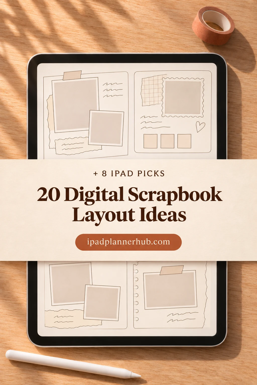
The arrangements are my suggested page plans, not layouts included in every product below. You can sketch them on paper before moving them into an iPad scrapbook. Start with the photos you want to preserve, rather than buying a new notebook for each composition.
Choose the shape of your story before the paper
Give one page one main job: show a place, compare two moments, preserve a conversation, or explain what happened between photographs. If the story needs a paragraph, reserve its space before enlarging the pictures. A tiny caption squeezed into the final corner is usually a sign that the page needs a different arrangement.
- One important image: try a hero photo, an offset portrait or a quiet central frame.
- A sequence: use equal-sized photographs when order matters; enlarge one when it carries the story.
- A memory with missing photos: let a letter, caption column or quotation lead the page.
- A longer album: plan the relationship between neighboring pages, including breathing room and a useful index.
My proportions below refer to the usable page area inside its borders, tabs and binding artwork. They are starting points, not fixed template measurements. Sketch light rectangles for photos and lines for text, then adjust them around the actual subjects in your images.
Digital scrapbook layout ideas with one main photograph
These five plans let one image do most of the work. Keep the original photo safe and experiment with a copy, particularly when a composition calls for a tight crop. A wide photo and a tall portrait need different homes; forcing both into the same frame can remove the detail you meant to remember.
1. Wide hero with a caption ledge
- 1Place a landscape image across the upper two-thirds of the page, with a title and two short caption lines underneath. Keep the lower ledge clear of decorative strips so the words remain easy to find.
Use it for a photograph with useful scenery on both sides. If the original is tall, use a smaller full image rather than cutting away the people to make a banner. Add who, where and one detail the image cannot explain.
2. Portrait beside a story column
- 2Set a vertical photograph on the left, occupying a little more than half the usable width. Leave a narrow but visible gap before a right-hand text column, with the title aligned to the top of the image.
This works when a face or full-length figure should remain intact. Write the story first so you know the column width you need. If the handwriting becomes cramped, move the final sentence to a second page instead of shrinking everything.
3. Small frame in an open field
- 3Center a modest photograph slightly above the middle of the page. Put a short caption directly below it with generous untouched background around it. Keep the title smaller than the photograph.
Choose this for a quiet detail or a memory that needs very few words. A border can separate a pale image from cream paper, but several nested frames will consume the open space. The empty area is part of this layout, not a gap you must fill.
4. Photo band above a handwritten account
- 4Use the top third for a wide image and the lower area for a short handwritten account. Align both to the same left edge and keep a clean gap between the picture and the first line.
A half-lined page provides a convenient starting division. Crop only after checking that the important gesture remains visible. Give the account a beginning and an ending: one sentence about the setting and one about why this moment stayed with you.
5. Offset image with a generous outside margin
- 5Anchor a photo near the lower-left corner, leaving a larger field above and to the right. Add a short heading in that field and place the caption close to the photo rather than floating at the opposite edge.
This asymmetrical arrangement suits a photograph whose subject looks toward the open side. If the subject faces the other direction, mirror the plan. Keep any tiny supporting decoration near the image so it does not become a second competing focal point.
Arrange several photos without losing the reading order
A grid, crop and spacing work together: equal frames suggest a set, while a larger frame signals emphasis. Adobe’s photo collage guide describes choosing a grid, rearranging images, adjusting spacing and cropping. The following proportions are my own ways to apply those choices to a scrapbook page.
6. Four-photo grid with one shared caption
- 6Make a two-by-two grid with equal gaps and a consistent outside margin. Put a heading above and a short shared caption below, rather than four paragraphs beneath four small images.
Use photos that can survive a similar crop. Write the order into your caption if it matters: top left to bottom right. Avoid hiding part of one image under a sticker, because the interruption makes an otherwise regular grid feel accidental.
7. One large photo with two supporting details
- 7Give the left side to one large image and stack two smaller pictures on the right. Align the top and bottom edges of the stack with the hero image, leaving the caption below the complete block.
The large image introduces the moment; the smaller ones show a sign, a close-up or what happened next. Avoid using nearly identical frames for all three. If a supporting photo deserves a long explanation, give it its own page rather than a miniature text box.
8. Vertical photo strip beside a narrow diary
- 8Stack three images of equal width down one side. Place a single column of writing alongside, using small numbered captions to connect each picture with the relevant sentence.
A portrait page suits this narrow sequence. Keep the gaps equal and leave space around the numbers so they do not cover faces. Choose this when the photos show stages of an event; do not make the reader guess whether the sequence runs upward or downward.
9. Contact sheet with a selected frame
- 9Arrange six or nine small photographs in rows, then mark one with a simple outline. Put a larger caption panel below the grid explaining why you chose that particular frame.
This is useful when a set matters as much as a single favorite. The thumbnails will not show fine detail, so save the clearest face or object for a separate page if necessary. Keep captions out of the thumbnails and group the contextual notes together.
10. Stepped photographs across a diagonal
- 10Place three rectangular images at descending positions from upper left to lower right. Keep them upright and align each caption with its own image; use the diagonal in placement rather than rotating all the text.
Leave a continuous open area between the steps so the page does not become a pile. The final photo can be the smallest, with the ending sentence beside it. Check that the diagonal stays inside the usable paper and does not cross a notebook’s illustrated rings.
Give longer stories room beside the images
A scrapbook does not need a photograph of every meaningful part of an event. Writing can carry the missing context. Adobe’s scrapbook ideas guide recommends helpful captions and leaving open space; its photo-page and grid suggestions also support planning pictures and words together. These five layouts give the writing a defined place.
11. Letter first, photograph second
- 11Reserve the main area for a letter with a small photo in an upper corner. Let the text run in a clean rectangle below the picture rather than wrapping a few awkward words around every edge.
Use a readable scan of a letter or write your own account; keep sensitive details out of any page you plan to share. If the letter is long, use an excerpt and give the complete version a separate page. A photograph should provide context rather than cover the words.
12. Photo column and caption column
- 12Divide the page into two stable columns: photographs on one side and captions aligned beside them on the other. Each caption begins at approximately the height of its corresponding image.
This works for a series that needs names, locations or short explanations. Give the photo column more width when detail matters. Leave an extra gap between pairs so a reader can see where one caption ends and the next begins, even without numbered labels.
13. Numbered photos with a story key
- 13Group several images near the top and label them with small numbers outside their borders. Use the lower portion for a numbered story key, allowing a longer entry only where it adds information.
This arrangement keeps words out of busy photographs. Make the numbers large enough to read at normal page size and keep their positions consistent. A story key should explain something beyond what is visible, such as who took the picture or what happened immediately afterward.
14. Quotation with a small detail image
- 14Put one short quotation in the upper half and a small photo below or beside it. Place the speaker’s name and context in a separate, smaller caption, with open space around the quotation.
Choose a quotation you have permission to reproduce, such as your own words or a family remark. Do not turn a long passage into tiny decorative type. A close-up of an object from the moment can provide a quieter companion than another full scene.
15. Full image with a separate caption panel
- 15Place a large photo in the center and reserve a solid caption panel below it. Repeat one restrained color from the photo in the panel or its border, while keeping dark text on a light surface.
I prefer a separate panel when the image has faces, patterns or high contrast. A translucent overlay may look attractive at first but becomes hard to read over a busy subject. If you do place words over a photo, check every line at normal page size and move the panel when needed.
Plan neighboring pages as an album
A pair of pages can share a story without behaving like one giant image. Some digital notebooks display an illustrated spread inside a single PDF page; others show separate portrait pages. Treat the product’s visible binding as part of the background, and check the actual page format before designing a cross-page photograph.
16. Mirrored pair with outside captions
- 16Place a photo toward the inner edge of each page and text toward the outside. Match the image sizes and top edges, leaving generous room next to the center binding.
The repeated geometry connects two moments without forcing the photos to touch. Use this for a before-and-after pair or two viewpoints. Give each side a clear label so the reader understands the relationship without needing a long explanation across the gutter.
17. Panorama with a deliberate pause
- 17Divide a wide scene across two neighboring pages, leaving a visible pause at the center. Place identifying details and faces well away from the division and put the caption on one page only.
Try this only when your page format and viewing mode let the pair make sense. A decorative ring binder is not a seamless canvas. Keep an intact copy of the panorama on another page if splitting it would lose an important person or landmark.
18. Dense page followed by an airy page
- 18Make one page a compact grid with short captions, then follow it with a single image and a little writing. Repeat the same title treatment so the change in density feels intentional.
This gives an album a pause after a busy sequence. The airy page can hold the strongest photograph or the ending of the story. Resist adding small filler images just to match the previous page’s photo count; the difference is the point of the pair.
19. Visual index before a photo collection
- 19Use a small representative thumbnail for each group of pages, with a plain text title and the page number you assign. Leave room to add entries as the album grows.
This is a manually designed index unless your app provides another method. Do not promise that adding a thumbnail creates a working link. A notebook’s section tabs can help navigation, but your photo titles and page references still need to match the actual album.
20. Repeating module across a short series
- 20Choose one rectangle for the main photo, one caption position and one place for a small date label. Repeat those positions on successive pages while changing the images and stories.
A repeating module is useful for a long project where consistency saves decisions. Make an empty master page before adding personal content, then duplicate it through your app’s supported controls. Review each crop individually: the same frame does not suit every face or photograph.
Eight iPad notebook and paper picks for building these pages
The seven notebooks and one paper pack below offer blank, divided or lined surfaces for these arrangements. None is a promise of twenty ready-made photo frames. I have matched each option to a composition task and noted where decorative borders, binding or paper texture affect the usable area.
TL;DR: Seven digital notebooks and one paper pack provide surfaces for the layouts above. These are general-purpose pages, not twenty ready-made scrapbook templates. You add your own photos, frames and captions; a compatible annotation app may cost extra.
Quick Picks
- Best for photo above handwriting: Watercolor Hyperlinked Digital Notebook
- Best for side-by-side storytelling: Digital Notebook
- Best for a portrait photo sequence: Digital Notebook Hyperlinked Cute Purple
- Best for a small spread collection: Digital Notebook 5 Hyperlinked Tabs
- Best for textured photo-and-note pages: Digital Notebook 5 Hyperlinked Tab
- Best for a guided photo corner: Cute Hyperlinked Notebook – 5 Tab
- Watercolor Hyperlinked Digital Notebook – Best for photo above handwriting
- Digital Notebook – Best for side-by-side storytelling
- Digital Notebook Hyperlinked Cute Purple – Best for a portrait photo sequence
- Digital Notebook 5 Hyperlinked Tabs – Best for a small spread collection
- Digital Notebook 5 Hyperlinked Tab – Best for textured photo-and-note pages
- Cute Hyperlinked Notebook – 5 Tab – Best for a guided photo corner
- Pastel Digital Notebook Hyperlinked – Best for choosing a light paper tone
- Digital Notebook Papers – GoodNotes – Best for adding paper to an existing album
More sections for separate photo stories
Best for photo above handwriting
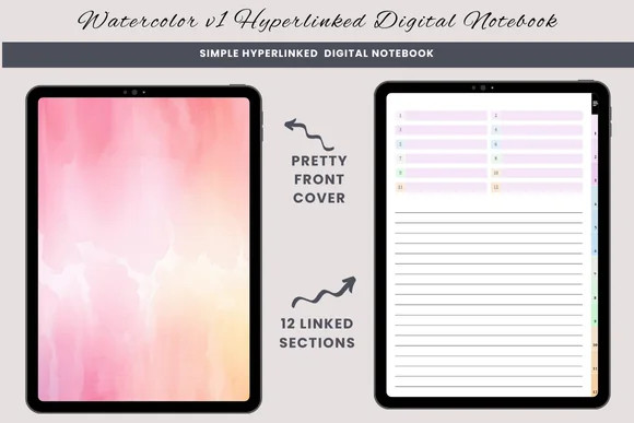
1. Watercolor Hyperlinked Digital Notebook
Orientation: PortraitLayouts: Lined, blank, half-linedSections: 12Format: PDF
Best for: one photograph with a handwritten story below it. Designed by daysfilledwithjoy.
- 12 hyperlinked sections
- Lined, blank and half-lined pages
- One PDF for GoodNotes or a similar PDF annotation app
- Duplicate a page when a section needs more room
The half-lined page gives the photo and the story separate jobs: an image above, a short memory underneath. It provides a simple starting point for layout 4. Choose a blank page for an edge-weighted composition; the watercolor cover does not mean every interior page has a painted background.
Best for side-by-side storytelling
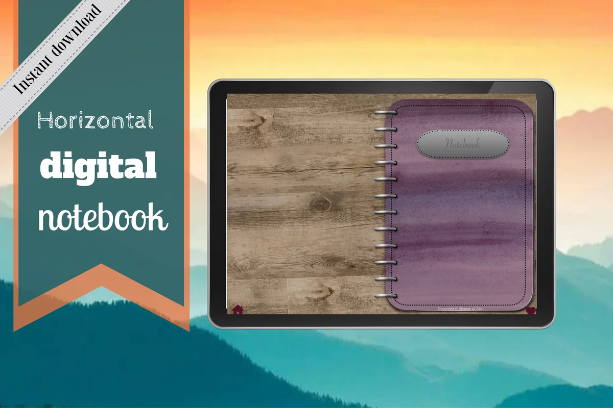
2. Digital Notebook
Orientation: LandscapeLayouts: 16 templates; lined, dotted, graph, CornellSections: 12Format: PDF annotation notebook
Best for: paired photographs and two-column captions. Designed by Shades of Zen.
- 12 expandable sections with linked tabs
- 16 note templates
- Lined, dotted, wide-ruled, graph and Cornell options
- Distinct section dividers and instructions
A landscape spread makes the relationship between two images easy to plan, but the illustrated rings take up the center. Keep faces and small captions on either side of that gutter. Its two-column paper is useful for a letter beside a detail photo, while the sixteen templates offer more structure than a plain scrapbook canvas.
Best for a portrait photo sequence
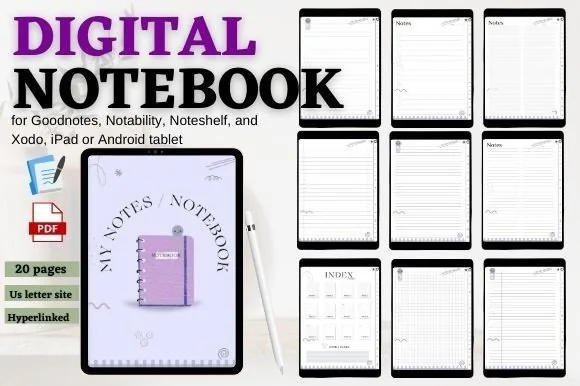
3. Digital Notebook Hyperlinked Cute Purple
Orientation: PortraitLayouts: Lined, grid, checklist and notesSections: 12Format: PDF
Best for: grouping photo stories into twelve sections. Designed by mixxdigitaldesign.
- 12 hyperlinked sections and an index with shortcuts
- 20-page PDF, including the cover and three extra pages
- Lined, grid, checklist and note pages
- For GoodNotes, Notability, Noteshelf and Xodo
This portrait option leaves room for a photo strip with a short account beside it. Twelve sections could separate different collections, although the twenty-page starting file is a small base rather than twenty finished scrapbook designs. The little decorative motifs are visible on the paper, so check whether they suit the photographs before choosing it.
Compact albums and guided writing areas
Best for a small spread collection
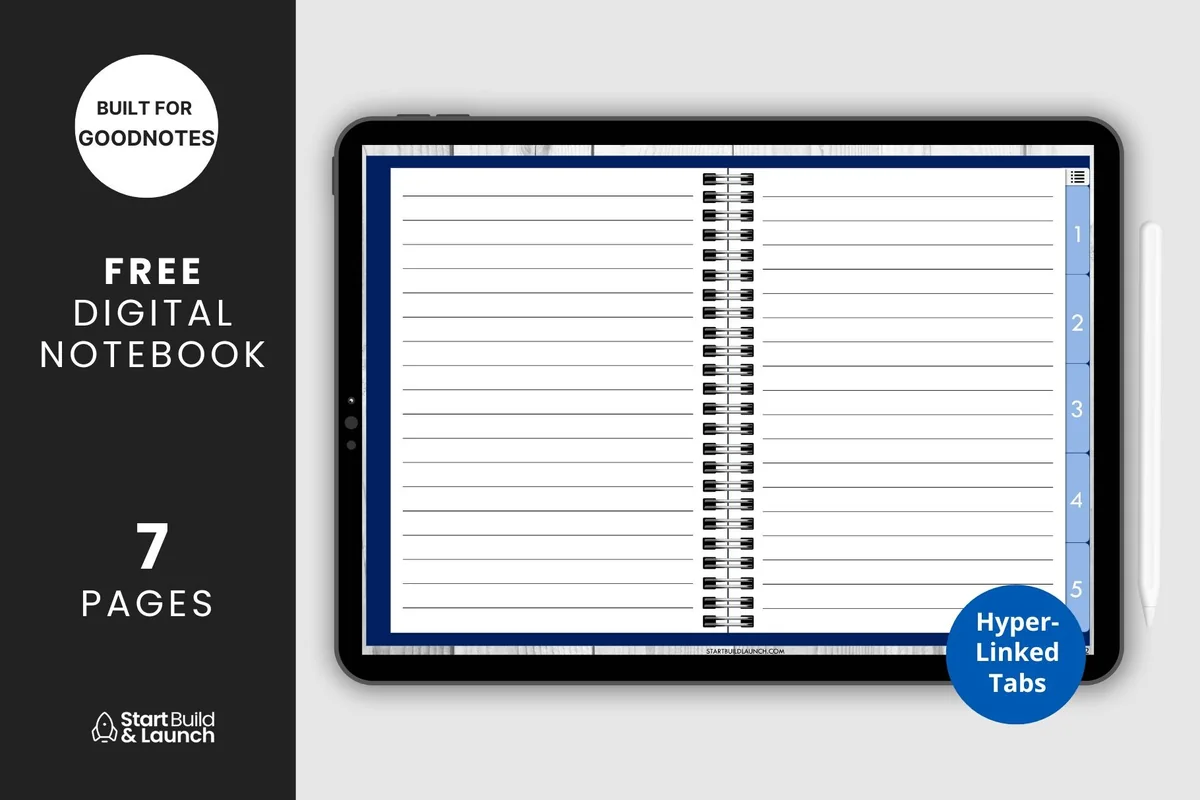
4. Digital Notebook 5 Hyperlinked Tabs
Orientation: LandscapeLayouts: Blank, lined, graph, Cornell, dottedSections: 5Format: PDF
Best for: organizing paired pages across five sections. Designed by aviswilliams.
- Five hyperlinked sections and a contents page
- Blank cover with space for your title
- Blank, lined, graph, Cornell and dotted paper
- PDF for iPad or tablet annotation apps
Five linked sections are enough for a compact album without a long subject index. The horizontal ring-binder design suits a mirrored pair built on separate pages; it is less suitable for a single uninterrupted panoramic photograph. Its paper templates are general note paper, so you create the frames and caption positions yourself.
Best for textured photo-and-note pages
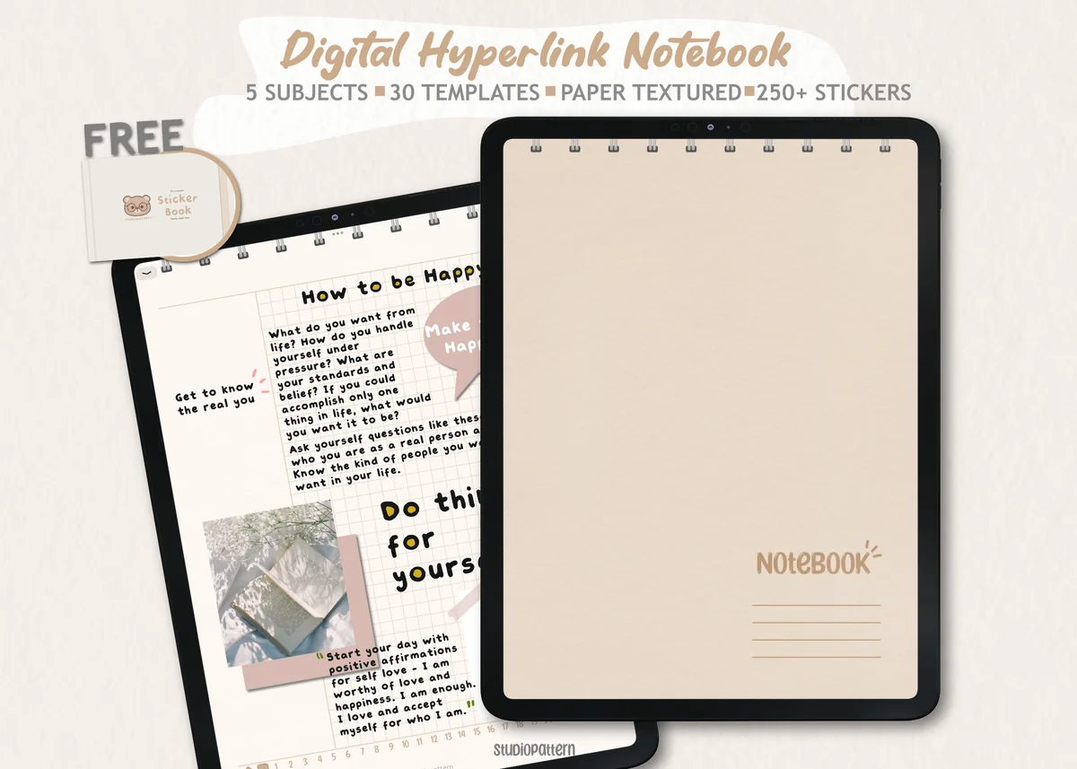
5. Digital Notebook 5 Hyperlinked Tab
Orientation: PortraitLayouts: 30 templates including notes and planningSections: 5Format: PDF; PNG stickers; GoodNotes sticker book
Best for: combining collage areas with divided writing paper. Designed by studiopattern.
- Five hyperlinked sections and 30 paper templates
- Blank, lined, grid, dotted and dashed paper styles
- Monthly, weekly, daily, habit and checklist pages
- Hyperlinked PDF, manual, individual PNG stickers and a GoodNotes sticker book
The warm textured pages and divided layouts suit a letter-led collage. Choose among the thirty paper options before adding stickers, leaving decoration until the photo and text fit. The scheduling templates in the pack are optional extras, not scrapbook layouts.
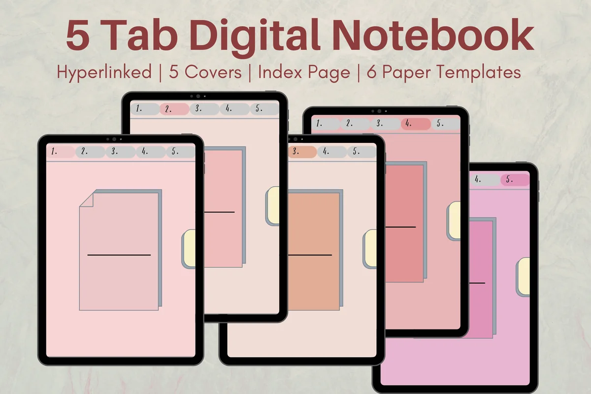
Best for a guided photo corner
6. Cute Hyperlinked Notebook – 5 Tab
Orientation: PortraitLayouts: 6 paper templatesSections: 5Format: PDF
Best for: pairing a small image with structured writing. Designed by Melissam Illustration.
- Five linked subject dividers and an index page
- Six paper templates
- Five cover color options
- One PDF for GoodNotes, Notability, Noteshelf or Xodo
A divided page pairs a small square area with writing and dotted space. That gives layout 14 a useful starting structure without filling the entire page with photographs. Six paper templates keep the choice manageable; the pink border and numbered tabs remain part of the visual setting.
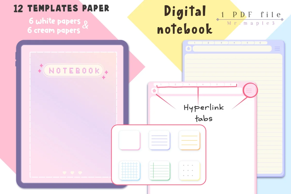
Best for choosing a light paper tone
7. Pastel Digital Notebook Hyperlinked
Orientation: PortraitLayouts: 6 white and 6 cream paper variantsSections: 6 chapter coversFormat: PDF; JPG instructions
Best for: matching white or cream paper to a photograph. Designed by Maple3Studio.
- Hyperlinked tabs throughout the notebook
- 12 paper templates: six white and six cream
- Six chapter covers
- Archive with a notebook PDF and JPG instructions
White and cream versions let the same arrangement read differently without changing the photo geometry. Try it for an airy single-image page where a colored frame is enough decoration. Twelve templates here include six paper types in two tones; they are not twelve bespoke scrapbook compositions.
Paper for an album you already own
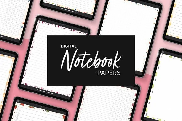
Best for adding paper to an existing album
8. Digital Notebook Papers – GoodNotes
Orientation: PortraitLayouts: 8 layouts per designPaper: 9 designsFormat: PNG and PDF
Best for: using portrait column paper as a caption guide. Designed by catsquills.
- Nine portrait paper designs
- Eight layouts per design: columns, habit tracker, to-do, numbered list, dots, square, lines and notes
- PNG and PDF formats
- 2550 × 3300 px, US Letter proportions
This is the option to consider when you already have a notebook and only need different paper. The Columns layout can guide a photograph-and-caption arrangement, while the decorative outer border gives you a visible limit for the image area. It is a PNG/PDF paper pack rather than another linked notebook, so it does not add section navigation.
Quick Comparison
| Notebook or paper | Composition use | Structure | Paper choice |
|---|---|---|---|
| 1. Watercolor Hyperlinked Digital Notebook | Photo above story | 12 sections | 3 paper types |
| 2. Digital Notebook | Paired images | 12 sections | 16 templates |
| 3. Digital Notebook Hyperlinked Cute Purple | Portrait photo strip | 12 sections | 20-page PDF |
| 4. Digital Notebook 5 Hyperlinked Tabs | Mirrored pages | 5 sections | 5 paper types |
| 5. Digital Notebook 5 Hyperlinked Tab | Letter-led collage | 5 sections | 30 templates |
| 6. Cute Hyperlinked Notebook – 5 Tab | Small photo and notes | 5 sections | 6 templates |
| 7. Pastel Digital Notebook Hyperlinked | Airy single image | 6 chapters | 12 paper variants |
| 8. Digital Notebook Papers – GoodNotes | Caption columns | No linked shell promised | 9 designs × 8 layouts |
Build a page in five deliberate passes
Once you choose a layout, work from the story outward. The sequence below keeps the practical decisions separate, so you can spot a cramped caption before it becomes a finished page.
- 1Choose the evidence of the moment. Select the main photo and write a one-sentence description of what the page should preserve. Keep the original files separately.
- 2Block the page. Mark a photo area, writing area and outer margin on an empty copy of the paper. Keep tabs and illustrated binding visible.
- 3Fit the pictures. Position images through your chosen app’s supported tools. Check the crop around faces, hands and important signs; use a different layout if a key detail disappears.
- 4Write for context. Add names, place, order and the detail that the picture cannot show. If the caption needs more space, reduce the image or continue on another page.
- 5Review before decoration. View the whole page at a normal reading size. Check the captions, then add only the frames or stickers that help the story. Reopen a saved copy to inspect the result.
Choose an app and keep the album readable
A digital notebook is a file, while an app is the tool used to view and annotate it. The product listings name PDF annotation apps such as GoodNotes and Notability. That does not mean every app has identical photo, crop, grouping or export controls; check the features you need before buying a separate app.
- For a PDF notebook: verify that your app can import the PDF and place your images and writing where needed. The notebook’s hyperlinks organize sections; they do not arrange photos automatically.
- For a paper pack: check how your app adds a PDF page or PNG background. A paper file is not a linked album, and importing it does not create a contents page.
- For sharing: inspect the final saved pages at the size your reader will use. Keep text clear of edges and remove personal information before sending a copy.
- For continuity: preserve an editable working version and keep a separate copy of the original photos. A decorative scrapbook page should not be your only photo archive.
For embellishments after the structure is settled, see my digital scrapbook sticker picks. If you need something to write beside a picture, the digital journaling ideas guide covers prompts rather than photo geometry.
FAQ: Digital Scrapbook Pages
What is the best app to make a digital scrapbook?
Choose according to the file and tools you need. These picks are PDF notebooks or PNG/PDF paper intended for annotation apps named in their listings. A dedicated collage tool is another route for image-heavy pages. Check importing, image placement and saving before committing to an app; this article does not rank apps from hands-on tests.
Which layout is easiest for a beginner?
Start with one photo above a short caption, or a two-by-two grid with one shared caption. Those structures make the image area and writing area obvious. Use a blank master page and keep the first attempt simple enough that you can finish it without adding more supplies.
Can I make a scrapbook without buying another notebook?
Yes, if you already have a suitable page and an app that supports your planned images and writing, you can build these arrangements there. The layouts are page-planning suggestions, not locked to the products featured here. Try a blank page first; a paper pack is an optional change of surface.
Where can I find free digital scrapbook templates?
Check a seller’s current terms and the files included before relying on a free label. Some product preview graphics use that word, but this article does not verify current free offers or prices. You can also sketch these arrangements yourself on paper you already have, without purchasing a premade composition.
How many photos should fit on one page?
Use the number that leaves room for the story at a readable size. One image can carry a quiet memory; four equal frames can explain a sequence; a contact sheet can summarize a larger set. If faces become tiny or captions require zooming, split the material across two pages.
Leave room for the part a photo cannot tell
The strongest digital scrapbook layout ideas give pictures and words distinct places. Choose one arrangement for the photos in front of you, reserve the caption area and keep some open space. Start with the photo band and handwriting below; for a longer album, repeat a simple module and let the stories change.
If a notebook helps you maintain that structure, choose by its paper and usable page area. Seven notebooks and a paper pack offer different starting surfaces here, but the photographs, words and finished composition remain yours.
You May Also Like
This article contains affiliate links. If you buy through them, I may earn a commission at no extra cost to you. Read the affiliate disclosure.