The box looks generous until you try to explain why the moment mattered. Then the last sentence runs into the next day. These gratitude journal layout ideas start with writing space: twenty page arrangements you can draw on iPad paper, with room for a date, a real detail and a little breathing space.
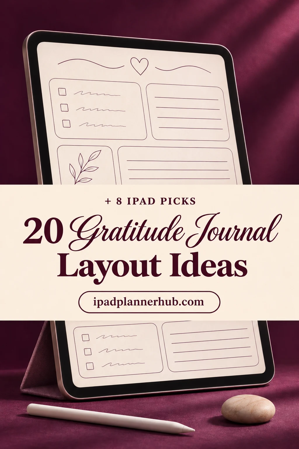
Choose a page by the kind of entry you want to keep and the space it needs. Below are daily, weekly, monthly and visual designs, followed by seven digital notebooks and one paper pack. The layouts are my suggested structures; they are not promised contents of those products.
Match the space to the entry before drawing the page
Use the writable area inside any border or binder rings as your measuring frame. The proportions below refer to that area, so they work on different page sizes. Leave a small outside margin, then test one ordinary entry at your normal handwriting size before making copies.
| What you want to keep | Starting layout | Capacity | When to change it |
|---|---|---|---|
| A small daily observation | Three-line strip | One day per strip | The reason needs a paragraph |
| A week on one page | Seven cards plus one review | Seven daily entries | Your handwriting feels compressed |
| A whole month at a glance | Numbered list | 28–31 dated entries | You want images or longer stories |
| One memorable moment | Picture and caption | One image and three details | The picture replaces the explanation |
A daily gratitude journal layout does not need a full page per day. A strip can be enough for a single specific moment; a weekly spread is better when you want to compare entries together. Keep longer stories on their own pages rather than shrinking your handwriting to make them fit.
20 gratitude journal layout ideas, organized by writing rhythm
Every design below includes a zone plan, a capacity and a sample entry. The examples are invented to show how the space works. They are not a list of prompts you must answer or a schedule you have to maintain.
Daily pages: enough room for one clear moment
- 1Three-line strip. Divide a portrait page into four equal horizontal strips. Give each strip a small date box at the left and three writing lines at the right. Capacity: four days per page, one short entry per day. Try “The bus driver waited while I crossed with groceries.” If the explanation needs more than three lines, continue on a story page rather than letting the extra line run into the next strip.
- 2Event and detail. Split the page into a narrow event column, about one-third of the width, and a wider detail column. Leave a header for the date. Capacity: one day with three paired entries. An event might be “Lunch with Mia”; the detail is “She remembered the project I was nervous about.” Choose this when a bare list of names feels too vague; use a strip for genuinely short notes.
- 3Morning and evening halves. Draw a horizontal line halfway down the writable area and put a date header above it. Use the top for something you appreciate now, the bottom for a moment you noticed later. Capacity: two entries for one day. For example, “A quiet kitchen” can sit above “Sam handled the dishes after dinner.” Leave either half empty when needed; this is a page arrangement, not a two-entry quota.
- 4One scene with a detail margin. Reserve the left three-quarters for a short account and the right quarter for two or three concrete details. Capacity: one scene per page, updated whenever there is something you want to preserve. Write about a walk, then add “cold air,” “red scarf” and “coffee smell” in the margin. This works for descriptive writing; switch to a weekly grid if you mainly want one-line notes.
- 5Small photo, generous caption. Give the upper third to one image and the lower two-thirds to the date and a caption. Capacity: one image and roughly four to six comfortable lines, depending on handwriting. A photo of a shared meal might be captioned “Dad brought soup before I had to ask.” Add the image through your annotation app if supported. If arranging photos delays the entry, use a blank rectangle and a written description instead.
Weekly spreads: compare moments without a tiny calendar
- 6Seven cards and a review. Draw two columns and four rows. Label seven cells with the days; reserve the eighth for a sentence about something you want to remember. Capacity: seven short entries plus one weekly review. “Tuesday: Noor checked in after the presentation” fits a daily cell. Test the longest weekday label before duplicating. If two columns make the cells too narrow, use the full-width bands in layout 8.
- 7Weekday rail with an open weekend. Use the left two-thirds for five stacked weekday boxes and the right third for one shared weekend area. Capacity: five short entries and two longer weekend notes. A weekday could read “Someone saved me a seat”; the weekend column can explain a family visit. Update during the week or at its end. Avoid this split if weekends are quieter than weekdays; equal bands give your actual rhythm more room.
- 8Seven full-width bands. Leave a small title area, then draw seven horizontal bands of equal height across the page. Put each date in the left margin. Capacity: one sentence for each day of a week. “Friday: Lee sent the recipe with the adjustments already marked” has more width here than in a calendar square. If the bands are too shallow for your handwriting, split the week across two pages. Choose landscape when you need a wider line, allowing for its reduced page height.
- 9People, places and small actions. Make three equal columns beneath a week header, then leave an unruled footer across the bottom. Capacity: up to three short entries per column and one closing note. Put “Ava offered a ride” under people, “library window seat” under places and “fresh sheets” under actions or everyday comforts. Add a date beside each note. This is a weekly collection, so repeated days are fine and empty columns need no filler.
- 10One story of the week. Give the main story the upper two-thirds, then divide the bottom into two boxes: a memorable detail and a title for the week. Capacity: one developed account, refreshed weekly rather than daily. For example, describe a friend helping move a heavy desk, record the joke you shared and title it “An easier move.” Choose this when a list would flatten the memory; use seven cards when you want every day visible.
Monthly records: leave space for the actual calendar
- 11A numbered month list. Use dotted or lined paper with a narrow date column and a wide writing column. Number only the dates in that month, from 1 through 28, 29, 30 or 31. Capacity: one entry per day. If thirty-one lines are cramped, split the list over two pages, days 1–16 and 17 onward. An entry such as “12: a neighbor brought the parcel inside” needs no decorative box.
- 12A calendar with room outside the cells. Draw seven columns and as many as six week rows; add a small note area below. Place the month’s dates in the correct weekday cells and leave unused cells blank. Capacity: one short phrase per date plus a few expanded notes. “Shared umbrella” fits a cell, while the footer can explain who helped. If cell writing is too small at normal zoom, use a two-page spread or the numbered list.
- 13Six weekly ribbons. Divide the page into six horizontal ribbons, each with a narrow date-range label and a wider writing space. Capacity: up to six calendar weeks touching the month, including partial first and last weeks. Use one or two entries in each ribbon, such as “8–14: friends made time for a short call.” Fill only the weeks needed. This captures weekly highlights within a month; it is not a daily log.
- 14Month index with continuation pages. Make two columns: date and a short title with its page reference. Keep a narrow final column for the reference if you prefer three zones. Capacity: as many titled entries as fit legibly, with additional index pages when needed. “18: The unexpected lift, page 6” points to a longer story. Update the index after writing the story so it refers somewhere real; handwritten references do not become automatic PDF links.
- 15Four windows and an overflow strip. Divide the upper three-quarters into four large windows and leave a full-width strip at the bottom. Capacity: four selected moments plus one extra note for the month. Label windows by their dates rather than “week 1” through “week 4,” since a month is longer than four weeks. One window could hold “The afternoon everyone stayed to help.” Choose this for a curated month summary, not a promise to record every day.
Visual pages: keep the explanation beside the image
- 16A people map with labeled connections. Place one small circle in the center and up to five around it. Reserve at least the bottom quarter for writing. Capacity: five names with one labeled action each, plus a short closing sentence. “Rae → helped with the application” says more than a name alone. Revisit monthly or after a particular event. If names feel private, use initials; choose a written story when connections need a longer explanation.
- 17Keepsake and its missing context. Reserve one side for a ticket, receipt image or tiny drawing, and the other for a date and three details the object cannot tell you. Capacity: one keepsake per page, added when you want to preserve it. A café receipt might sit beside “First catch-up after her move; she asked about the garden.” Crop away payment or contact details before inserting an image. Use a simple caption page if there is no object to keep.
- 18An open sketch with three anchors. Give the upper two-thirds to a small drawing and the bottom third to three labeled lines: place, moment and detail. Capacity: one sketch and three brief notes, updated per occasion. Draw a mug, then write “Kitchen / Sunday call / Mum remembered the interview.” The drawing can be rough; it only has to cue the memory. If the sketch takes over, write the notes first and add the picture later.
- 19A wide story with a summary pocket. Keep the central three-quarters for writing and a narrow side pocket for the date and a one-sentence summary. Capacity: one extended entry with a short pointer you can scan later. Describe a difficult journey made easier by someone’s help; the pocket might say “I did not have to solve it alone.” Add a new page when the story outgrows the space. This layout suits paragraphs, not a month of tiny entries.
- 20A drawing with an observation column. Split the writable width evenly. Put one drawing on the left and three separate observation boxes on the right. Capacity: one illustrated subject with three details, updated whenever you choose. A plant drawing might sit beside “New leaf,” “Gift from Jo” and “Brightened the desk during a long week.” Unlike the open-sketch layout, the equal column gives each observation its own box. Use half-lined paper instead if you prefer continuous writing.
Build one reusable page without losing the filled version
Treat the first page as a draft of the layout. For an event-and-detail design, begin with dotted paper or a blank two-column sheet. The important test is whether your ordinary handwriting fits while you can still see the date and the connection between both columns.
A clean master, then a working copy
- 1Measure the writable area. Ignore decorative borders and the binder center. Draw a date header and a vertical divider about one-third of the way across. Add three horizontal rows, leaving the detail side wider than the event side.
- 2Try one entry. Write a short event on the left and a full sentence on the right at your normal size. If the sentence wraps into the next row, make fewer rows or use a second page. Remove the trial writing once you settle on the spacing.
- 3Keep a clean master. Give the unused page an obvious title such as “MASTER: event and detail.” Duplicate it using your app’s page controls before writing a real entry; menu names differ between apps and versions.
- 4Check the destination. Open the copied page and confirm that its header is empty before adding a date. Keep the master separate from completed entries. When revising the design, preserve the filled pages and update only the clean version.
For ready-made prompts and specialized journal pages, see the digital gratitude journal comparison. Here the purpose is choosing and drawing the page structure yourself. More general reflection formats belong in digital journaling ideas.
Eight iPad notebook and paper options for these page designs
These options provide different paper styles and linked navigation. Some have only a few page styles; others add planning sheets. All eight are general surfaces for making your own designs, so choose the writing area first and the cover second.
TL;DR: Choose a page by how much you want to write. These eight options are seven general digital notebooks and one paper pack for building your own layouts, not eight ready-made gratitude journals. A compatible annotation app may cost extra.
Quick Picks
- Best for a picture above the writing: Watercolor Hyperlinked Digital Notebook
- Best for event-and-detail columns: Digital Notebook
- Best for a tall monthly list: Digital Notebook Hyperlinked Cute Purple
- Best for a small set of layout types: Digital Notebook 5 Hyperlinked Tabs
- Best for keeping reflection beside plans: Digital Notebook 5 Hyperlinked Tab
- Best for a ready split-page surface: Cute Hyperlinked Notebook – 5 Tab
- Watercolor Hyperlinked Digital Notebook – Best for a picture above the writing
- Digital Notebook – Best for event-and-detail columns
- Digital Notebook Hyperlinked Cute Purple – Best for a tall monthly list
- Digital Notebook 5 Hyperlinked Tabs – Best for a small set of layout types
- Digital Notebook 5 Hyperlinked Tab – Best for keeping reflection beside plans
- Cute Hyperlinked Notebook – 5 Tab – Best for a ready split-page surface
- Pastel Digital Notebook Hyperlinked – Best for choosing white or cream paper
- Digital Notebook Papers – GoodNotes – Best for an existing digital notebook
Twelve-section notebooks for longer collections
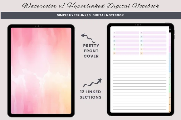
Best for a picture above the writing
1. Watercolor Hyperlinked Digital Notebook
Orientation: PortraitLayouts: Lined, blank, half-linedSections: 12Format: PDF
Best for: pairing a sketch with a short account. Designed by daysfilledwithjoy.
- 12 hyperlinked sections
- Lined, blank and half-lined pages
- One PDF for GoodNotes or a similar PDF annotation app
- Duplicate a page when a section needs more room
Half-lined paper gives a picture its own area without squeezing the caption into a corner. For the sketch-and-detail layout, leave the upper half open and divide the ruled half into three observations. Twelve sections are useful if you want separate collections; the three paper styles do not include a prebuilt gratitude system.
Best for event-and-detail columns
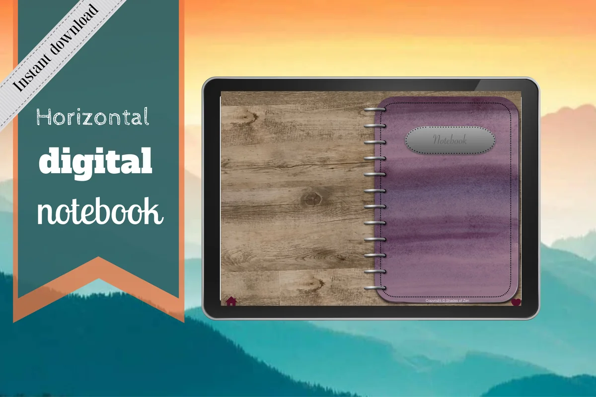
2. Digital Notebook
Orientation: LandscapeLayouts: 16 templates; lined, dotted, graph, CornellSections: 12Format: PDF annotation notebook
Best for: separating what happened from the detail worth keeping. Designed by Shades of Zen.
- 12 expandable sections with linked tabs
- 16 note templates
- Lined, dotted, wide-ruled, graph and Cornell options
- Distinct section dividers and instructions
The two-column sheets make the event-and-detail arrangement a natural fit. A visible center ring separates the landscape spread, so treat each page as a writing surface rather than stretching a sentence across the binder. Sixteen templates offer more structural choices than the simpler three-paper notebook.
Best for a tall monthly list
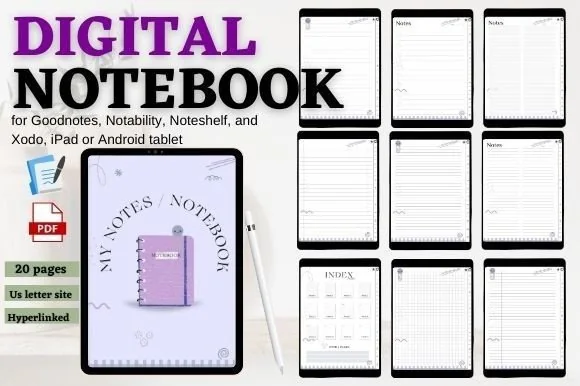
3. Digital Notebook Hyperlinked Cute Purple
Orientation: PortraitLayouts: Lined, grid, checklist and notesSections: 12Format: PDF
Best for: keeping a numbered month record on portrait paper. Designed by mixxdigitaldesign.
- 12 hyperlinked sections and an index with shortcuts
- 20-page PDF, including the cover and three extra pages
- Previews show lined, grid, checklist and blank-style note pages
- For GoodNotes, Notability, Noteshelf and Xodo
A tall page leaves room for a monthly list that can reach day 31. The lined and grid-style sheets give that list a starting surface, while the index keeps a longer account elsewhere in the notebook findable. The twenty-page total describes the PDF, not twenty different page designs.
Smaller notebooks for a few repeating layouts
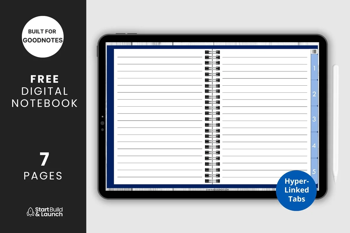
Best for a small set of layout types
4. Digital Notebook 5 Hyperlinked Tabs
Orientation: LandscapeLayouts: Blank, lined, graph, Cornell, dottedSections: 5Format: PDF
Best for: separating daily, weekly and visual pages into five sections. Designed by aviswilliams.
- Five hyperlinked sections and a contents page
- Blank cover with space for your title
- Blank, lined, graph, Cornell and dotted paper
- PDF for iPad or tablet annotation apps
Five tabs are enough for daily entries, weekly pages, month records, pictures and an index. The five paper types make a compact starting set for choosing a layout. The landscape binder has five paper types plus cover and contents pages; its seven-page preview label is not a promise of seven writing templates.
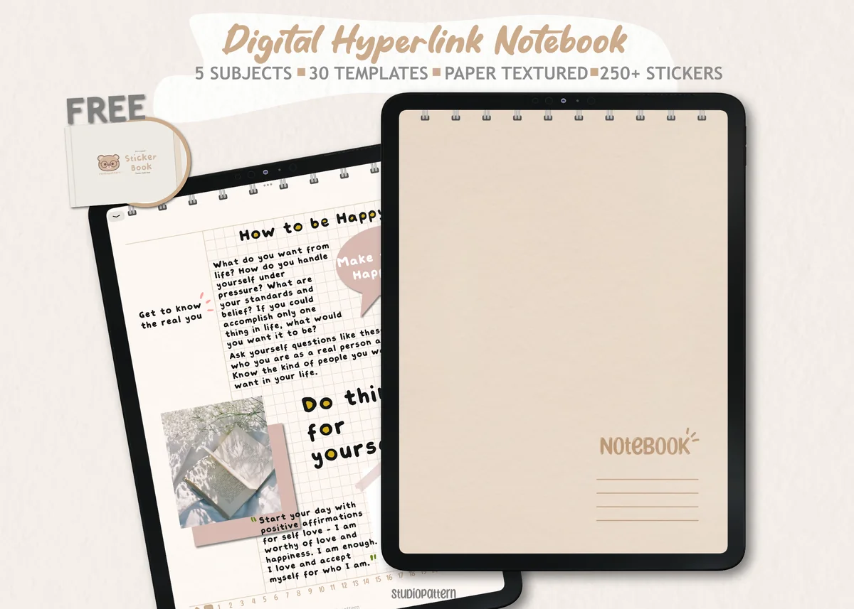
Best for keeping reflection beside plans
5. Digital Notebook 5 Hyperlinked Tab
Orientation: PortraitLayouts: 30 templates including notes and planningSections: 5Format: PDF; PNG stickers; GoodNotes sticker book
Best for: using custom gratitude pages alongside ordinary planning sheets. Designed by studiopattern.
- Five hyperlinked sections and 30 paper templates
- Blank, lined, grid, dotted and dashed styles shown in the previews
- Monthly, weekly, daily, habit and checklist pages shown
- Hyperlinked PDF, manual, individual PNG stickers and a GoodNotes sticker book
This option makes sense when reflection belongs beside a weekly plan. Its thirty templates include planning pages as well as several note styles, so you can keep the gratitude layout on blank or dotted paper and use a separate sheet for appointments. The beige paper texture is visible, and the file does not provide automatic reminders.
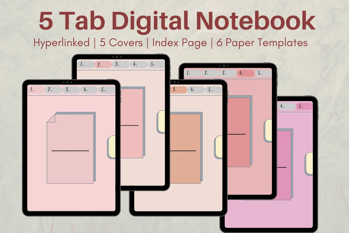
Best for a ready split-page surface
6. Cute Hyperlinked Notebook – 5 Tab
Orientation: PortraitLayouts: 6 paper templatesSections: 5Format: PDF
Best for: combining one image with writing on portrait paper. Designed by Melissam Illustration.
- Five linked subject dividers and an index page
- Six paper templates
- Five cover color options
- One PDF for GoodNotes, Notability, Noteshelf or Xodo
The mixed writing-and-picture sheet is a useful starting surface for the photo-caption and sketch layouts. Six paper templates keep the choice manageable. Five cover colors change the appearance rather than the page system; you still draw or label your own gratitude zones.
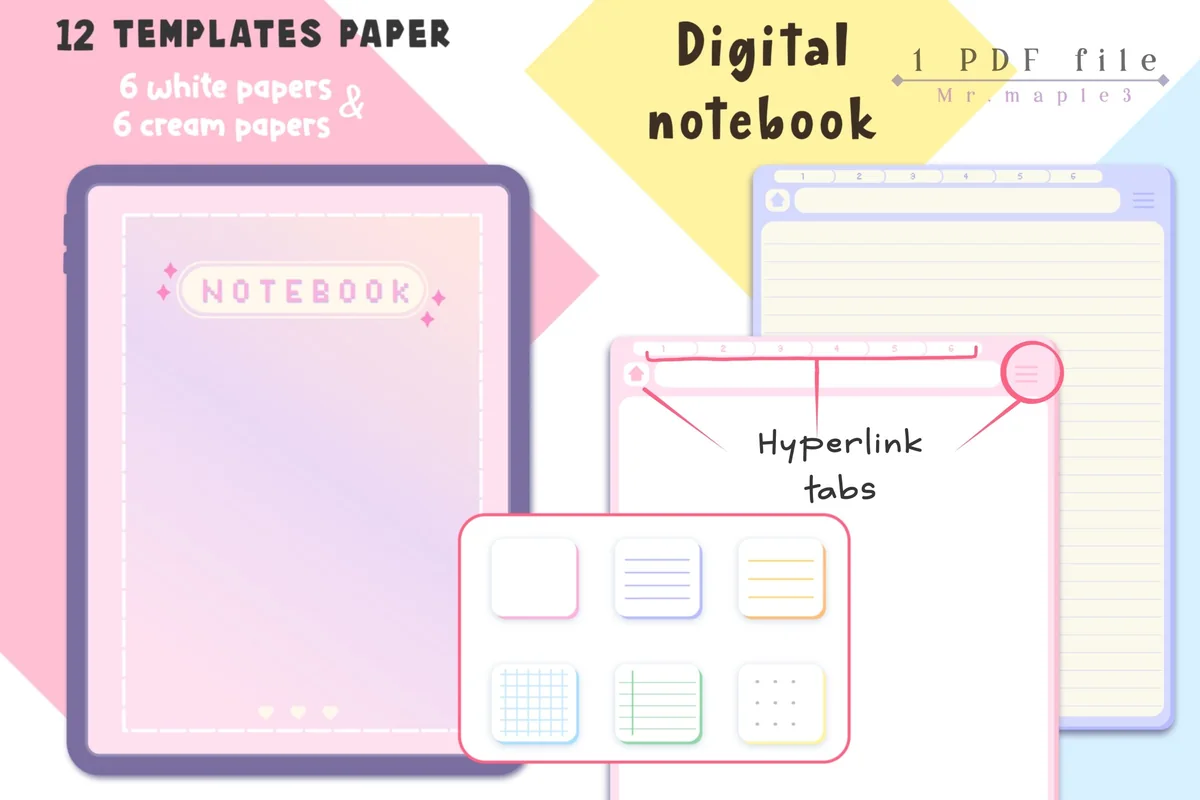
Best for choosing white or cream paper
7. Pastel Digital Notebook Hyperlinked
Orientation: PortraitLayouts: 6 white and 6 cream paper variantsSections: 6 chapter covers shownFormat: PDF; JPG instructions
Best for: matching a simple written layout to a preferred paper background. Designed by Maple3Studio.
- Hyperlinked tabs throughout the notebook
- 12 paper templates: six white and six cream
- Six chapter covers shown in the previews
- Archive with a notebook PDF and JPG instructions
White and cream options let the same entry structure sit on different backgrounds. The preview divides twelve templates into six of each color, so the count includes color variants rather than twelve unrelated writing formats. Choose it for that visual choice and linked navigation, rather than for specialized gratitude prompts.
Paper to add to your current notebook
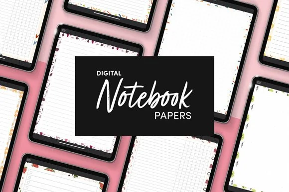
Best for an existing digital notebook
8. Digital Notebook Papers – GoodNotes
Orientation: PortraitLayouts: 8 layouts per designPaper: 9 designsFormat: PNG and PDF
Best for: adding columns or dotted paper without another notebook system. Designed by catsquills.
- Nine portrait paper designs
- Eight layouts per design: columns, habit tracker, to-do, numbered list, dots, square, lines and notes
- PNG and PDF formats
- 2550 × 3300 px, US Letter proportions
This is the paper-only choice: use a column layout for a weekly category spread or dotted paper for a grid you draw yourself. The nine portrait designs each come in eight layouts. PNG and PDF files add a surface to your own notebook; they do not provide a complete linked journal or the twenty layouts described above.
Quick Comparison
| Notebook or paper | Layout use | Structure | Paper choice |
|---|---|---|---|
| 1. Watercolor Hyperlinked Digital Notebook | Sketch and caption | 12 sections | 3 paper styles |
| 2. Digital Notebook | Paired written entries | 12 sections | 16 templates |
| 3. Digital Notebook Hyperlinked Cute Purple | Month lists and index | 12 sections | 20-page PDF |
| 4. Digital Notebook 5 Hyperlinked Tabs | Five layout collections | 5 sections | 5 paper types |
| 5. Digital Notebook 5 Hyperlinked Tab | Reflection plus plans | 5 sections | 30 templates |
| 6. Cute Hyperlinked Notebook – 5 Tab | Photos and short notes | 5 sections | 6 paper templates |
| 7. Pastel Digital Notebook Hyperlinked | Simple pages in two tones | Linked chapters | 6 white + 6 cream |
| 8. Digital Notebook Papers – GoodNotes | Add-on writing paper | 9 designs × 8 layouts | PNG and PDF |
Keep the entry readable after the decoration
A border can take more space than the sentence it frames. Before committing to a gratitude journal design, compare the clean page with one filled example. The filled version tells you whether the layout supports the writing you actually want to keep.
- Keep a date visible. It can be small, but it should not disappear underneath an image or sticker.
- Use fewer zones when sentences grow. Move from seven cards to full-width bands, or from a calendar to a list, instead of reducing every letter.
- Let missed days stay blank. Add the next date you want to record; a page is not a scorecard.
- Put the explanation near its cue. A name, photo or keepsake needs a detail beside it if you want to understand the memory later.
Paper choice changes the setup work. Dots make it easier to place your own dividers; lines provide a writing baseline; half-lined paper already separates image and text. Your gratitude journal format can be a short list or a roomy story page. A PDF gratitude journal template provides the background; your headings and zones define the writing space. The GoodNotes paper template guide compares those surfaces in more detail.
FAQ: spacing, schedules and PDF pages
Where should the first divider go on a blank page?
Choose one rhythm, reserve a date area and draw only the zones your entry needs. A two-column event-and-detail sheet is a useful first test: make the detail column wider, try one sentence, then copy the clean layout. The twenty arrangements above are page plans you can recreate, not an extra file included with this article.
Should a monthly gratitude page have thirty rows?
Use the actual number of days in the month, including day 31 when needed. A calendar may need six week rows because the month can begin late in the week. If that makes the writing too cramped, split a numbered list over two pages rather than forcing every month into thirty lines.
Do I have to write three things every day?
No fixed entry count is required by these designs. Three lines, two halves and seven cards describe capacity, not obligations. One specific observation can fill the space; a longer account can move to its own story page. Choose a daily or weekly rhythm you want to return to.
Is there one standard 3-3-3 or 3-2-1 journaling format?
Check the instructions of the particular 3-3-3 or 3-2-1 exercise before copying its labels. None of these page designs depends on a named method: decide how many entries and details you want, then draw enough space for them.
Will a PDF journal send reminders or sync with my calendar?
The notebook files themselves do not create reminders or sync entries to a calendar. You write in a compatible annotation app and manage pages there. An app may have its own features, but those are separate from the paper and linked tabs offered by these products.
Give the longest sentence the final say
Test one of these gratitude journal layout ideas with a moment you can describe precisely. If the final sentence has nowhere to go, change the page before making a month of copies. Keep the simplest version that holds the date, the moment and the detail you want to remember. The unused space can stay unused.
You May Also Like
Product links here can earn this site a commission when you buy. This does not add a charge to your order. The policy is explained in my affiliate disclosure.