When you want procreate pixel art ideas for a journal margin, the space can feel too empty for a plain label and too small for a whole illustration. Start with a tiny object that has a job: two initials on a divider, three book spines beside a reading list, or a badge marking a personal milestone.
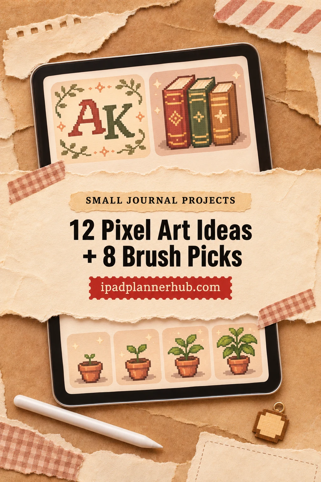
These twelve drawing prompts turn that blank space into bounded projects. Each prompt gives you a suggested grid, a color limit and a finished artifact. They are original exercises to draw yourself, not ready-made pictures included with the brush offers.
I selected the optional tools from their descriptions and public previews, rather than hands-on testing. You can plan the designs before buying anything. A pixel art brush can help with marks or texture, but a ready stamp and an original drawing are different choices.
Choose a small result before choosing a brush
- For a first session: choose the two-color monogram. Its outline and spacing are the entire task.
- For a short series: draw the plant in four static stages, keeping the pot in the same place.
- For a journal page: try the reading-log spines or the month-name divider. Leave space for the writing around them.
- For a texture study: finish a clean silhouette first, then make a second version with a small patterned shadow.
Treat the sizes below as project constraints, not universal Procreate settings. A 32×32 study forces different decisions from a 64×64 scene. If a tiny shape stops reading clearly, simplify its silhouette before adding another color or another brush.
12 Procreate Pixel Art Ideas for Small Journal Spaces
1. A two-letter divider monogram 32×32 · 2 colors
Make a square signature for a notebook divider. Pick initials with different silhouettes so they do not merge into one dark block. Leave a narrow empty border so the letters have room to breathe.
- 1Block both letters in one color, giving each a clear vertical stem. Decide whether they sit side by side or overlap before adding details.
- 2Leave a visible gap between the letters. Compare the counters, such as the inside of an A or P, and widen any opening that closes at small size.
- 3Use the second color for the background or one offset accent. Stop when both initials are readable without needing a caption.
Keep a plain version and a single-accent version as your two finished divider marks. If the overlap is confusing, undo the overlap rather than outlining every letter.
2. Three invented book spines 48×48 · 4 colors
Build a compact reading-log emblem from three upright books. Invent the titles and keep them short; the point is an original bookshelf symbol rather than copying a publisher logo.
- 1Place three rectangles on a shared baseline. Give the middle one a different height so the group has a clear rhythm.
- 2Choose one spine color per book and use the fourth color for shared title marks. Use a dot or two short bars if full words feel cramped.
- 3Check the spaces between the books, then add one common shadow direction. Keep the tops and lower edges distinct.
Finish one small bookshelf emblem. A title mark can suggest a title without being legible type; do not describe decorative bars as readable words.
3. A plant in four static stages 32×32 each · 4 colors
Draw four separate images of one imagined plant: seed, sprout, leafy stem and fuller growth. This is a sequence for a journal page, not an animation tutorial or a promise of an included plant pack.
- 1Draw the pot once and reuse its position as a visual anchor for all four images. Keep the same canvas dimensions throughout.
- 2Change only the growth above the soil. Use fewer leaves in the early stages and keep the outermost leaf tips away from the frame.
- 3Lay the four images beside each other. Make sure the order is visible from the silhouettes before you add small highlights.
Your result is a four-image strip. If two stages look almost identical, change the height or leaf count instead of relying on a tiny color change.
4. A four-point compass rose 32×32 · 3 colors
Give a walking journal a directional emblem. The design is decorative; it does not navigate, track location or supply a real map. Four points are enough for the tiny composition.
- 1Mark the center and draw the north and south points first. Match their lengths so the center does not appear to drift.
- 2Add east and west points, then assign one light face and one dark face to each arm. Leave a quiet background around the shape.
- 3Try the emblem beside a line of journal text. Remove any miniature labels that become harder to read than the main symbol.
Keep a clean compass emblem with one visually prominent north point. A simple directional contrast is more useful here than packing all eight directions into the square.
5. A three-object desk still life 64×64 · 5 colors
Arrange a closed notebook, a pencil and a small lamp. This is a miniature object composition, not a landscape header. The extra grid space is for the relationship between the objects.
- 1Place the notebook as the largest shape and the lamp as the tallest. Let the pencil lead toward the notebook instead of cutting the scene in half.
- 2Choose one imagined light source. Put all three shadows on the same side before adding any surface detail.
- 3Reserve the brightest color for one small light-catching area. Remove tiny decorative marks if they compete with the three main silhouettes.
Finish a compact still life with a readable focal object. If the pencil disappears, thicken its silhouette or move it onto a contrasting area rather than adding a glow.
6. A map of an invented walking route 64×64 · 4 colors
Make a fictional route diagram with three landmarks: a bridge, a bench and a round garden. It can stand beside notes about an imaginary afternoon. Do not use it as real navigation.
- 1Set three landmark shapes apart with generous empty ground between them. Make each outline different enough to recognize without a key.
- 2Join them with one route line. Keep it away from the landmark outlines so it reads as a path rather than a fourth object.
- 3Add a start dot and a finish mark. Review the map at the intended journal size and simplify any intersection that looks tangled.
The result is one illustrated route card. If you choose a ready tree stamp as a secondary accent, keep your three main landmarks hand drawn and the preset distinct.
7. An instrument icon for a listening log 32×32 · 3 colors
Choose one instrument with a strong outline, such as a drum or a simple bell. Avoid lettering, album art and band logos. The icon should identify a listening page without becoming a miniature poster.
- 1Draw the body as one solid mass. Give the instrument one defining feature, such as the opening of a bell or the rim of a drum.
- 2Use a second tone for one face and a third for the smallest highlight. Leave the background clear near the identifying feature.
- 3Place the icon beside a short handwritten label. If the label has to explain every detail, simplify the instrument until its outline does more work.
Finish a single listening-log icon. A recognizable silhouette is the goal; reproducing strings, keys or hardware is optional and often too much for this grid.
8. Two matching book-genre symbols
32×32 each · 3 shared colors
Create your own pair of metaphors, such as a doorway for mystery and a ringed planet for science fiction. These are journal labels, not covers copied from existing books.
- 1Give both symbols the same outer frame and approximate occupied area. Start with silhouettes before assigning colors.
- 2Choose one defining opening or detail for each. Keep the dark-to-light balance similar so one symbol does not dominate the other.
- 3View the pair beside two equally sized text labels. Reduce the heavier symbol or widen the lighter one until they feel related.
Keep two separate genre icons that look like a family. Matching visual weight matters more than having exactly the same number of colored squares.
9. A repeating geometric border tile 16×16 · 2 colors
Design a tiny step or diamond motif for a journal edge. This is an original tile exercise. A decorative pattern brush can provide a separate alternative, but it does not teach the same seam decisions.
- 1Draw one motif away from the edge first. Decide whether its ends will touch neighboring copies or remain separated.
- 2Place repeated copies beside each other on a separate larger test canvas. Inspect horizontal and vertical joins as a pattern, not just one tile.
- 3Return to the tile and fix accidental gaps or doubled dark bands. Repeat the check until the border has a steady rhythm.
Finish the tile plus a small test strip. A seamless-looking center is not enough if the join produces a heavy stripe, so preserve the test strip with your study.
10. A personal habit milestone medal 32×32 · 3 colors
Design a badge for a milestone you define yourself, such as finishing a reading session. Keep the central symbol personal: an open page, a small pencil or your own geometric mark.
- 1Build a round or stepped shield silhouette with enough room for the center. Keep any ribbon ends short and distinct.
- 2Place your symbol inside and leave a visible band of background around it. Use the darkest color for structure, not for filling every gap.
- 3Add a small highlight and compare a plain version with a patterned-shadow version. Keep the pattern only if the center remains dominant.
Your artifact is a decorative milestone badge. It does not calculate streaks or provide a functioning tracker; it simply gives a personal achievement a visual marker.
11. A coordinated stationery trio
24×24 each · 4 shared colors
Draw a paper clip, a sticky note and a pencil as three individual icons. Think of them as a small visual vocabulary for your journal, rather than a purchased sticker sheet.
- 1Use the same outline color across all three. Fit each object within a similar amount of empty border, even if its proportions differ.
- 2Assign one shared accent and one shared shadow direction. Let the paper clip remain mostly empty so it contrasts with the solid note.
- 3Arrange the trio in a row and compare their apparent size. Enlarge the smallest-looking object without changing the common canvas dimensions.
Finish three coordinated icons. Check them together; an attractive pencil on its own can still feel out of scale beside an oversized sticky note.
12. A month-name divider with custom letters 64×32 · 3 colors
Draw a short month name on your own block-letter grid and add two small decorative lines. Choose a wider canvas for a longer name rather than squeezing the spacing until the letters touch.
- 1Sketch the word as evenly spaced blocks. Resolve narrow and wide letters before giving them shadows or interior decorations.
- 2Add one line above and one below, stopping short of the word edges. Leave a clear quiet band between the lines and letters.
- 3Review the whole divider beside an ordinary paragraph. Keep any ready star stamp off to the side so it does not replace a letter or interrupt the word.
Keep a clean title strip and an optional decorated version. The exercise is your own lettering; a pack of ready symbols does not include your custom month title.
Eight optional tools for drawing, texture and ready accents
Choose one tool role for the project you picked. Drawing brushes help you construct the shape; patterns add texture; stamps place an existing motif. The broad library below has a pixel bonus, while the smaller packs focus more narrowly on pixel marks. None supplies these twelve finished journal projects.
TL;DR: Start with a project, then choose a tool: drawing brushes for your own shapes, pattern tools for restrained shadows, or clearly labeled ready stamps for decoration. These eight offers supply tools, not the twelve finished projects below.
Quick Picks
- Best for initials and lettering: Procreate Pixel Art Brush Set
- Best for patterned object studies: 24 Pixel Brush NHD 01
- Best for decorative plant studies: Procreate Pixel Brush
- Best for route-map accents: Pixel Art Brush Pack for Procreate
- Best for an existing mixed-media library: 3500 Procreate Brushes Ultimate Pack
- Best for dotted tonal areas: Procreate Pixel Art Brushes
- Procreate Pixel Art Brush Set – initials and lettering
- 24 Pixel Brush NHD 01 – patterned object studies
- Procreate Pixel Brush – decorative plant studies
- Pixel Art Brush Pack for Procreate – route-map accents
- 3500 Procreate Brushes Ultimate Pack – an existing mixed-media library
- Procreate Pixel Art Brushes – dotted tonal areas
- 135 Procreate Pixel Art Brushes – decorative marks and motifs
- Y2k Pixel Retro Procreate Brush Stamp – ready retro accents
Drawing tools for your own small designs
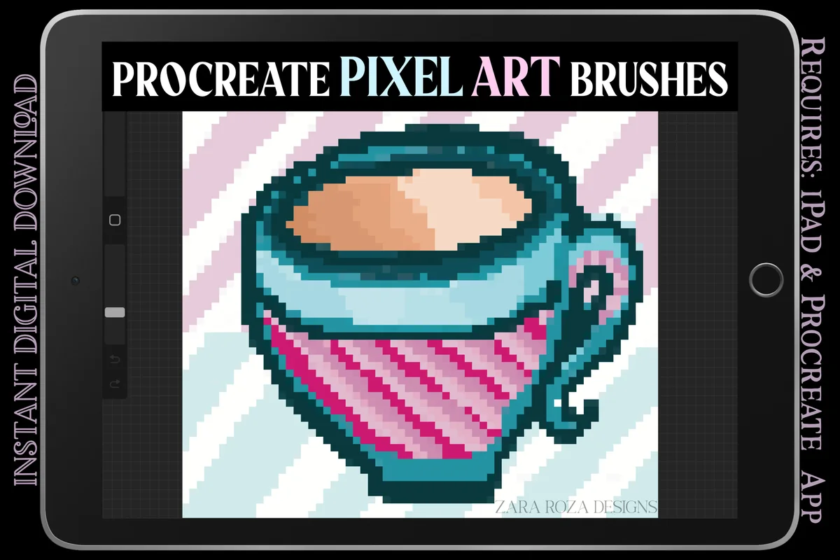
initials and lettering
1. Procreate Pixel Art Brush Set
Format: Procreate on iPad
Best for: drawing your own monogram and month divider. Designed by ZaraRozaDesigns.
- Two .brushset files with simple and aesthetic pixel brushes
- 10+ aesthetic brushes, including lettering and glitch variations
- Grid-guide canvases include 16×16, 32×32 and 64×64 pixels
A monogram needs deliberate spacing more than a decorative effect. This set pairs small grid canvases with drawing tools; keep the glitch and lettering effects for a separate version rather than assuming every brush makes a crisp single-pixel edge.
patterned object studies
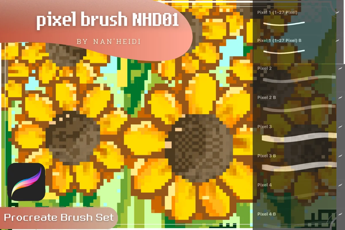
2. 24 Pixel Brush NHD 01
Format: Procreate on iPad
Best for: adding a restrained shadow to desk objects. Designed by panisa7766.
- 24 brush heads for Procreate on iPad
- Previews show solid and softer pixel strokes
- Checkerboard, dot and other repeated pattern samples
The stroke sheets give this pack a useful role in the desk still life: draw the object with a solid mark, then reserve a pattern for one shaded face. The softer variants have a different finish, so inspect the edge before treating them as precise grid tools.
decorative plant studies
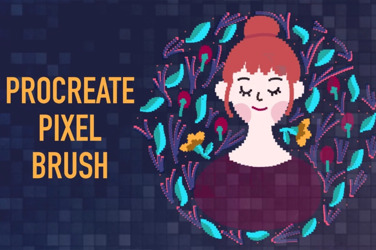
3. Procreate Pixel Brush
Format: Procreate on iPad
Best for: a larger pixel-style version of your plant sequence. Designed by Zmapist.
- One Pixel Brush in a ZIP archive
- Procreate on iPad required
- Gallery shows leaf details and a botanical arrangement
This is one illustration brush, rather than a library of ready plants. The botanical examples suggest a larger variation of the growth exercise. They do not establish that the brush is suitable for every tiny one-pixel grid.
route-map accents
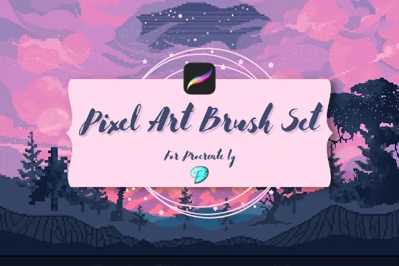
4. Pixel Art Brush Pack for Procreate
Format: Procreate on iPad
Best for: drawing a route and optionally adding scenic stamps. Designed by Emily Designs.
- 26 pixel brushes and 7 pixel stamps
- Simple, fading, dotted and scatter stroke previews
- Stamp sheet includes tree and moon silhouettes
The useful distinction here is between drawing your own route and placing an existing tree silhouette. The map can stay original while a stamp supplies a secondary marker. The finished forest scenes in the gallery illustrate the tools; they are not a promise of finished map artwork.
Pattern tools for a second version
an existing mixed-media library
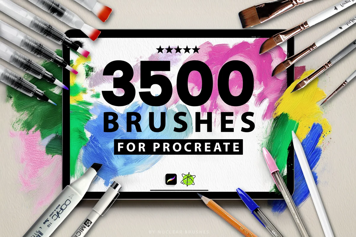
5. 3500 Procreate Brushes Ultimate Pack
Format: Procreate on iPad
Best for: trying pixel texture alongside broader illustration tools. Designed by EasyProcreate.
- 3500+ brushes across 23 categories
- Pixel art bonus with a retro color palette
- 16 seamless paper texture brushes
The pixel bonus has its own visible stroke sheet, including patterned marks. It gives this broad collection a role in the texture variation of a badge or book spine. Consider the full bundle only if its other illustration categories are useful too. It is not 3500 pixel brushes.
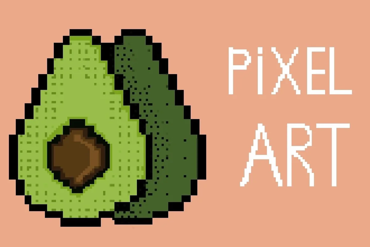
dotted tonal areas
6. Procreate Pixel Art Brushes
Format: Procreate on iPad
Best for: a small patterned shadow inside a badge or book spine. Designed by SvgOcean.
- One .brushset file for Procreate
- Gallery shows square dots and repeated dithering-like patterns
- Intended for Procreate on iPad with Apple Pencil
The pattern sheets are the reason to consider this option. A small shaded patch could add texture to a plain badge, but an all-over pattern would compete with its central symbol. This is a pattern-and-stamp role, not a substitute for drawing every outline.
Ready motifs for optional decoration
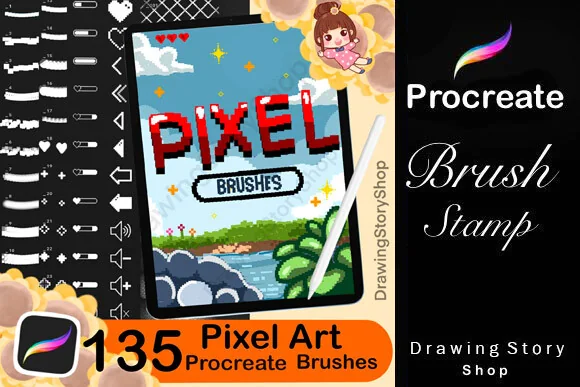
decorative marks and motifs
7. 135 Procreate Pixel Art Brushes
Format: Procreate on iPad
Best for: embellishing a finished divider after drawing the main design. Designed by DrawingStoryShop.
- 135 pixel brushes for Procreate on iPad
- Gallery includes ready icons, arrows and lettering-like motifs
- Separate samples show foliage marks and surface textures
There is more here than a drawing pen: the gallery includes preset symbols and ready text-like shapes. Those can decorate a divider, but using one does not make it an original hand-drawn motif. Keep the month lettering and monogram as your own design; use a preset only as a clearly separate accent.
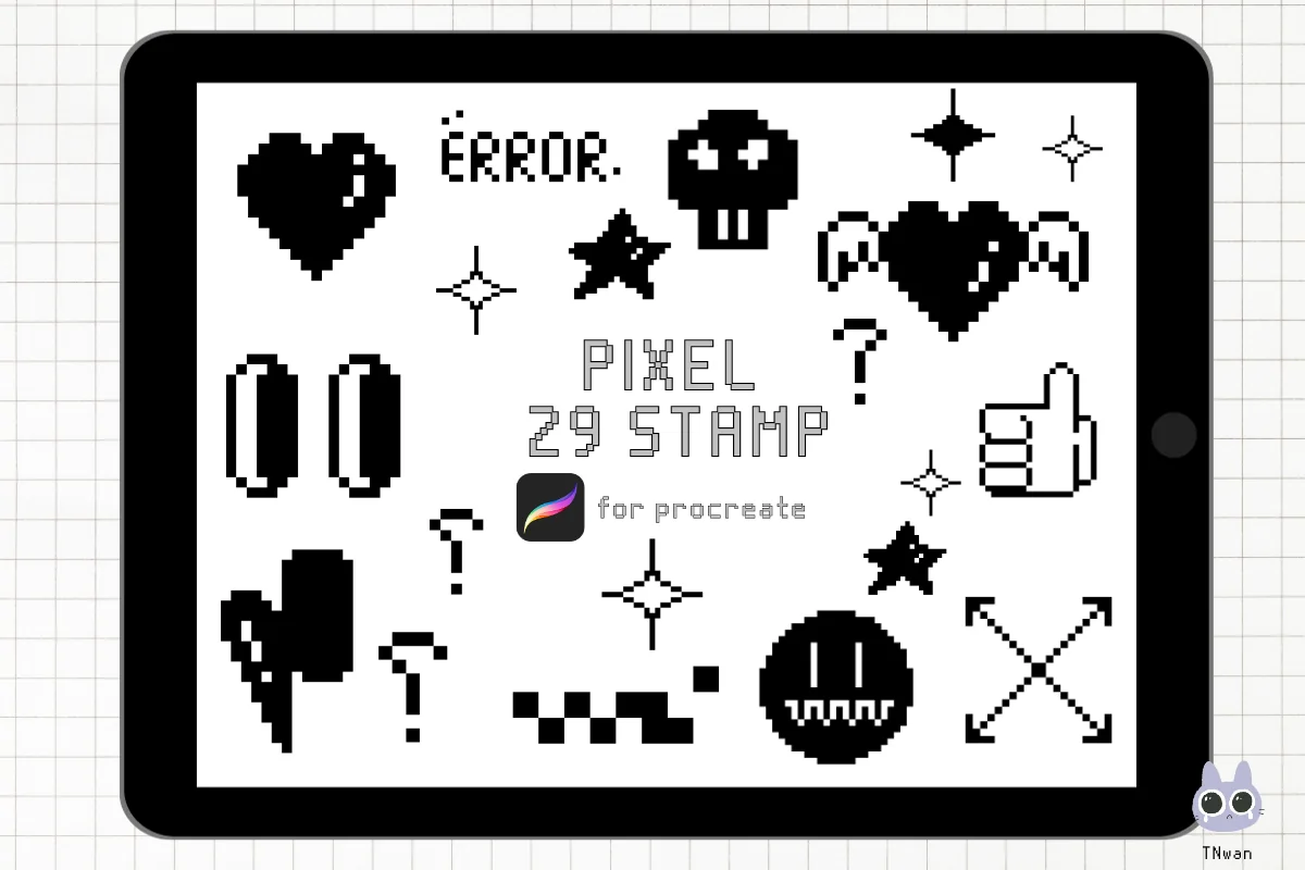
ready retro accents
8. Y2k Pixel Retro Procreate Brush Stamp
Format: Procreate on iPad
Best for: placing a small decorative mark beside original lettering. Designed by TNwan.
- 29 pixel element stamps in a ZIP archive
- Procreate on iPad required
- Gallery shows hearts, stars, arrows and other preset motifs
This is the shortcut for a ready decorative shape, rather than the tool for learning to draw that shape. One small star beside a month title can work; a page full of unrelated stamps would drown out the lettering exercise. The proposed journal projects are not included as ready artwork.
Quick Comparison
| Tool | Role | Contents | Project link |
|---|---|---|---|
| 1. Procreate Pixel Art Brush Set | Drawing and lettering | 2 brushset files + grid canvases | Monogram and month title |
| 2. 24 Pixel Brush NHD 01 | Drawing and patterns | 24 brush heads | Desk shadows |
| 3. Procreate Pixel Brush | Single illustration brush | 1 brush | Botanical variation |
| 4. Pixel Art Brush Pack for Procreate | Drawing + scenic stamps | 26 brushes + 7 stamps | Invented route map |
| 5. 3500 Procreate Brushes Ultimate Pack | Broad library with pixel bonus | 3500+ mixed brushes | Texture experiments |
| 6. Procreate Pixel Art Brushes | Pattern stamps | 1 brushset file | Small tonal patches |
| 7. 135 Procreate Pixel Art Brushes | Motifs and textures | 135 pixel brushes | Divider accents |
| 8. Y2k Pixel Retro Procreate Brush Stamp | Ready element stamps | 29 stamps | Small title accents |
Make a second version with one deliberate change
Once the first design reads clearly, keep it as a reference and change a single decision. Changing the grid, colors and texture at once makes it harder to see what improved the result.
- Silhouette study: keep the palette and remove one detail. Does the instrument or book still read clearly?
- Palette study: keep the shape and swap only the accent. For choosing colors, see my Procreate color palette shortlist.
- Texture study: keep the contour and put one dot pattern in the shadow. Compare it with the plain version in the final journal placement.
- Set study: place related designs together. Align their baselines and compare their visual weight before adding them to a journal page.
A simple finish-and-review routine
From a grid study to a usable journal mark
- 1Finish the core shape. Hide optional accents and decide whether the subject is still recognizable. The compass needs distinct points; the book group needs separate spines. Do this before judging surface texture.
- 2Check the intended placement. Compare the drawing with the text it will sit beside. Leave enough empty space around a divider title and keep a tiny icon from visually outweighing a full line of writing.
- 3Keep the study and a placement sample. Preserve a clean version alongside the decorated version. A small test page lets you choose later without redrawing the underlying design or confusing a preset accent with your original shape.
For broader page prompts, my digital journaling ideas give these little marks somewhere to live. If you want a softer doodle or lettering direction instead, the planner doodle and lettering brush guide covers that different look.
FAQ: Small pixel art projects on iPad
What are some easy Procreate pixel art ideas?
Start with the two-letter monogram, the single instrument or the personal medal. Each has one main shape. Leave the desk scene and repeating tile for a later session, since they add relationships between several objects or between neighboring copies.
What pixel art canvas size should I choose?
For these exercises, try 24×24 for the stationery trio, 32×32 for a single emblem and 64×64 for the desk scene or invented route. These are proposed constraints, not required app settings. Increase the space if your chosen word or composition cannot remain readable.
Can I do pixel art on an iPad with Procreate?
The selected offers include Procreate drawing brushes, grid-guide canvases, patterned tools and stamps for iPad work. They serve different tasks. A pixel-style illustration brush is not automatically a one-pixel pen, so check the mark you intend to use rather than assuming the entire pack has identical edges.
Do I need all eight brush offers?
No. Pick the tool role your project needs, and check what you already have first. A broad illustration bundle only makes sense if its other categories are useful too. A ready stamp can decorate a page, but it is optional for the original drawing exercises.
Are the four plant stages an animation?
They are four separate static studies with a shared pot position and canvas size. Arrange them as a strip or keep them as individual journal illustrations. This article does not cover animation settings or claim that the purchased packs include the finished sequence.
Are the journal designs included in the brush packs?
No. The initials, book spines, route map and other projects are prompts for your own drawings. Some offers contain ready stamps, and their cards say so. Those preset motifs should not be confused with the custom artifacts described in the exercises.
Pick one mark that belongs on your next page
The most useful procreate pixel art ideas give you a small, finished result instead of another open-ended canvas. Choose one journal placement, one grid limit and one palette today. Finish the plain shape first, then decide whether a pattern or ready accent improves it.
You May Also Like
This article contains affiliate links. If you purchase through them, I may earn a commission at no extra cost to you. Read the affiliate disclosure.