You open Procreate to draw one small sticker for your planner, and twenty minutes later you’re still dragging the color wheel around looking for a sage that goes with your pink. Ready Procreate color palettes fix that: one tap installs 30 colors that already belong together, and every doodle, header and tab on the page matches without any thinking.
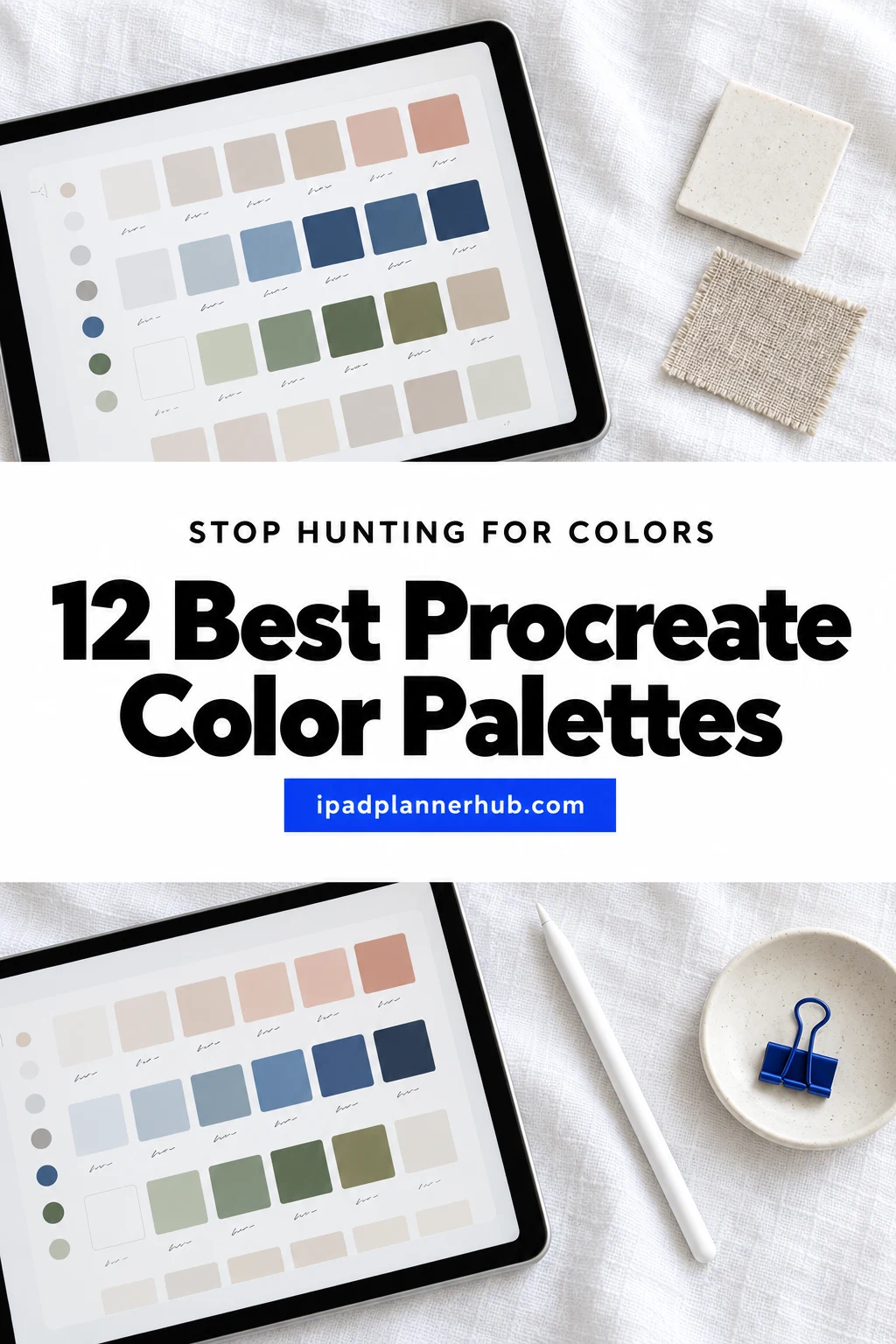
Below are 12 palettes from Creative Fabrica I’d keep in my Procreate library, from earthy and pastel sets to bright, moody and seasonal ones for fall and winter. After the list: which mood fits which planner, a simple palette routine, how to import .swatches files, how to make a palette from a photo and how to use the same colors in GoodNotes. A palette pairs well with Procreate coloring pages and with Christmas stamps for Procreate.
The 12 Best Procreate Color Palettes I Found
Creative Fabrica has hundreds of Procreate palettes, many of them Halloween sets, hair and makeup charts or near-copies from the same shop. I skipped those and kept palettes with a clear mood and a .swatches file for Procreate, no more than two per designer. The list goes from muted and neutral to pastel, bright, and finally moody and seasonal.
TL;DR: 12 ready Procreate color palettes from Creative Fabrica, grouped by mood: 3 muted and neutral, 2 pastel, 3 bright (with a 15-palette bundle), and 4 moody and seasonal for fall and winter. Every one is a .swatches file that installs with one tap and works in the Procreate app on iPad; the cards list how many colors you get and which tones are inside.
Quick Picks
- Best overall: Earthy Aesthetic Procreate Color Palette
- Best for cool tones: Dusty Muted Procreate Color Palette
- Best for minimal pages: Neutral Procreate Color Palette
- Best for planner art: Pastel Planner Procreate Color Palette
- Best for pastel variety: Procreate Color Palette Pastel Bundle 01
- Best for bold color: Vivid Procreate Color Palette
- Earthy Aesthetic Procreate Color Palette – Best overall
- Dusty Muted Procreate Color Palette – Best for cool tones
- Neutral Procreate Color Palette – Best for minimal pages
- Pastel Planner Procreate Color Palette – Best for planner art
- Procreate Color Palette Pastel Bundle 01 – Best for pastel variety
- Vivid Procreate Color Palette – Best for bold color
- Bright Cute Procreate Color Swatches – Best for cute stickers
- 450 Color Palette Bundle Procreate – Best for trying moods
- Gothic Academia Procreate Color Palette – Best for dark pages
- Fall Procreate Color Palette Bundle – Best for fall
- Muted Winter Procreate Color Palette – Best for winter
- Frosted Noel Procreate Color Palette – Best for Christmas
Best overall
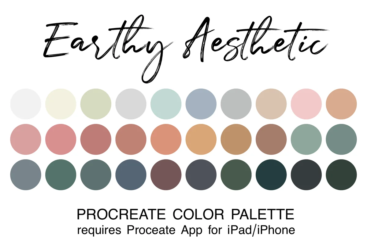
1. Earthy Aesthetic Procreate Color Palette
Layouts: 30 colors: sage, terracotta pink, brown, neutrals, slateFormat: .swatches file for Procreate
Best for: muted style fans, everyday doodlers, beginners. Designed by JulieCampbellDesigns.
- 30 colors in one .swatches file for the Procreate app
- Soft sage greens, warm terracotta pinks, rich browns and gentle neutrals
- Three rows on the cover: light neutrals, warm pinks and browns, deep slate and forest tones
- Install steps for beginners in the description; needs Procreate on iPad or iPhone
If I could keep only one palette, it would be this one: light, mid and dark tones in the same earthy family, so a header, a doodle and its shadow all match without thinking. 117 people have it in favorites, more than any other single muted palette I looked at.
Best for cool tones
2. Dusty Muted Procreate Color Palette
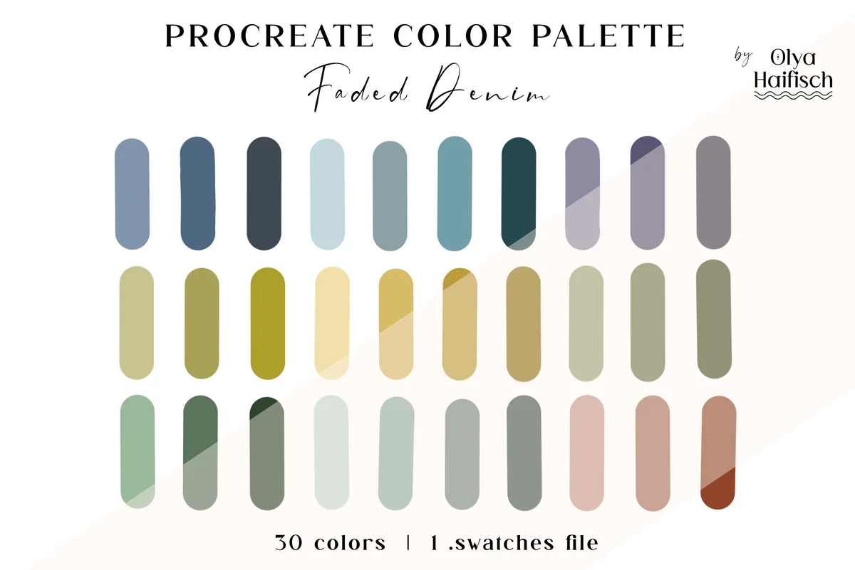
Layouts: 30 colors: dusty blue, navy, teal, forest green, olive, sage, dusty roseFormat: .swatches file for Procreate
Best for: cool tone lovers, fall and winter planners, minimalists. Designed by Olya Haifisch.
- 30 handpicked colors in 1 .swatches file, named Faded Denim on the cover
- Dusty blue and navy, soft teal and dark forest green, muted olive and golden khaki
- Pale sage and dusty rose accents for highlights
- Listed in July 2026, one of the newest palettes here
Earthy Aesthetic leans warm; this one is the cool twin, with denim blues and greens doing most of the work and a little rose for contrast. I'd pick it for a fall or winter planner that should feel quiet, not orange.
Best for minimal pages
3. Neutral Procreate Color Palette
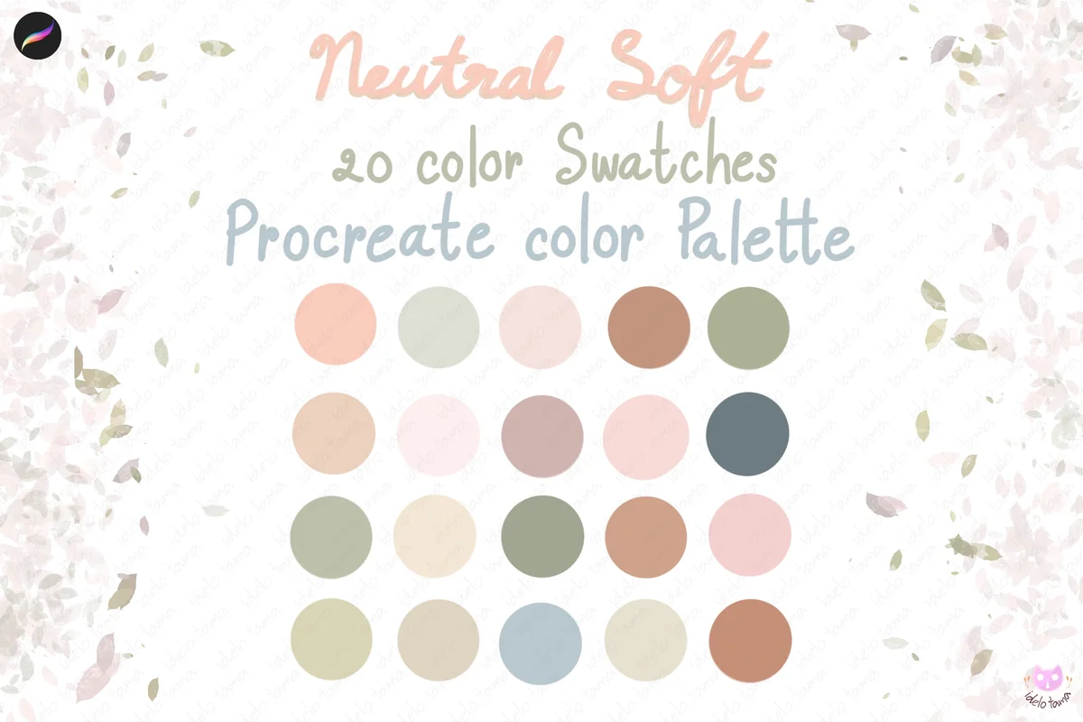
Layouts: 20 colors: peach, blush, ivory, sand, sage, terracotta, grey-blueFormat: .swatches file for Procreate
Best for: minimalists, neutral planner fans, beginners. Designed by idelotama.
- 20 colors in one .swatches file, called Neutral Soft on the cover
- Peach, blush, ivory, sand, sage, terracotta and one grey-blue
- A preview shows the palette loaded in the Procreate Palettes panel
- Works in the Procreate app only
Twenty colors sounds small, but for a minimal planner it's the right size: every swatch is soft, so nothing on the page shouts. I'd use it for stickers and covers that sit on cream paper templates.
Best for planner art
4. Pastel Planner Procreate Color Palette
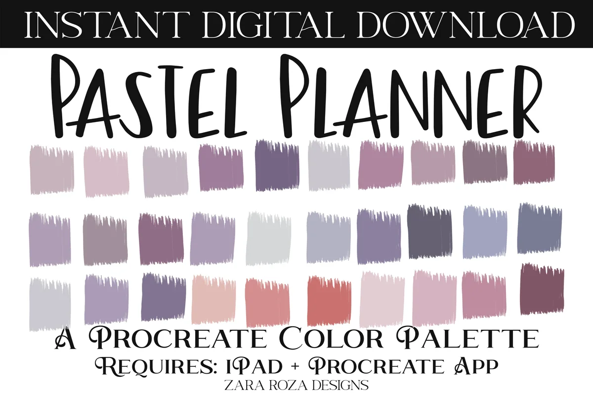
Layouts: 30 swatches: lavender, purple, pink, iris blue, grey, roseFormat: .swatches file for Procreate
Best for: planner sticker makers, lavender lovers, pastel fans. Designed by ZaraRozaDesigns.
- 1 palette with 30 swatches in a .swatches file
- Lavender and purple, makeup pink, iris blue, grey and soft rose tones on the cover
- Made for planning art by the designer; requires iPad and the Procreate app
- Rated 5.0 on Creative Fabrica, 71 favorites
This is the only palette I found that was made with planners in mind, and you can see it: lots of lavender and mauve that look good as tabs and washi, plus a few deeper tones for text. If your planner is purple, start here.
Best for pastel variety
5. Procreate Color Palette Pastel Bundle 01
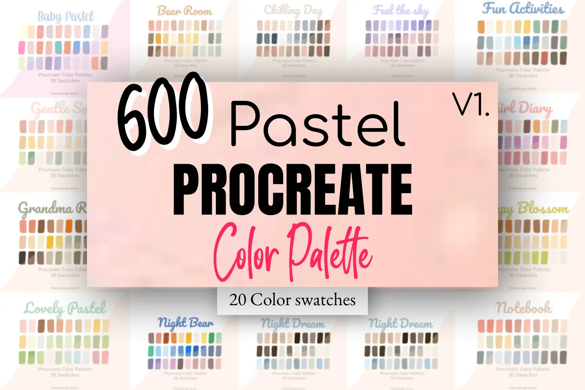
Layouts: 20 themed pastel palettes of 30 colors (600 colors)Format: 20 .swatches files for Procreate
Best for: pastel sticker makers, theme lovers, bundle fans. Designed by Pakka Design Studio.
- 20 .swatches files of 30 colors each, 600 pastel colors on the cover
- Themed sets like Baby Pastel, Bear Room, Feel the Sky, Girl Diary, Notebook, Pastel Cake and Night Dream
- Pastel Diary and Notebook sets fit journal and planner art
- The most-saved palette in this list: 258 favorites, rated 5.0
Twenty pastel palettes is a lot, but each one has its own theme, so you can match a palette to a month or a sticker set instead of mixing random pinks. If you draw pastel stickers often, this one bundle covers most of what you need.
Best for bold color
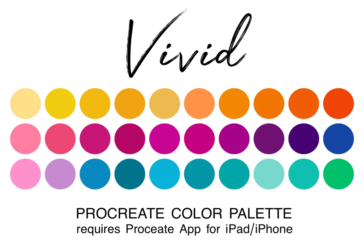
6. Vivid Procreate Color Palette
Layouts: 30 saturated colors: yellow, orange, pink, magenta, blue, aquaFormat: .swatches file for Procreate
Best for: bold lettering fans, colorful planners, sticker makers. Designed by JulieCampbellDesigns.
- 30 saturated colors in one .swatches file
- Sunshine yellows and oranges, electric pinks and magentas, deep blues and aquas
- Balanced for contrast, so bright colors still read on a white page
- 224 favorites, the most of any single palette here
Bright palettes often turn into a rainbow mess, but this one is built in blocks: warm row, pink-to-purple row, blue-to-green row. I'd use one row per page, which keeps a colorful spread from feeling loud.
Best for cute stickers
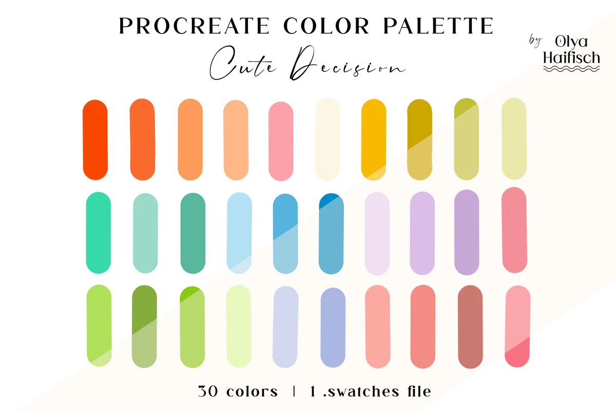
7. Bright Cute Procreate Color Swatches
Layouts: 30 colors: coral, orange-red, teal, sky blue, yellow, olive, lavender, dusty pinkFormat: .swatches file for Procreate
Best for: cute sticker makers, spring and summer planners, kawaii fans. Designed by Olya Haifisch.
- 30 handpicked colors in 1 .swatches file, named Cute Decision on the cover
- Orange-red and peachy coral, bright teal and sky blue, golden yellow and olive green
- Soft lavender and dusty pink accents
- Listed in October 2026, the newest palette in this list
Brighter than a pastel set, softer than Vivid: the corals and teals sit somewhere in between, which is why it works for kawaii-style stickers. It's brand new, so no reviews yet, but the cover shows exactly what you get.
Best for trying moods
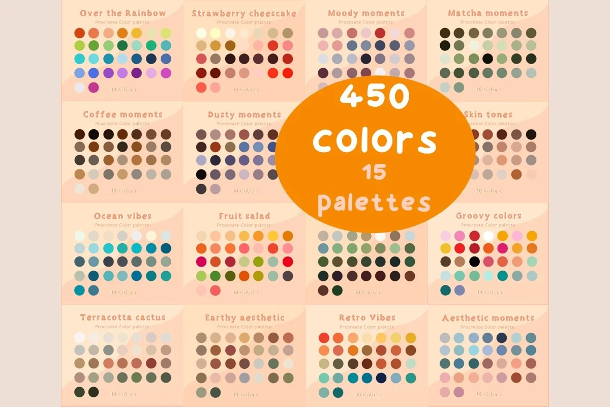
8. 450 Color Palette Bundle Procreate
Layouts: 15 themed palettes, 450 colors, incl. skin tonesFormat: .swatches files for Procreate (zip)
Best for: palette explorers, bundle fans, character doodlers. Designed by ResipaintDesign.
- 15 Procreate palettes, 450 colors in one zip
- Themes on the cover: Over the Rainbow, Strawberry Cheesecake, Matcha, Coffee, Moody, Dusty, Ocean Vibes, Fruit Salad, Retro Vibes, Forest Tones and more
- A Skin Tones palette is part of the bundle
- Rated 5.0, 145 favorites
This is the bundle I'd get to find out which mood I actually like: coffee, matcha, dusty and retro sets side by side. The skin tones palette inside is a nice bonus if you ever draw little people on planner pages.
Best for dark pages
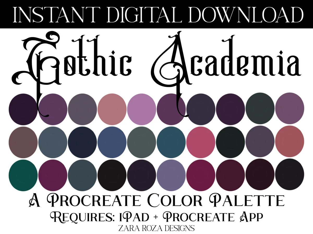
9. Gothic Academia Procreate Color Palette
Layouts: 30 swatches: plum, wine, navy, bottle green, slate, near-blackFormat: .swatches file for Procreate
Best for: dark academia fans, black paper journalers, moody art lovers. Designed by ZaraRozaDesigns.
- 1 palette with 30 swatches in a .swatches file
- Deep plum, wine, navy, bottle green, slate and near-black tones
- A few lighter mauves and roses for highlights
- Rated 5.0, 120 favorites; requires iPad and the Procreate app
Most palettes assume a white page. This one is for the opposite: dark plums and greens that look rich on a black or navy planner, with a couple of lighter mauves to make lettering stand out. I'd pair it with a dark reading or study journal.
Best for fall
10. Fall Procreate Color Palette Bundle
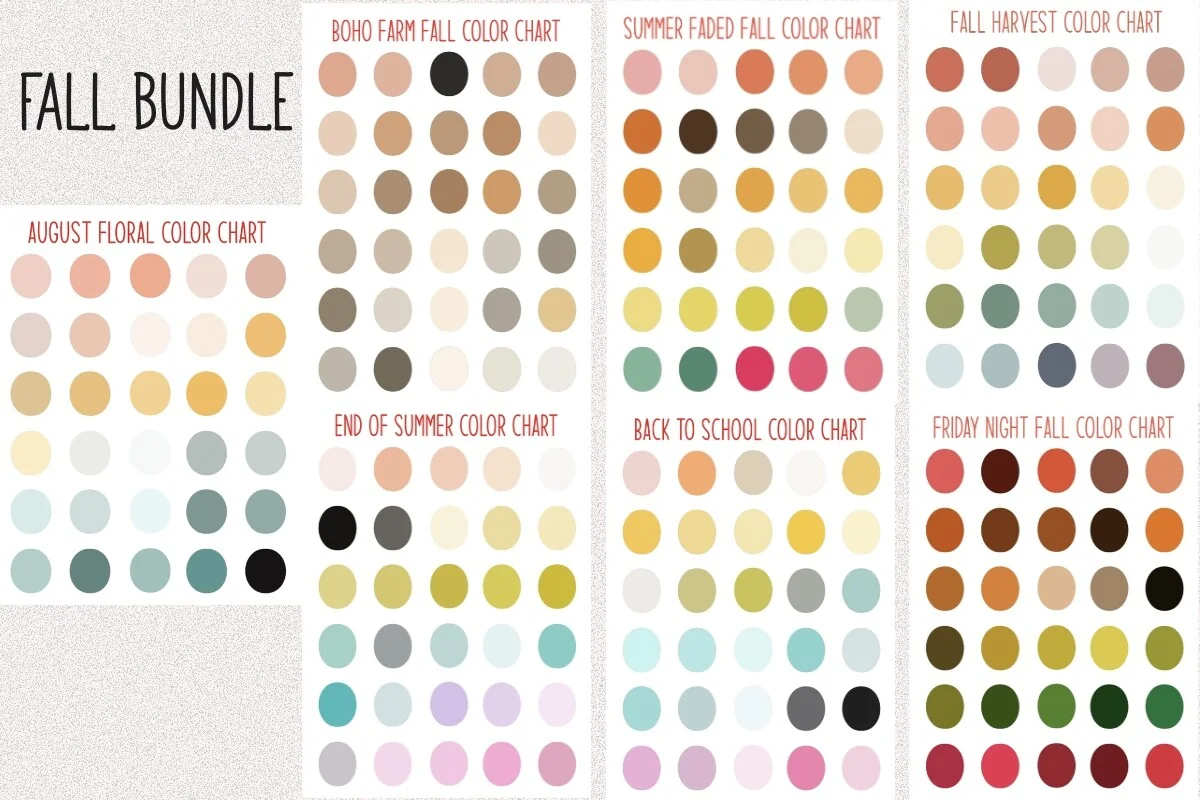
Layouts: 210 fall swatches in 7 charts (August Floral to Friday Night Fall)Format: Procreate color palette bundle
Best for: fall planners, monthly spread makers, seasonal decorators. Designed by Sierras Crafts Creations.
- 210 fall color swatches in one bundle
- Seven charts on the previews: August Floral, End of Summer, Back to School, Boho Farm Fall, Summer Faded Fall, Fall Harvest, Friday Night Fall
- From late-summer pinks and yellows to deep harvest reds and greens
- Listed in August 2026
Instead of one fall palette, this one moves through the season: end-of-summer pastels for September, harvest oranges for October, deep reds and greens for November. That makes it handy for monthly spreads where each month should feel a little different.
Best for winter
11. Muted Winter Procreate Color Palette
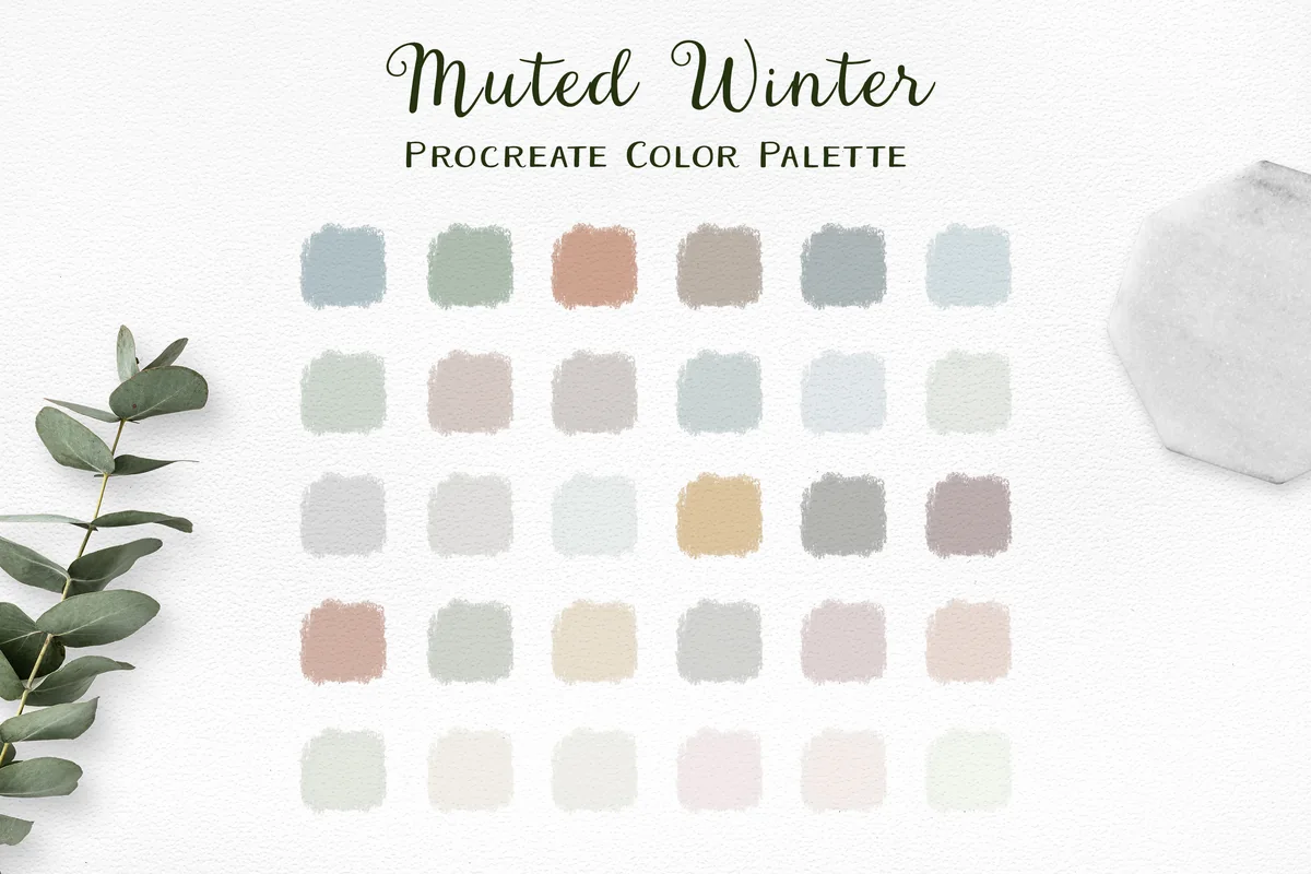
Layouts: 30 soft winter colors: frosty blue, sage, pale gold, dusty pink, greyFormat: .swatches file for Procreate
Best for: winter planners, soft pastel fans, holiday crafters. Designed by Little Nordic Atelier.
- 1 .swatches file with 30 soft, delicate colors
- Frosty blues, sage, pale gold, dusty pink and warm greys on the cover
- The designer names digital crafting, planning and Christmas projects as uses
- 63 favorites; works in the Procreate app on iPad
Christmas palettes are usually red and green; this one is the snowy version, all pale blues and soft golds. I'd use it from December to February, because nothing in it says Christmas only.
Best for Christmas
12. Frosted Noel Procreate Color Palette
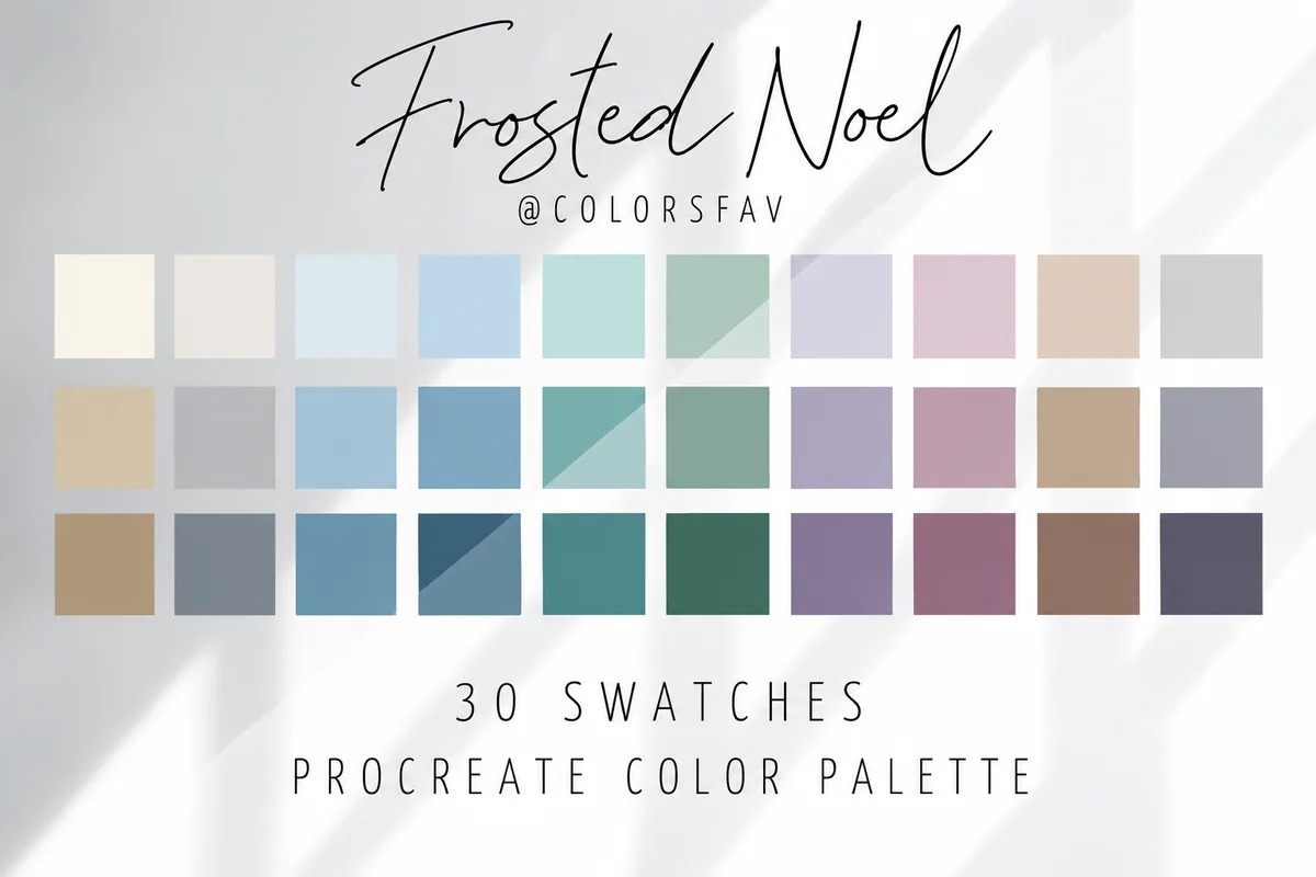
Layouts: 30 winter shades in light, medium and deep rows: icy blue, teal, evergreen, mauve, silver, ivoryFormat: .swatches file for Procreate
Best for: December planners, holiday sticker makers, festive letterers. Designed by ColorsFav.
- 30 winter shades in three rows of ten: light, medium and deep
- Icy blues, muted teal, evergreen, dusty mauve, silver grey and warm ivory
- Each color family lines up, so highlight, base and shadow sit in one column
- Listed in October 2026; suggested for Christmas cards, winter stickers and festive lettering
The light-medium-deep layout is the clever part: pick a column and you have a highlight, a base and a shadow that belong together. That's exactly what you need for ornament and mitten stickers in a December spread.
Quick Comparison
| Palette | Mood | Colors | Stand-out extra |
|---|---|---|---|
| 1. Earthy Aesthetic Procreate Color Palette | Earthy, muted | 30 | Light to deep in one file |
| 2. Dusty Muted Procreate Color Palette | Cool, dusty | 30 | Denim blues and sage |
| 3. Neutral Procreate Color Palette | Neutral, soft | 20 | Smallest, easiest to learn |
| 4. Pastel Planner Procreate Color Palette | Pastel, lavender | 30 | Built for planner art |
| 5. Procreate Color Palette Pastel Bundle 01 | Pastel, themed | 600 (20 palettes) | Most favorites in the list |
| 6. Vivid Procreate Color Palette | Bright, saturated | 30 | Grouped by color family |
| 7. Bright Cute Procreate Color Swatches | Bright, cute | 30 | Newest (Oct 2026) |
| 8. 450 Color Palette Bundle Procreate | Mixed moods | 450 (15 palettes) | Includes skin tones |
| 9. Gothic Academia Procreate Color Palette | Dark, moody | 30 | Made for dark pages |
| 10. Fall Procreate Color Palette Bundle | Fall, seasonal | 210 (7 charts) | August to November |
| 11. Muted Winter Procreate Color Palette | Winter, pale | 30 | Works past Christmas |
| 12. Frosted Noel Procreate Color Palette | Christmas, frosty | 30 | Highlight, base, shadow columns |
Muted, Pastel, Bright or Moody: Which Procreate Color Palette Fits You
Palettes on Pinterest are saved by mood, and the 12 above fall into four groups. Pick the group that matches your planner first, then the palette inside it.
Muted and neutral palettes
Soft, slightly grey colors that never fight with a planner template. They suit cream and beige pages, minimal bullet journals and anyone who wants decoration to stay in the background: the earthy sage and terracotta set, the cool denim blues and the 20-color neutral palette.
For a small botanical accent in those muted colors, decide whether you want to color an outline or build the bloom yourself. These Procreate flower brushes and stamps separate complete flower stamps from petal and dynamic brushes, so the shape-making tool follows the decoration you have in mind.
Pastel palettes
Light, sweet colors for cute stickers, washi and tabs. A Procreate color palette in pastels is the safest choice for planner art, because pastel shapes still leave room for dark text on top. In this list: the lavender planner palette and the 20-palette pastel bundle.
For a pastel sticker with a repeated fill, color is only part of the choice. The dots, checks and other motifs in these Procreate pattern brush sets need enough space to stay readable, so compare the repeat at the size your finished decoration will use.
Bright palettes
Saturated colors for lettering, headers and stickers that should pop. Use them in small doses on a planner page: one row of the Vivid palette, the softer corals of the Cute Decision set, or try many moods at once with the 450-color bundle.
For a tiny bright accent, the number of colors matters as much as their intensity. These pixel art projects for journal margins give monograms, book spines and other small drawings explicit color limits, so you can choose a few swatches for a defined result.
Moody and seasonal palettes
Dark or seasonal colors for a specific month or a dark-paper journal: Gothic Academia for black pages, the fall bundle for September to November, and two winter sets, the pale Muted Winter and the frosty Frosted Noel for December.
For an illustrated cover in those darker colors, consider whether smoke should be a small curl or part of the background. This Procreate smoke brush comparison distinguishes narrow trails from broad textures, helping you keep the effect in proportion to the title and subject.
What I Look For in a Procreate Color Palette
- Light, mid and deep tones of the same colors. A palette with only mid tones looks flat. You need a light version for highlights and a deep one for shadows and text.
- One mood, not a random rainbow. Thirty colors that share a temperature (warm, cool, dusty, bright) are easier to use than thirty favorites from everywhere.
- A real .swatches file. Some listings are only a picture of colors. A .swatches file installs with one tap; a picture means picking every color by hand.
- Neutrals inside. A cream, a grey or a soft brown in the palette saves you from leaving it every time you need a background or an outline.
- Bundles only if you’ll use them. A 20-palette bundle is great value, but if you always draw in one style, one strong palette is easier to live with.
Stop Hunting for Colors: A Simple Palette Routine for Planner Art
The point of a ready palette is to decide about color once, not every time you draw. This is the routine I’d use for planner stickers, headers and doodles in Procreate:
- Pick one palette per month or per notebook and set it as default in Procreate, so it shows up in every color mode.
- Use the 60-30-10 split. About 60% of the color on a page from one light tone (backgrounds, tabs), 30% from a mid tone (shapes, washi), 10% from a deep or bright accent (titles, dots, arrows).
- Keep three “jobs” fixed. One color for headers, one for highlights, one for outlines. Once they’re chosen, a new sticker takes seconds.
- Check contrast for text. Write a test word in your darkest swatch on your lightest one. If it’s hard to read, swap the text color, not the whole palette.
- Change palettes with the season, not every day. A fall palette for October and a winter one for December makes each month feel fresh while every page inside it still matches.
For brushes and stamps to draw those headers and tabs, see my Procreate brushes for planners. For spread ideas to color in, my planner layout ideas are a good start.
How to Import Procreate Color Palettes (.swatches Files)
- Save the zip to the Files app on your iPad and tap it to unzip.
- Tap the .swatches file. Procreate opens and adds the palette to the Palettes tab of the Colors panel.
- If tapping doesn’t work, open Colors, go to Palettes, tap + and choose New from File, then pick the .swatches file.
- Set it as default with the Set default option on the palette, so it appears under the Disc, Classic, Harmony and Value modes too.
- For a bundle, repeat for each file. You can drag palettes up and down to keep your favorites at the top.
To share a palette or back it up, swipe left on it in the Palettes tab and choose Share: Procreate exports it as a .swatches file.
How to Make Your Own Palette From a Photo
When a ready palette is almost right, you can also build one from a picture you love: an autumn walk, a café, a page from a magazine.
An autumn photo can also suggest the subject for a small landscape. These Procreate tree brushes separate whole-tree silhouettes from detailed drawings, so you can choose a tree shape to work with the colors you sampled.
- Open Colors, then Palettes, and tap +.
- Choose New from Photos (or New from Camera to point the iPad at something in front of you).
- Pick the image: Procreate fills a new palette with colors taken from it.
- Clean it up: long-press a swatch to delete colors you don’t need, and add a neutral or a deep tone if the photo didn’t give you one.
A photo palette is great for one project. For planner art you use every week, a curated palette like the ones above is usually more balanced, because someone already sorted light, mid and deep tones for you.
A small room makes a useful test of a balanced palette: one focal chair, quieter furniture and a light floor. The Procreate isometric scene prompts include a reading nook where those color roles have a specific job.
Procreate Palettes vs GoodNotes Colors
A .swatches file works in Procreate (and Procreate Pocket on iPhone), not in GoodNotes or Notability. To use the same colors in your planner, copy them by hex code:
- In Procreate, tap a swatch, open the Value mode in Colors and copy the hex code.
- In GoodNotes, open the pen color options, add a custom color and paste the hex code.
- Do this for your three “job” colors (headers, highlights, outlines), and your handwriting will match the stickers you drew.
If you only want ready hex codes for GoodNotes pens and highlighters, my GoodNotes color palettes have 12 sets to copy, from pastel to black paper.
Two Free Palettes to Install Tonight
Before buying a bundle, it’s worth trying a palette or two that cost nothing. These two procreate color palettes are freebies on Creative Fabrica, with no trial attached, and both are real .swatches files with 30 colors each, which is what I look for in a paid one too.
Free jewel tones
Free & Fancy FREEBIE Procreate Palette
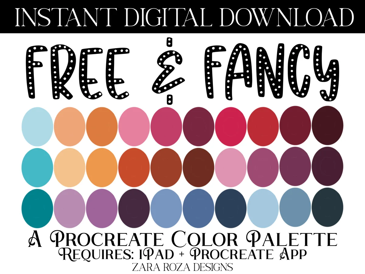
Colors: 30 swatchesFiles: .swatches for Procreate on iPad
Best for: planner art with magenta, teal and lavender, lettering. Designed by ZaraRozaDesigns.
- One Procreate palette with 30 swatches
- Magenta, blue, purple, lavender, teal, emerald and brown tones
- Made for iPad and the Procreate app
- Rated 5.0 on Creative Fabrica (one review)
It’s the most saved of the free palettes I found, and the mix of teal, berry and brown gives you light and deep versions of the same colors. That makes it easy to letter a header and color its shadow without leaving the palette.
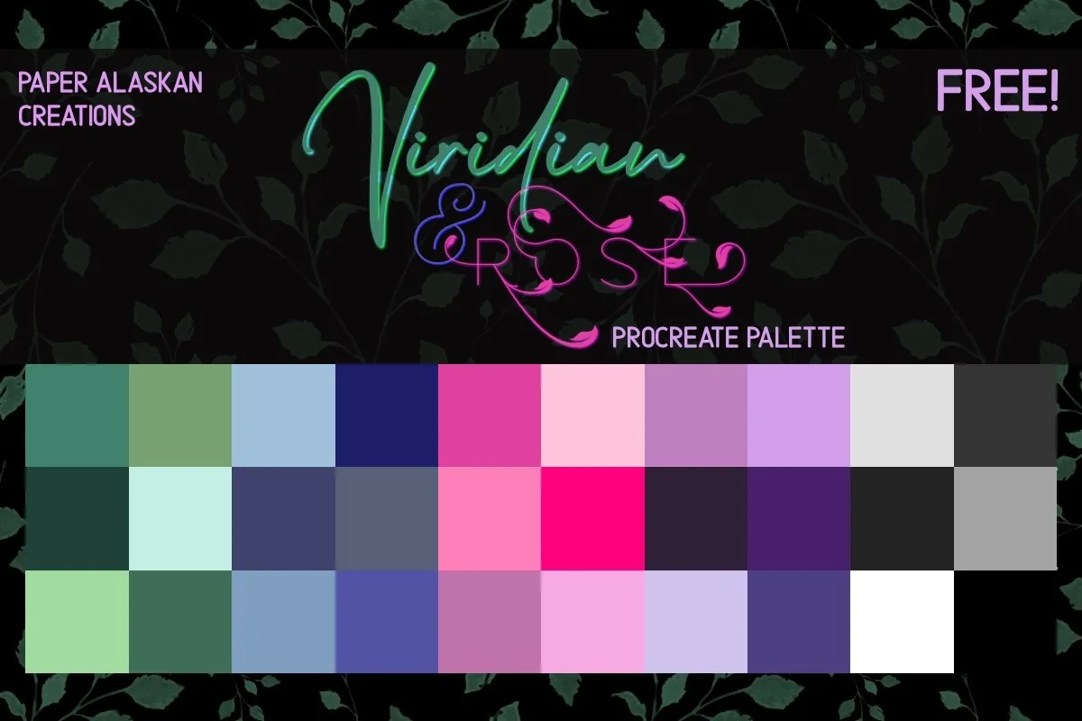
Free green and pink
Viridian & Rose Procreate Palette FREE
Colors: 30 coordinated colorsFiles: .swatches in a zip
Best for: botanical doodles, spring spreads, pink and green pages. Designed by Paper Alaskan.
- 30 colors built around viridian green and rose
- The preview shows greens, blues, pinks, purples plus white, grey and black
- A .swatches file that installs in Procreate with a tap
- For iPad with the Procreate app
Green and pink is a classic combination for plant and flower doodles, and this palette also has the neutrals I want for text and outlines. A good one to set as your default for a spring planner.
FAQ
How do I get more color palettes in Procreate?
Three ways: import ready .swatches files (like the ones above), create a palette from a photo or the camera with the + button in Palettes, or build one by hand by tapping empty squares in a new palette to save the current color.
Where can I find free Procreate color palettes?
Some artists and blogs share small free palettes, and Procreate itself comes with a few default ones. Free sets are often single palettes with a random mix of colors. Many Creative Fabrica palettes are included in an All Access subscription, and you can always make your own from a photo for free.
How many colors fit in one Procreate palette?
Most ready palettes come with 30 swatches, which fill the compact palette view in Procreate. Smaller sets (like the 20-color neutral palette) leave empty squares where you can add your own colors.
Are there Procreate color palettes for skin tones?
Yes, skin tone palettes are a popular category of their own. If you only need them now and then, the 450-color bundle includes a skin tones palette next to its 14 mood sets.
When those colors are for a character, the gaze needs its own shape decisions. The Procreate eye brush comparison separates eyelid outlines, iris details and reflections, so you can choose the missing component before coloring it.
If those skin tones are for a small character, decide how you want to build the surrounding hairstyle too. This Procreate hair brush comparison distinguishes drawn strands from ready hairstyle stamps, so the tool choice follows the character rather than the palette size.
Can I use Procreate palettes in GoodNotes?
Not as a file. GoodNotes doesn’t open .swatches files, but you can copy each color’s hex code from Procreate and add it as a custom pen color in GoodNotes, as shown in the section above.
Do these palettes work on iPhone?
.swatches files also open in Procreate Pocket on iPhone, and some designers mention iPhone in the description. The palettes are made mainly for Procreate on iPad, where most planner art is drawn.
Final Thoughts
The best Procreate color palettes are the ones that stop the color hunt: start with one everyday set, like the Earthy Aesthetic palette, add a seasonal one such as the fall bundle or Frosted Noel, and set it as default for the month. For stickers to color with them, see my GoodNotes stickers; for brushes, my Procreate brushes for planners; for more guides, all how-to guides.
A palette sets the color direction; the brush determines the mark. Compare these Procreate sketch brushes for iPad for line work, soft shading and specialist textures.
For a watercolor project, pair your chosen colors with one of these Procreate watercolor brushes; the roundup separates washes, edges and paper effects.
You May Also Like
This post contains affiliate links. If you buy through them, I may earn a small commission at no extra cost to you. Learn more.