A flat shadow can leave a comic panel looking unfinished, but adding random grain may give it the wrong texture. Procreate halftone brushes offer tiny dots, fine lines or worn-looking ink instead. I find the useful choice is the kind of screen you want to see in the finished picture: crisp and orderly, visibly distressed, or closer to a manga tone. A larger brush count only helps when those extra variations solve that particular job.
I compared the public descriptions and preview galleries for these 10 brush packs. This is a guide to their advertised contents and visible marks, rather than a claim that I installed every paid brush. Some sets concentrate on repeat patterns; others add stamps, grain or comic-page extras. I have kept those differences visible so you can choose a pack for an actual project.
What Makes a Halftone Screen Different?
Look for the structure inside the shaded area. A regular dot field or set of parallel lines has a repeating rhythm, even when the marks become denser or more worn. Random stipple, paper grain and scattered speckles can add texture too, but they do not give you the same orderly screen. Several packs combine both effects, which is useful as long as you know which tools you are choosing.
- Dot screens: useful when you want a shadow to read as a field of visible points. Compare the gaps as well as the dots.
- Line screens: give the shaded area a clear direction. An angle change can become part of the composition.
- Distressed screens: keep a repeating pattern while breaking up its edges or ink coverage. Grain brushes can add a second, less regular surface.
- Screentones: in these manga packs, the term covers dot and line fills alongside grids, fades and other tonal marks. Check the example sheet instead of expecting every brush to make the same kind of dot.
Clean Dots, Lines and Repeatable Shades
Start with packs 1–4 if you want orderly screens. The 50-brush GrallysSupplyCo library offers a varied starting range; Faye’s clean pack adds stamps and pens. The larger Grallys collection emphasizes angle and shade variants, while Dimauavn separates static and dynamic marks. These are different ways to organize the same decision: how regular should the shading look?
Distressed Ink and Pop-Art Texture
Packs 5–8 put worn ink, rough surfaces or comic accents closer to the center of the project. Dirty Halftones divides shading, filling and spraying into named roles. Faye’s smaller distressed pack is more focused; the pop-art set adds paper, while the eighth pack mixes regular screens with rough accents. Choose the surface you want before counting the extras.
Dedicated Manga Tones and Atmospheric Marks
Packs 9–10 cover dedicated tones and darker atmospheric marks. DrawingStoryShop is the direct tone-library option. Kraftcake’s examples emphasize textured transitions. Compare the dedicated tone libraries for the dot sizes, densities and line patterns your panels need.
The 10 Best Procreate Halftone Brushes by Screen Style
TL;DR: For varied seamless screens, start with GrallysSupplyCo’s 50-brush set. Choose Dirty Halftones for separate shader, fill and sprayer roles, or DrawingStoryShop for a dedicated manga tone library. The ten packs cover clean screens, distressed print and comic tones; choose one by its finish before comparing the biggest totals.
Quick Picks
- Best for a varied seamless starter library: Halftone Brushes for Procreate
- Best for clean screens with stamp accents: Exclusive Halftone Procreate Brushes 2
- Best for many angle and shade variants: Seamless Halftone Brushes for Procreate
- Best for static versus rotating marks: Procreate and PS Halftone Brushes Set
- Best for distinct shading and fill roles: Dirty Halftones Brush Set
- Best for a compact distressed screen set: Exclusive Halftone Procreate Brushes
- Halftone Brushes for Procreate – Best for a varied seamless starter library
- Exclusive Halftone Procreate Brushes 2 – Best for clean screens with stamp accents
- Seamless Halftone Brushes for Procreate – Best for many angle and shade variants
- Procreate and PS Halftone Brushes Set – Best for static versus rotating marks
- Dirty Halftones Brush Set – Best for distinct shading and fill roles
- Exclusive Halftone Procreate Brushes – Best for a compact distressed screen set
- Procreate Pop Art Comic Brushes – Best for a vintage pop-art scene
- Halftone Procreate Brush & Stamps – Best for mixing screens and rough accents
- 100+ Procreate Manga Screentone Brushes – Best for a dedicated manga tone library
- Procreate Manga Screentone Brush – Best for atmospheric manga texture
Clean dot and line screens
Best for a varied seamless starter library
1. Halftone Brushes for Procreate
Layouts: 50 brushesFormat: Procreate on iPad
Best for: mixing dot, line and grid screens without a huge brush library. Designed by GrallysSupplyCo.
- 50 seamless halftone brushes
- Assorted textures, shapes, sizes and angles
- Color and opacity can be changed
- Examples show dots, parallel lines and fine grids
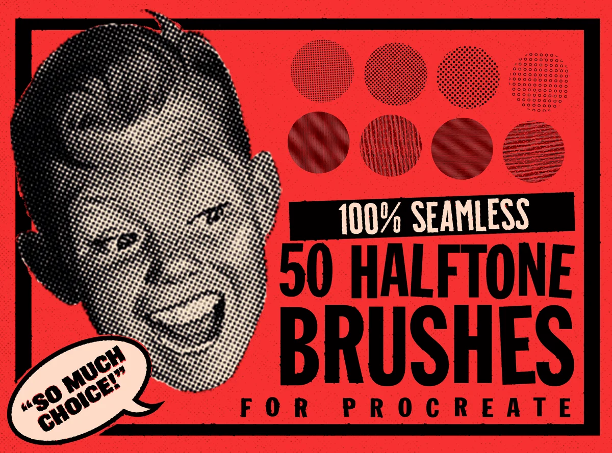
The range of marks is the appeal here. The sample sheet puts orderly lines beside open dots and much denser textures, so you can choose a screen for a shadow without giving the whole illustration the same finish. I like this as a starting point for lettering and flat shapes. GrallysSupplyCo says the pattern continues between strokes; that is a useful claim to check with a two-stroke swatch before committing to a large area. The previews show examples, rather than an individual labeled sheet of all 50 brushes.
Best for clean screens with stamp accents
2. Exclusive Halftone Procreate Brushes 2
Layouts: 36 mixed toolsFormat: Procreate on iPad
Best for: combining clean dots with ready-made shadow and texture accents. Designed by PawsitivelyAesthetic.
- 36 tools: 14 clean halftones, 2 halftone pens, 10 stamps and 10 textures
- One .brushset file for Procreate on iPad
- Stamps include round fades and a heart
- Ten texture examples shown separately
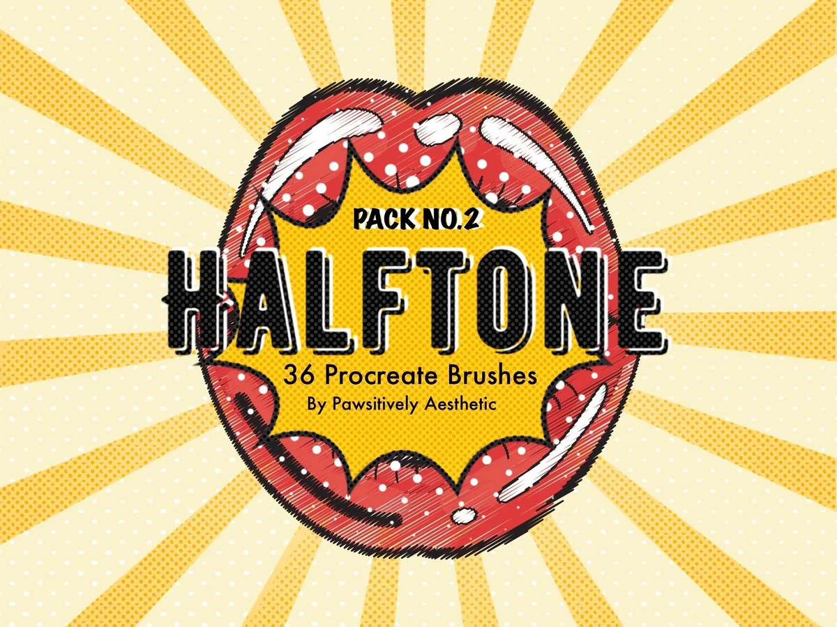
Pack No. 2 is the cleaner of Faye’s two halftone collections. Its circular swatches make dot density easy to compare, while the separate stamp sheet gives you a quick way to place a small accent. The useful distinction is the breakdown: 36 tools does not mean 36 continuous screen brushes. Fourteen are clean halftones, with pens, stamps and texture tools making up the rest. Choose this over her distressed pack when you want orderly dots and a few decorative shortcuts in the same file.
Best for many angle and shade variants
3. Seamless Halftone Brushes for Procreate
Layouts: 990 advertised variantsFormat: Procreate on iPad
Best for: building a consistent print treatment across several related illustrations. Designed by GrallysSupplyCo.
- 990 brushes advertised on the cover
- 11 shades per set
- 10 angles, including 45 degrees
- Color, opacity and size can be adjusted
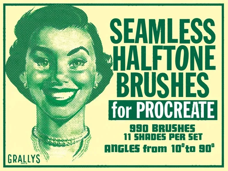
This is a much larger library from GrallysSupplyCo than the 50-brush set above. The green preview cards emphasize matching gradient screens, eleven shades and ten angles; the point is having variations available, rather than searching for 990 unrelated textures. It makes sense for a series of posters or panels where the screen direction and darkness need a repeatable choice. The public gallery contains three promotional examples, not a full swatch of every brush, so I would start with the smaller collection if deciding between many close variants feels like extra work.
Best for static versus rotating marks
4. Procreate and PS Halftone Brushes Set
Layouts: 14 designs; 2 variationsFormat: Procreate on iPad
Best for: choosing between regular placement and a more varied stroke. Designed by dimauavn.
- 14 halftone designs with static and dynamic variations
- Two Procreate .brushset files; separate Photoshop .abr files
- Maximum brush size listed as 2000 × 2000 px
- Installation guides for both applications
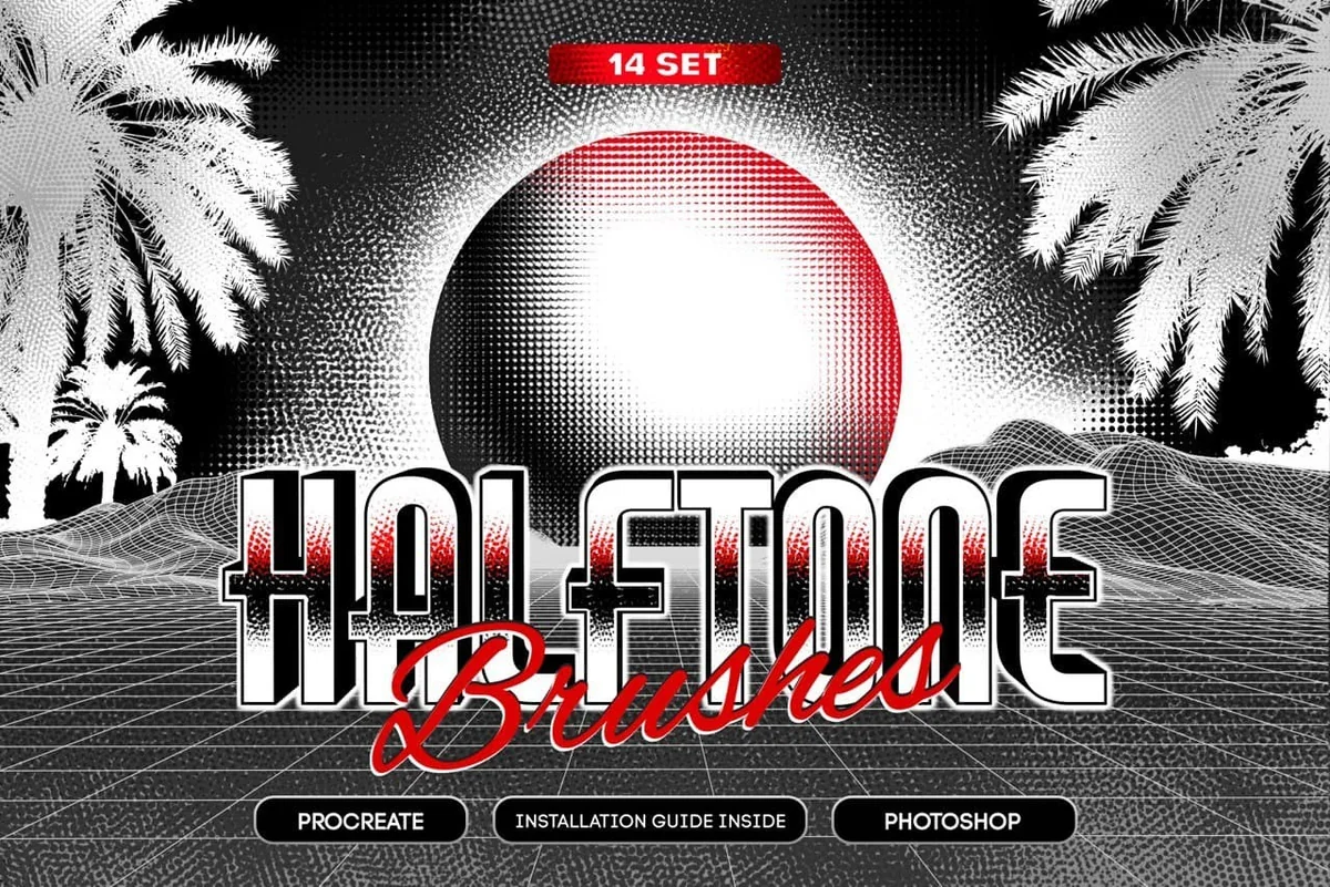
Dimauavn’s set gives you a specific behavior choice: a static version and a rotation-based dynamic version. The black-and-white swatches and curving strokes show how the same family of dots can read as a soft spot or a sweeping ribbon. The static option suits a controlled screen; the dynamic version is aimed at looser texture. The Photoshop files are separate extras, not the files you need to import on iPad. Fourteen designs in two variations should not be read as 28 unrelated halftone patterns.
Distressed ink and pop-art textures
Best for distinct shading and fill roles
5. Dirty Halftones Brush Set
Layouts: 42 halftones + 5 extrasFormat: Procreate on iPad
Best for: adding distressed dots and lines to lettering or bold shapes. Designed by Shoutbam.
- 42 halftone brushes: 14 shaders, 14 texturizers and 14 sprayers
- 5 extra brushes
- 2 video tutorials and an installation PDF
- Seamless textures sampled from real-world surfaces
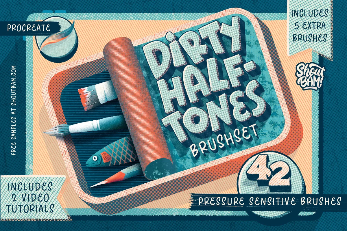
Shoutbam separates three jobs that often get bundled together: building shade, filling a shape and spraying extra texture. The butterfly example labels horizontal lines and dot shaders on different parts of the wings; other previews show the same patterns in the three tool families. The count reflects three tool roles, each with fourteen patterns. The finish is deliberately grubby, with worn dots and rough edges. If you want a pristine dot field, look at the clean sets first. The tutorials are listed extras; I have not watched the paid lessons.
Best for a compact distressed screen set
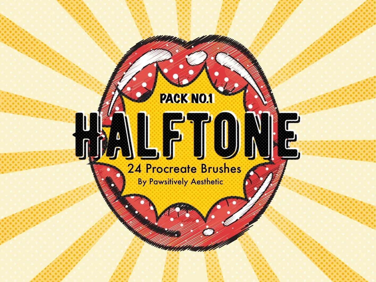
6. Exclusive Halftone Procreate Brushes
Layouts: 24 brushesFormat: Procreate on iPad
Best for: getting worn dots without a wider comic production toolkit. Designed by PawsitivelyAesthetic.
- 24 distressed halftone brushes shown on the cover
- One .brushset file for Procreate on iPad
- Preview grid compares small and large dotted marks
- Separate Pack No. 1 from the cleaner 36-tool Pack No. 2
The first PawsitivelyAesthetic pack takes a narrower route than Pack No. 2: twenty-four distressed halftones, with no separate pen-and-stamp breakdown advertised. Its preview grid moves from small dots to larger, more broken shapes. I like the smaller scope for a single retro poster where a little surface wear is the main decision. This and the clean pack are alternatives with different finishes, so there is no need to buy both to begin. The gallery shows swatches and an illustration, but it does not demonstrate every possible pressure behavior.
Best for a vintage pop-art scene
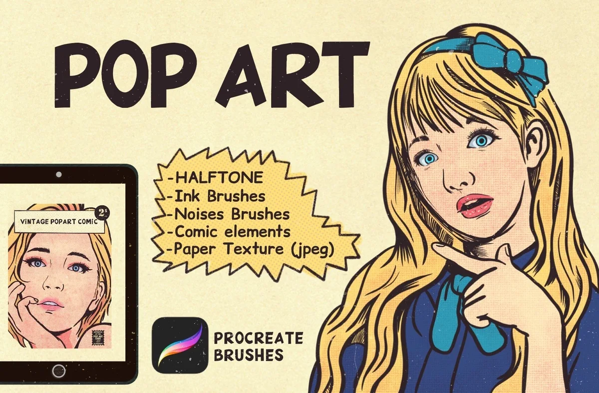
7. Procreate Pop Art Comic Brushes
Layouts: 35 halftonesFormat: Procreate on iPad
Best for: pairing dotted shadows with paper and comic-style accents. Designed by vectorheroes.
- 28 halftones and 7 vintage halftones
- 2 basic line-art brushes and 3 noise brushes
- 5 vintage papers, listed at 2900 × 4060 px
- Texture-resizing video listed; Procreate 5x and Apple Pencil required
Vectorheroes puts the screen inside a recognizable pop-art workflow. The portrait example labels the liner and vintage halftones, then separate sheets compare cleaner dots and visibly broken dots. Five paper images can help carry that aged-print idea beyond the shadow itself. Comic word accents also appear in the gallery, though their number is not specified in the written contents. That coherent pop-art direction is the main reason to choose this kit. If you only need a neutral screen to add to existing line art, the paper and comic extras may be unnecessary.
Best for mixing screens and rough accents
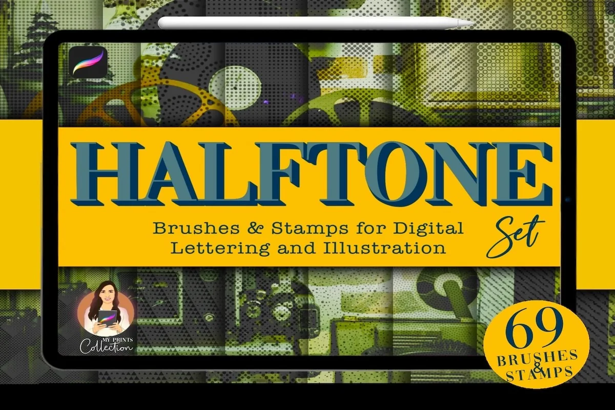
8. Halftone Procreate Brush & Stamps
Layouts: 49 brushes + 20 stampsFormat: Procreate on iPad
Best for: texturing lettering with both repeat patterns and placed marks. Designed by myprintscollection.
- 49 seamless brushes and 20 stamps
- One Procreate .brushset collection, version 5 or higher
- Preview grids include dots, lines and rough or cracked marks
- Not compatible with Photoshop or Illustrator
The cover’s 69 tools split into 49 brushes and 20 stamps. That matters because a stamp places an accent while a repeat brush gives you a different way to cover an area. Myprintscollection shows both fine line patterns and much rougher textures, followed by a film-projector illustration and a patterned lettered heart. It is a useful middle ground between orderly screening and more decorative wear. A palette promotion appears in the final preview, but it says those extras are available in the shop; I would not assume that palette is part of this purchase.
Dedicated manga screentones
Best for a dedicated manga tone library
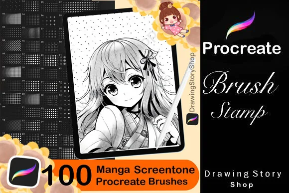
9. 100+ Procreate Manga Screentone Brushes
Layouts: 113 listed tonesFormat: Procreate on iPad
Best for: comparing dotted, lined and patterned tones for comic panels. Designed by DrawingStoryShop.
- 113 halftone/screentone brushes listed in the description
- Product title uses 100+; preview banners use 100
- iPad Procreate brush collection with an import PDF
- Gallery shows dots, line screens, grids and softer tonal marks
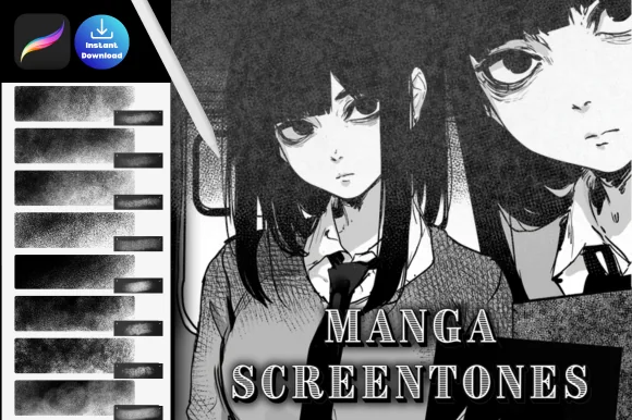
DrawingStoryShop gives the largest dedicated manga tone selection here without adding a whole speech-bubble toolkit. The broad sample sheets are useful for seeing the difference between a regular dot fill, a lined shadow and a more atmospheric texture. Those differences help separate clothing, background and shade within a panel. The maker lists 113 tools, while the title says 100+ and the banners say 100. Use 113 as the listed count, rather than an independently verified file total.
Best for atmospheric manga texture
10. Procreate Manga Screentone Brush
Layouts: Count not statedFormat: Procreate on iPad
Best for: adding grainy transitions alongside more regular dot and grid shading. Designed by kraftcake.
- ZIP archive containing a Procreate .brushset file
- Designed for halftone and dot-grid effects
- Three public previews with before-and-after art and brush samples
- The listing does not state an exact brush count
Kraftcake’s examples lean darker and softer than a page of perfectly even dots. The before-and-after illustration combines a rough grid with grainy, fading patches, while the sample sheet shows both sweeping strokes and rectangular texture areas. It is worth a look if you want atmosphere around a character rather than the same crisp dot fill everywhere. The product name is singular, but the listing describes a brush set; it does not give a reliable number to compare with the other packs. The visible finish is the reason to choose it; its tool count is unstated.
Quick Comparison
| Brush pack | Tool count | Other contents or focus | Best use |
|---|---|---|---|
| 1. Halftone Brushes for Procreate | 50 brushes | Seamless screens | Dots, lines and grids |
| 2. Exclusive Halftone Procreate Brushes 2 | 36 mixed tools | 14 clean halftones | Clean dots plus stamps |
| 3. Seamless Halftone Brushes for Procreate | 990 advertised variants | 11 shades; 10 angles | Repeatable screen choices |
| 4. Procreate and PS Halftone Brushes Set | 14 designs; 2 variations | Static and dynamic | Controlled or varied marks |
| 5. Dirty Halftones Brush Set | 42 halftones + 5 extras | Shaders, fills, sprayers | Distressed illustration |
| 6. Exclusive Halftone Procreate Brushes | 24 brushes | Distressed screens | A focused worn finish |
| 7. Procreate Pop Art Comic Brushes | 35 halftones | 5 papers; liners and noise | Vintage pop-art scenes |
| 8. Halftone Procreate Brush & Stamps | 49 brushes + 20 stamps | Screens and rough textures | Lettering with accents |
| 9. 100+ Procreate Manga Screentone Brushes | 113 listed tones | Import PDF | Dedicated manga screening |
| 10. Procreate Manga Screentone Brush | Count not stated | Brushset in ZIP | Grainy manga atmosphere |
Choose a Screen That Survives the Final Image
The brush that looks most interesting at extreme zoom is not always the one that reads best in a small illustration. Make the first comparison at the intended viewing size, using one simple shape and one color. That keeps a fancy example image from making the decision for you.
Match the screen to the job
- 1Small illustrated accent. Begin with a clearly separated dot or line screen. If the gaps disappear when you zoom out, compare a coarser pattern before adding more texture.
- 2Large lettering or a poster. Use a fill or texturizer when the shape needs fairly even coverage. Pick a shader when you want to build a darker edge instead; the names and examples in Dirty Halftones make that distinction explicit.
- 3A manga panel. Compare tones on two neighboring shapes. Give the focal subject enough separation from the background; a different screen direction or spacing may be more useful than a second noisy texture.
Brush size, pattern scale and opacity are separate choices. A wider stroke can cover more area without necessarily making the dots larger, depending on how the brush is built. Lower opacity makes a mark lighter, but does not automatically create a more open dot pattern. Follow the maker’s guide when available instead of expecting a single setting to behave identically across all ten packs.
A Short Screen-Swatch Routine
Use this practice sheet to compare a screen before adding it to a finished piece. Keep the same shape and color throughout so that you are judging the pattern rather than the drawing.
Compare one setting at a time
- 1Make a simple base shape. Draw a flat circle or letter with a clear edge. Add an empty layer above it for the screen. If you use a clipping mask, Procreate limits the visible content of that upper layer to the content below, which is useful for keeping the texture inside the shape.
- 2Compare open, medium and dense marks. Place three versions side by side using the same color. Look at how much of the base remains visible between dots or lines. Choose the one that separates the shadow from the lit area without swallowing a narrow detail.
- 3Check the join between strokes. Make one stroke, lift the stylus and continue beside it. Look for an unexpected seam or change of direction. If you change the pattern scale or switch brushes, repeat that check rather than assuming that the old join will still match.
- 4Review at the size you will share. Zoom out to the intended display size and compare the shapes again. Keep the version where the shadow and outline remain readable. Save your chosen brush name and settings with the working file so you have a useful reference for the next panel.
The Procreate Handbook explains clipping masks in more detail. The mask controls where the texture is visible; it does not promise to fix a broken pattern or choose the right dot spacing for you.
When Dots Stop Lining Up
A join can look wrong because the screen changed, because two marks were placed differently, or because the brush deliberately adds randomness. First check the simplest explanation. A static pattern and a rotating dynamic variation are not meant to produce identical repeated marks, even if they belong to the same pack.
- Keep a reference swatch: compare the new mark with the original before changing several controls at once.
- Check the intended tool role: a sprayer, stamp and fill brush may use the same pattern family in different ways.
- Treat scale advice as pack-specific: RetroSupply’s alignment tutorial recommends entering an exact Grain Scale percentage for its ColorLab and DupliTone brushes. That is a useful troubleshooting reference, not a setting tested with every pack here.
- Separate screen from surface wear: compare the clean screen alone before layering grain over it. This makes it easier to see whether the repeat itself is the problem.
Brush Shading or Procreate’s Halftone Adjustment?
A brush pack is not the only route to a print-style image. Procreate also has a built-in Halftone adjustment. The official Halftone guide describes Full Color, Screen Print and Newspaper modes, with a control for the screen size. That is worth trying before buying a pack if your goal is to transform existing artwork.
| Approach | Useful starting point | What to decide |
|---|---|---|
| Halftone brush | Painting selected shadows or texture areas | Dot or line pattern, tool role and placement |
| Halftone adjustment | Applying a print treatment to an image or layer | Full Color, Screen Print or Newspaper; screen size |
The adjustment changes an existing image or layer; a brush gives you marks to place as part of drawing. Neither route guarantees a physical printing result. If the artwork is intended for a print shop, ask for its file requirements and check a proof rather than treating a retro-looking preview as a production specification.
Read the Extras Before Comparing Brush Counts
- Variations are useful, but different from new designs. The 990-brush library emphasizes shades and angles. The 14-design set supplies static and dynamic versions. Decide whether those variants fit your workflow.
- Stamps count as tools. Faye’s clean pack and the 69-tool Halftone Set include placed accents; their totals are not counts of continuous screen brushes.
- Paper is a separate layer of the look. The pop-art papers can support a vintage finish. Paper textures are separate from the halftone screens themselves.
- App-specific files matter. Import the Procreate .brushset or .brush files. Separate Photoshop extras do not make the Procreate version optional. Check the listed app version before purchase.
Free Option: One Distressed Fill Brush
HG Designs’ Messed Up Halftone fill brush offers a smaller place to start. Its listing is marked Freebies and shows a price of zero at the time of review. You receive one Procreate .brush file; the examples use its irregular, worn-looking fill in illustrations, lettering and speech shapes.
It is outside the ten paid-pack comparison. Try it if you want a distressed surface before committing to a larger library, while remembering that one rough fill does not replace a range of clean dots, angled lines or manga tones. Recheck the current offer on the product page.
FAQ: Halftone Brushes and Screentones
Are halftone and stipple brushes the same?
They can both suggest texture and shade, but the repeating dot or line pattern is the useful distinction for this guide. A grainy or randomly scattered brush may look softer and less regular. Check the swatches: a pack can contain both, so its overall name does not describe every tool.
Can I make a halftone effect without buying a pack?
Yes. Procreate’s Halftone adjustment provides Full Color, Screen Print and Newspaper effects. The free HG Designs brush above is another option for a distressed fill. The adjustment and the single brush solve different tasks, so start with whichever matches your image.
Which packs suit manga screentone shading?
DrawingStoryShop concentrates on a dedicated tone library, while Kraftcake shows grainier atmospheric marks. Compare their visible dot, grid and line samples against the style of panel you want to make.
How do I get a line halftone instead of dots?
Choose a set whose preview actually shows parallel line screens, such as GrallysSupplyCo’s 50-brush collection or Dirty Halftones. A line screen is a pattern choice; rotating a dot brush does not turn it into parallel lines.
Will these packs work in Photoshop?
Most are made for Procreate on iPad. Dimauavn’s product explicitly includes separate Photoshop files as well as Procreate brushsets. Follow each listing’s compatibility requirements instead of assuming that every file type works in both applications.
Should I create a custom halftone brush instead?
That can be useful if you want to design and tune your own repeating pattern. This article compares existing packs and their examples; it is not a custom Brush Studio construction tutorial. Start by deciding whether you need a new pattern or simply a clearer choice among the screens you already have.
Let the Pattern Do One Clear Job
Choose Procreate halftone brushes by how clearly their shadows read at the finished size. Start with clean dots or lines if you want an orderly screen, choose worn tools when broken ink is part of the idea, and use a manga collection when the panel needs several kinds of tone. One well-chosen pack and a small reference swatch are a more useful starting point than importing every library at once.
You May Also Like
Purchases made through the affiliate links here can support this site with a commission; your price stays the same. My affiliate disclosure explains the arrangement.