Your exam notes fill a notebook, but covering the page leaves you with nothing to ask yourself. These study guide layout ideas give the prompts, explanations and answer checks separate places on your iPad.
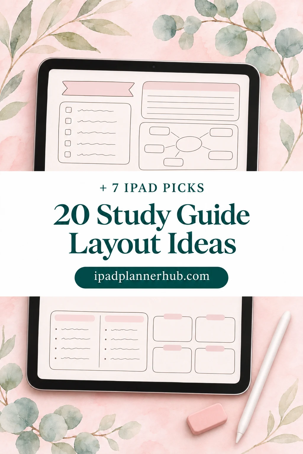
I would start with one topic and a single page, then choose the layout by what the exam asks you to do. The 20 ideas below focus on explaining, connecting and applying course material. Seven notebook and paper options follow the ideas; none supplies the subject answers for you.
Choose the question before the paper
A lecture notebook records a lesson. For this guide, give each page a narrower job: answer a question from the course outline, explain a connection or work through a problem. An attractive summary can still be hard to quiz from if every answer is visible beside its heading.
- Scope: copy the relevant learning objective or instructor-provided topic into the header. A chapter title alone may be too broad.
- Evidence: keep the page number, slide or approved answer reference in a small footer so you can check a disputed detail.
- Prompt: decide what you must produce without looking: a definition, diagram, comparison or worked step.
- Check: leave a separate answer space and a short line for the part you need to revisit.
Mountain Heights Academy recommends identifying course concepts, writing what you remember before checking notes, and marking what was missing. Mural also separates concepts, supporting material, questions and summaries. Those elements give each page a topic, supporting detail and a question to answer. See the school’s study-guide outline and Mural’s guide structure.
20 study guide layout ideas with a built-in check
Draw these page layouts on blank or ruled paper. Adjust the suggested proportions to fit your notes. A page can span a second sheet if your handwriting or the topic needs more room.
Explain one concept
- 1Cue column with a covered answer
Use roughly one quarter of the page for cues, the rest for explanations, and a narrow summary strip at the bottom. Write questions in the cue column rather than copying headings. Cover the larger column and answer each cue aloud or on a fresh page. Check the explanation afterward and change vague cues into questions that have a clear answer.
For the full Cornell setup, see our Goodnotes note-template guide.
- 2Term, explanation, example
Divide the page into three horizontal bands: term and definition, your own explanation, and an example with a reason it fits. Keep the formal wording in the first band when precision matters. Hide the bottom two bands and produce a different example. If you can only repeat the definition, leave a question beside the example area for the next review.
This works for vocabulary that must be applied, not merely recognized.
- 3One concept with four supporting boxes
Place one concept in the center and give the corners four jobs: definition, connection, example and quiz question. Draw only one or two links that you can explain. For the check, cover the corners and rebuild them from the central term. A link labeled only “related” needs a more specific verb before it belongs on the guide.
Use the boxes to limit the page, not to cram in every lecture detail.
- 4Question page with an answer key
Put five short-answer prompts on one sheet and the answers on a second sheet in the same order. Leave enough room beneath each prompt to write an actual response. Answer before navigating to the key, then compare the required points rather than just the wording. Rewrite any prompt that accepts several incompatible answers because its scope is unclear.
Separate pages avoid relying on a tiny handwritten answer hidden in a margin.
- 5One objective, three essentials
Give the top strip to a learning objective and three larger boxes to what you need to explain it. Use a final strip for one question that combines those essentials. Close the source notes and answer that question in a short paragraph. If the response needs an idea outside the three boxes, revise the guide’s scope or add the missing supporting point.
This is a page boundary, not a claim that every topic has exactly three parts.
Show relationships you can explain
- 6Two-concept comparison
Draw two columns beneath shared row labels such as definition, conditions, example and limitation. Choose labels that belong to both concepts so you are comparing like with like. Cover one column and reconstruct it from the labels, then explain the most consequential difference without reading either column. Keep a final row for a case that is easy to confuse.
Comparison becomes a question when you must choose which concept applies.
- 7Cause, mechanism, outcome
Use three boxes connected by labeled arrows: starting condition, mechanism and outcome. Add a small side box for one condition under which the sequence would change. For the check, hide the middle box and explain the missing mechanism. Do not turn a simple association in your source into a causal arrow; change the label when the evidence only supports a relationship.
The arrow’s wording matters as much as the boxes.
- 8Timeline with turning points
Reserve a wide central line for the sequence and alternate event labels above and below it. Give each turning point a short explanation of what changed. Cover dates or stages in a second copy and reconstruct their order before checking the course material. Then answer why two neighboring events appear in that order rather than just reciting the dates.
Keep the timeline to the period named in your learning objective.
- 9Process with a missing step
Lay out a process as a vertical chain with room beside each step for its input and output. Make a practice copy and erase one step in that copy. Rebuild the missing action, then say what the following step would receive if the action were omitted. Use a different missing step on the next attempt so the page does not become a memorized gap.
Keep a complete master page so practice erasures do not remove your reference.
- 10Classification tree with a test case
Put the broad category at the top and branch only when your course gives a useful distinction. Label the branch with the distinguishing property and place examples at the ends. To check the tree, classify a new example while explaining each branch choice. If an item fits several branches, record that ambiguity instead of forcing a neat but inaccurate hierarchy.
A tree fits nested categories better than overlapping ones.
Apply a rule to something new
- 11Formula, units, worked example
Split the sheet into a formula strip, a symbol-and-unit box and a larger worked example area. Add a final check box for whether the result makes sense in the stated units. Hide the worked solution and try a parallel course-approved problem. Compare the setup and substitutions separately from arithmetic so a correct final number does not conceal a wrong method.
Use the notation and permitted formula conventions from your own course.
- 12Rule beside its boundary
Place a rule on the left and its conditions on the right. Under both, add one valid example and one case outside the rule’s scope. Cover the examples and decide whether a new case meets every condition. The self-check is the reason for your decision, not simply a yes or no; revise any condition you cannot explain in ordinary language.
This layout is useful when an exception changes which method you should use.
- 13Diagram with a blank-label copy
Use the upper half for a checked reference diagram and the lower half for an unlabeled version, or place the practice version on another page. Leave space for a sentence explaining what each label does. Reconstruct the labels without scrolling to the reference, then explain one relationship between parts. A correct label alone is not the same as an explanation.
Trace or redraw only material you are permitted to use.
- 14Claim, evidence, explanation
Build three stacked areas for a course-relevant claim, supporting evidence and an explanation of how the evidence supports that claim. Keep a narrow footer for a possible limitation. Hide the explanation and write it again in different words. If the evidence merely repeats the claim, return to the source and choose support that actually carries the argument.
This is an exam-answer practice page, not a replacement for source evaluation.
- 15Problem with a next-step margin
Give a worked problem most of the page and reserve a narrow margin for “why this step?” notes. Pause before each line, cover the next line and predict what should happen. Check both the action and the reason. When a prediction fails, write the specific missing condition in the margin instead of copying the whole solution a second time.
A clean reference and a separate practice copy keep corrections readable.
Find what still needs work
- 16Blank map rebuilt from memory
Keep a small topic list at the top of a blank sheet, leaving the main area empty for a concept map. With the source closed, add concepts and label their connections. Compare with the checked reference afterward and use a second color for additions. On the next attempt, begin blank again rather than tracing the previous map.
Missing connections become explicit questions to investigate.
- 17Error, correction, reason
Make three columns for an actual practice error, the corrected response and why the correction is needed. Keep each row to one mistake. Cover the correction and reason columns, retry the question, then explain the change. If the original answer was guessed correctly, record that uncertainty too instead of treating the result as secure understanding.
Use your own practice errors, not invented mistakes presented as course facts.
- 18Prompt strip with a movable cover
Arrange short prompts down the left and fuller answers down the right, leaving a clear gutter between them. Cover the answer area with paper beside the iPad or another opaque aid that works in your setup. Write responses elsewhere before uncovering. If the app does not provide a suitable covering tool, use separate pages instead of assuming a special feature exists.
Long answers need more space than this compact format allows.
- 19Mini-test with a separate marking page
Give one page a short mixture of question types that match your course assessment. Put the key on another page with the required points for each answer. Complete the questions before looking at the key and note which points were missing. The point list is for your own review unless it comes from an official marking guide.
Use an instructor-provided marking guide when one is available.
- 20Unanswered-question queue
Create four fields per row: precise question, what you have checked, who or what can resolve it, and the resolved answer. Keep a separate space for the next action. At review, answer each resolved question with the answer column hidden. Leave unresolved items visibly open; a tidy page should not make an unverified explanation look settled.
Bring specific unresolved questions to office hours or another approved course support channel.
Study guide examples: a filled comparison
Here is an author-created comparison to show the page mechanics. Check the science wording against your own course before using it as an answer key; the example illustrates a layout rather than a complete unit summary.
- Shared row: change of state. Left: evaporation, liquid to gas. Right: condensation, gas to liquid.
- Example row: a puddle drying belongs on the evaporation side; droplets forming on a cold glass belong on the condensation side.
- Prompt row: “Where did the water on the outside of the cold glass come from?” Write your explanation on a separate sheet before checking your course source.
- Follow-up: if the answer says the water passed through the glass, record that as a question to resolve rather than copying it into the reference column.
The layout check is simple: can you see the question without also seeing the answer? If not, move the reference column to another page. That single change is often more useful than adding another border or highlighter color.
Seven iPad notebooks and paper options for your guide
I selected these for the space and navigation they offer to build your own pages. Choose by paper structure first. The apps may require a separate purchase, and the page recipes above are not promised built-in features of these products.
TL;DR: Build one of 20 study guide layouts around a question you can answer without seeing the solution. Compare seven iPad options below: notebooks and paper for creating your own guides, not prewritten course answers.
Quick Picks
- Best for sketch-and-explain pages: Watercolor Hyperlinked Digital Notebook
- Best for wide comparisons: Digital Notebook
- Best for a compact subject set: Digital Notebook 5 Hyperlinked Tabs
- Best for varied paper templates: Digital Notebook 5 Hyperlinked Tab
- Best for an existing notebook: Digital Notebook Papers – GoodNotes
- Best for a large course archive: Digital Notebook 500 Pages Bundle – 2
- Watercolor Hyperlinked Digital Notebook – Best for sketch-and-explain pages
- Digital Notebook – Best for wide comparisons
- Digital Notebook 5 Hyperlinked Tabs – Best for a compact subject set
- Digital Notebook 5 Hyperlinked Tab – Best for varied paper templates
- Digital Notebook Papers – GoodNotes – Best for an existing notebook
- Digital Notebook 500 Pages Bundle – 2 – Best for a large course archive
- Digital GoodNotes Journal – Tie Dye – Best for monthly review batches
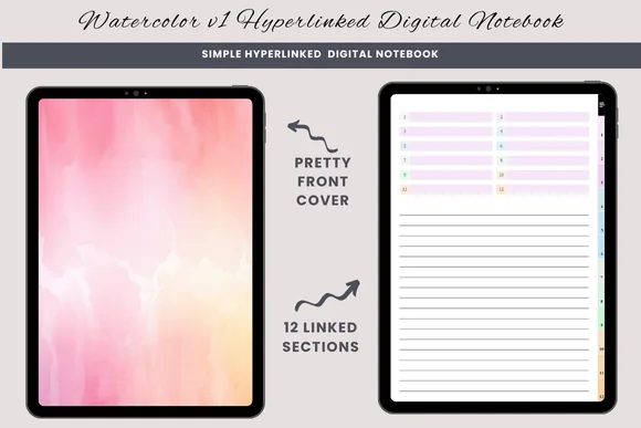
Best for sketch-and-explain pages
1. Watercolor Hyperlinked Digital Notebook
Orientation: PortraitLayouts: Lined, blank, half-lined
Best for: free-form writers, sketch and write journalers, topic-by-topic journalers. Designed by daysfilledwithjoy.
- Hyperlinked PDF with twelve sections
- Lined, blank and half-lined paper
- Designed for GoodNotes or a similar PDF annotation app
A half-lined sheet gives a diagram its own space above a short explanation. I like that separation for a label-and-explain guide. There is no ready-made quiz bank or Cornell grid; draw the zones you need on the blank paper.

Best for wide comparisons
2. Digital Notebook
Orientation: LandscapeLayouts: 16 templates; Cornell, graph, columns
Best for: landscape note-takers, busy students, meeting notes. Designed by Shades of Zen.
- Twelve expandable sections with hyperlinked tabs
- Sixteen templates including Cornell, dots, graph and two columns
- Instructions for use in Goodnotes or another PDF annotation app
The landscape spread is the reason to choose this notebook. Two columns can hold competing explanations, while a separate graph sheet can carry the same topic as a process. Its templates organize your writing; you still create every study question.
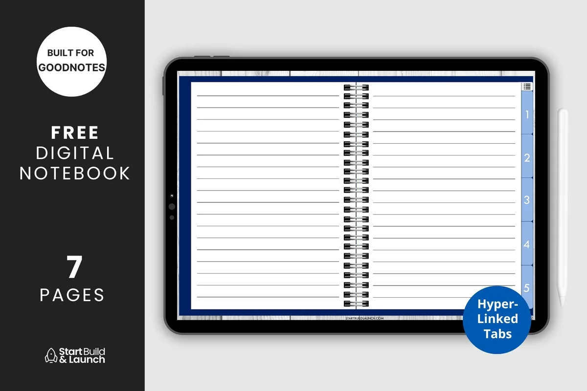
Best for a compact subject set
3. Digital Notebook 5 Hyperlinked Tabs
Orientation: LandscapeLayouts: Blank, lined, dotted, graph, Cornell
Best for: beginners, high school students, minimalists. Designed by aviswilliams.
- Index and five hyperlinked sections in a PDF notebook
- Blank, lined, dotted, graph and Cornell paper
- PDF for Goodnotes, Notability or Noteshelf
Five sections suit a tightly bounded exam guide. Assign one learning objective to each tab and keep the answer pages behind the matching prompts. This is a reusable notebook structure rather than a prepared course summary.
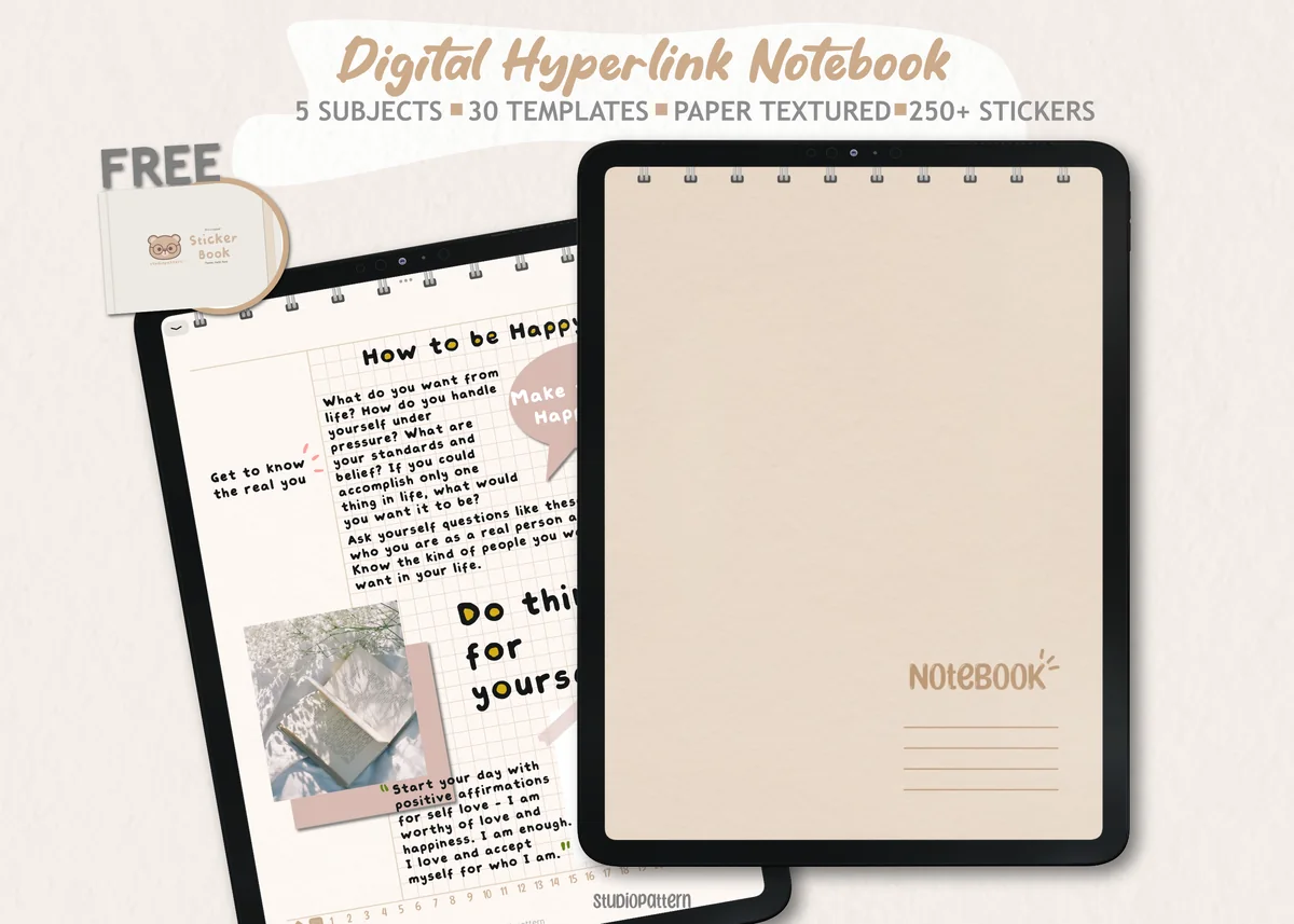
Best for varied paper templates
4. Digital Notebook 5 Hyperlinked Tab
Orientation: PortraitLayouts: 30 paper templates
Best for: 5-subject students, sticker lovers, neutral aesthetic fans. Designed by studiopattern.
- Five hyperlinked sections and a contents page
- Thirty paper templates; pages can be duplicated
- Hyperlinked PDF, manual, PNG stickers and a Goodnotes sticker book
The template overview shows several divisions of the writing area, useful when an explanation needs more room than a diagram. Keep one plain template as the default so changing paper does not become the task. Sticker extras are optional; the PDF is the basis of the study guide.
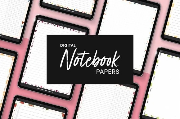
Best for an existing notebook
5. Digital Notebook Papers – GoodNotes
Orientation: PortraitLayouts: 9 designs; 8 layouts per design
Best for: list makers, decorative note-takers, planner add-ons. Designed by catsquills.
- Nine portrait paper designs, each with eight layouts
- Columns, dots, square, lines, notes and list layouts
- PNG and PDF files for GoodNotes or Notability
Already have course folders? A paper pack can be enough. The columns page supports a prompt-and-answer layout, and square paper gives comparison boxes a guide. These are paper files, not a promised hyperlinked study system.
Best for a large course archive
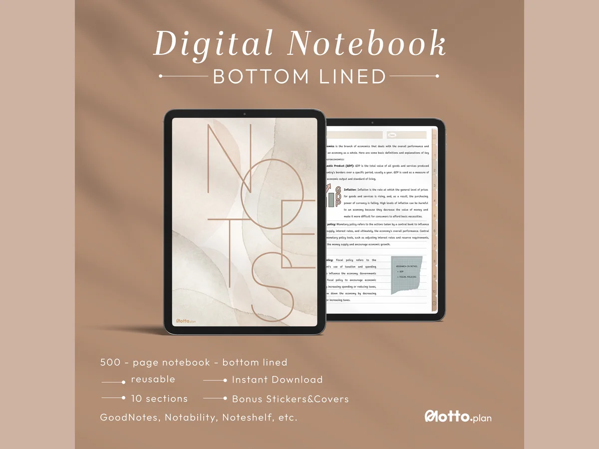
6. Digital Notebook 500 Pages Bundle – 2
Orientation: PortraitLayouts: Lined, blank, dots, graph, Cornell
Best for: college students, lecture note-takers, Cornell method fans. Designed by Motto Plan.
- Five hundred ready-to-use pages across ten sections
- Lined, blank, dot grid, graph and Cornell variants
- PDF notebook, covers, PNG stickers, GoodNotes sticker book and user guide
This is the larger option when a course needs room for repeated attempts. Ten sections can separate topics while old answers stay available for comparison. More pages do not decide what belongs on the exam: keep your scope list beside the notebook index.
Best for monthly review batches
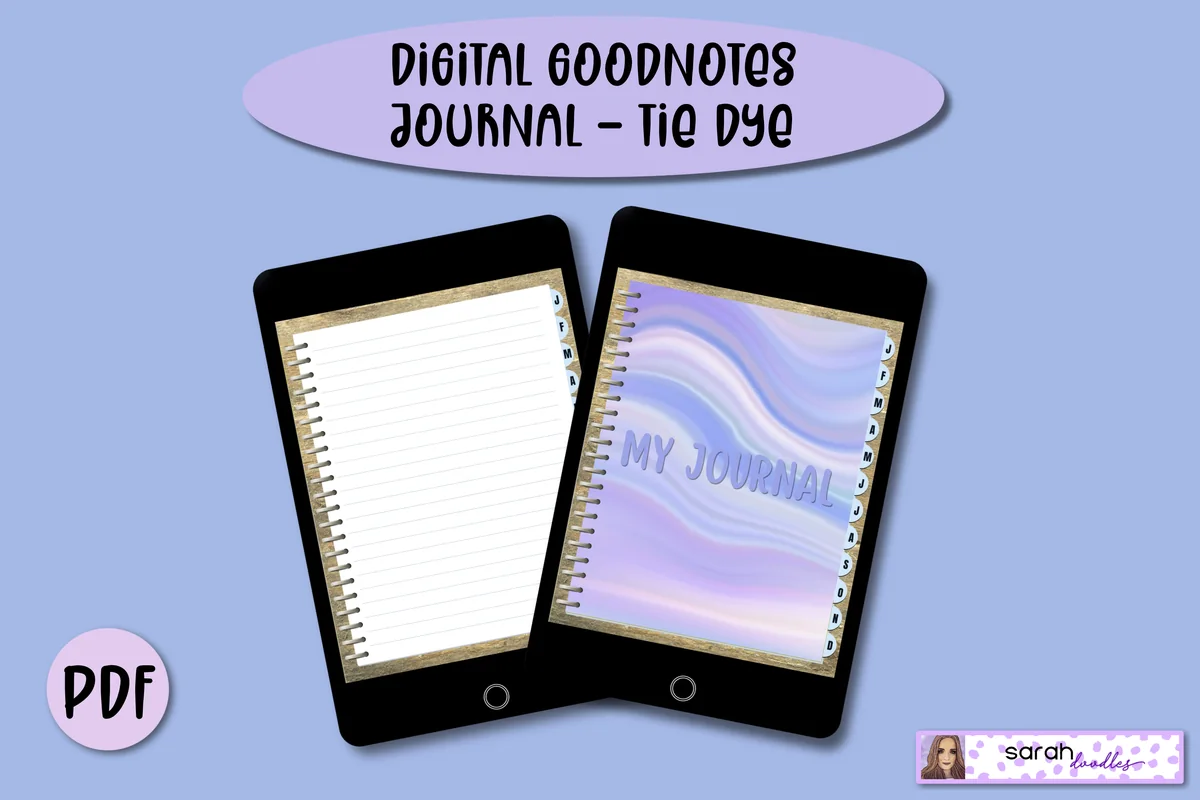
7. Digital GoodNotes Journal – Tie Dye
Orientation: PortraitLayouts: Five lined pages per month; expandableDates: Undated
Best for: colorful journalers, monthly writers, casual journalers. Designed by Sarah Doodles.
- Undated hyperlinked PDF journal with monthly dividers
- Five lined pages allocated per month; extra pages can be added
- Designed for iPad or tablets using PDF annotation apps
Monthly tabs offer a different organization: keep attempts together by when you wrote them, then add a topic index yourself. Lined pages suit short-answer quizzes and error explanations. This is a journal with monthly navigation, so it is less direct for topic tabs or precise diagrams.
Quick Comparison
| iPad option | Use it for | Paper | Organization |
|---|---|---|---|
| 1. Watercolor Hyperlinked Digital Notebook | Diagram plus explanation | Blank and half-lined | Twelve sections |
| 2. Digital Notebook | Side-by-side concepts | Cornell and two columns | Twelve sections |
| 3. Digital Notebook 5 Hyperlinked Tabs | Five topic sections | Graph and Cornell | Five tabs plus index |
| 4. Digital Notebook 5 Hyperlinked Tab | Mixed page structures | Thirty paper templates | Five linked sections |
| 5. Digital Notebook Papers – GoodNotes | Existing course files | Columns and square paper | PNG and PDF pack |
| 6. Digital Notebook 500 Pages Bundle – 2 | Repeated practice attempts | Cornell, graph and blank | 500 pages; ten sections |
| 7. Digital GoodNotes Journal – Tie Dye | Monthly review batches | Lined pages | Monthly linked dividers |
Build a small guide you can reuse
For a college course, start from the actual course outline rather than a generic list of subjects. One unit can contain several different tasks; use a comparison for two definitions and a worked-problem sheet for applying them.
From blank page to a checked guide
- 1Set a boundary
Write the topic and the question it must help you answer. Gather the relevant lecture notes, textbook section and instructor guidance before drawing the layout. Exclude unrelated chapters from this first guide so the page does not become another copy of the whole course.
- 2Make a master and a practice copy
Import the PDF or paper into a compatible annotation app using that app’s file workflow. Check that the writing area is comfortable at your usual zoom. Keep the source page intact, then duplicate a working sheet for your questions and another for an attempt.
- 3Separate prompts and explanations
Write the prompt before filling the reference area. Try an answer with the source closed, check it, and mark additions in a second color. The colors distinguish when information was added; they are not evidence of mastery or a psychological learning category.
- 4Return with a different question
Keep the missed point in a short queue and revisit it with a parallel example or a changed missing step. Review timing depends on your course and workload. Leave a specific next prompt so the next review can begin with an attempt.
Keep the page readable when answers get longer
- Dense definitions: keep the prompt on the guide and put the fuller explanation on a linked or numbered answer page.
- Diagrams: leave room for labels before decorating the border; switch orientation if the process is wide.
- Several sources disagree: keep the disputed point in the question queue and ask which convention the course expects.
- Planning takes over: keep dates and study sessions in a separate study-planner page. This guide is for the material itself.
Simple study guide layout ideas do not require a new color system. If visual organization is the obstacle, our readable aesthetic notes ideas cover headings and spacing; keep the self-quiz question as the test of this page’s purpose.
FAQ: Turning notes into a study guide
What is the best way to format a study guide?
Choose a format that lets you attempt the required task before seeing its solution. Keep the course topic, a prompt, supporting explanation and a place for corrections. A comparison needs shared row labels; a process needs ordered steps; neither has to be compressed into a universal one-page grid.
What are some creative ideas for a study guide?
Try a diagram with removable labels, a process with a missing step or a rule beside a case where it does not apply. The creative part is the question you build into the page. Decorative titles are optional, and an attractive layout does not prove that you can explain the material.
How do I turn blank PDF paper into a study guide?
Draw the zones on blank PDF paper in a compatible annotation app, or use lined, grid or column templates as a starting point. Notebook hyperlinks navigate sections; they do not automatically create quizzes, hide answers or grade your responses. Check the specific app’s tools before relying on them.
How many pages should my study guide have?
Use the number needed to cover the assessed topics legibly. Begin with one objective, then split explanations and practice answers if they compete for room. A large notebook gives you capacity, but a shorter guide with a clear scope can still require several pages for diagrams and worked examples.
Do I need to follow the 1/3,5/7 or 9-8-7 study rule?
Start with your course requirements and available review time. Choose a layout that lets you attempt an answer, check it and record the missing point. Use that record to decide what needs another attempt rather than forcing every topic into one ratio or timetable.
Leave yourself one answerable question
Choose one of these study guide layout ideas and write its first prompt before choosing a notebook cover. When you close the reference page, the question should still make sense and leave room for your own response. If you need help reserving time for that attempt, compare our digital study planners; keep the guide itself focused on what you need to explain.
You May Also Like
Purchases through the product links can generate an affiliate commission for this site. Your purchase price stays the same. Details are in our affiliate disclosure.