Most digital planners try to hold your whole life: 40 tabs, 300 stickers, a tracker for water you’ll never fill in. A minimalist digital planner goes the other way. Fewer sections, a calm palette and the same layout every week, so you open it and start planning instead of scrolling past pages you don’t use.
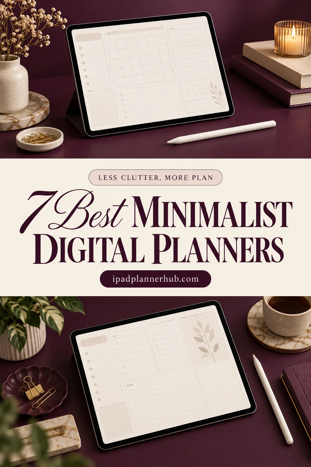
Below are 7 minimalist planners for the iPad from Creative Fabrica that I’d actually pick: black and white, beige and ivory, one dark mode calendar and one simple planner dated 2027. After the list: what a minimalist planner keeps and what it cuts, weekly vs daily layouts, and a 10-minute setup in GoodNotes.
The 7 Best Minimalist Digital Planners I Found
I skipped anything with a past year on the cover, Canva templates and printables, and planners where “minimal” was only a word in the title. Every pick has quiet pages with plenty of white (or black) space and hyperlinks, so even the bigger ones stay easy to move around in. If you came to minimalism through Notion’s clean pages, my Notion vs GoodNotes comparison explains what changes when you plan with a pen.
TL;DR: 7 minimalist digital planners for the iPad: black and white, beige and ivory, one dark mode calendar and one simple planner dated 2027. Five are undated, so you can start on any day. Each card lists orientation, layouts and dates, plus who it suits.
Quick Picks
- Best for black and white: Black and White Digital Planner
- Best for side-by-side planning: Undated Reusable Digital Planner
- Best for dated 2027: Simple Digital Planner 2027 Landscape
- Best for all-in-one that stays calm: Beige Digital Planner, Minimal Layout
- Best for dark mode: Dark Mode Minimalist Digital Calendar
- Best for minimalist daily: Digital Minimalist Daily Planner
- Black and White Digital Planner – Best black and white
- Undated Reusable Digital Planner – Best for side-by-side planning
- Simple Digital Planner 2027 Landscape – Best dated 2027
- Beige Digital Planner, Minimal Layout – Best all-in-one that stays calm
- Dark Mode Minimalist Digital Calendar – Best dark mode
- Digital Minimalist Daily Planner – Best minimalist daily
- Undated Minimal Digital Planner – Best lightweight setup
Best black and white
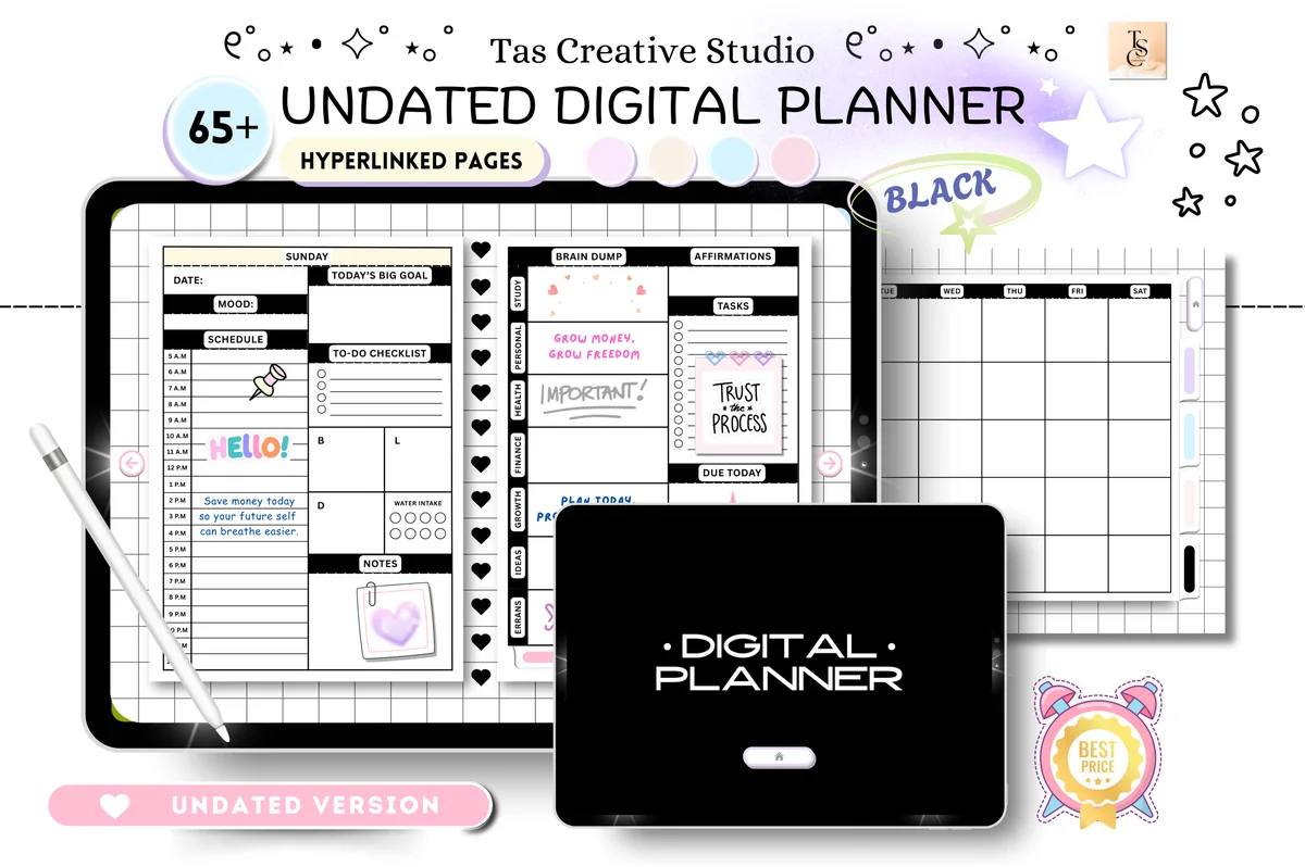
1. Black and White Digital Planner
Orientation: LandscapeLayouts: Monthly, Weekly, Daily + health, productivity, finance trackers (68 pages)Dates: Undated
Best for: monochrome fans, minimalists, all-in-one planners. Designed by Tas Creative Studio.
- Undated daily, weekly and monthly pages, all hyperlinked (68 pages)
- Horizontal layout, 11 x 8.3 in, with a black index menu and section tabs
- Health, productivity and finance sections: habit tracker, reading log, workout plan, budget, savings and subscription trackers
- Works in GoodNotes, Notability, Noteshelf and other PDF apps
Black covers, white pages, thin lines: this is the look most people mean by a minimalist planner. A few soft pastel accents show up on the sample pages, but the structure stays graphic and calm. I like that the trackers live in three short sections instead of fifty tabs.
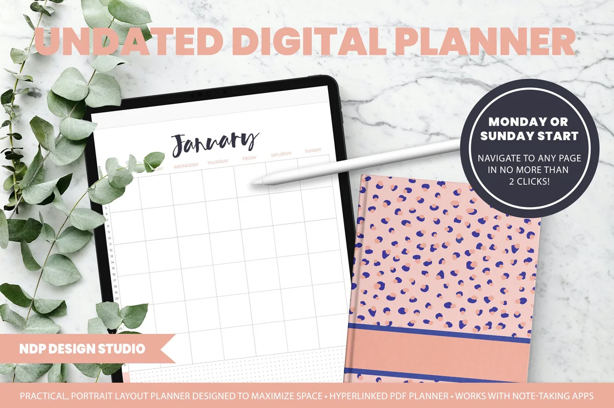
Best for side-by-side planning
2. Undated Reusable Digital Planner
Orientation: PortraitLayouts: Yearly, Monthly, Weekly, Daily, NotesDates: UndatedWeek start: Monday or Sunday
Best for: split-screen planners, minimalists, note takers. Designed by NDP Design Studio.
- Undated year view, monthly, weekly and daily pages, linked so any page is two taps away
- Two PDFs: Monday start and Sunday start
- Notes section with 6 labeled and 12 blank tabs, plus grid, dot, lined and blank paper
- GoodNotes sticker file to swap layouts (for example, a vertical week to horizontal)
White pages, light grids and a quiet handwritten month title: the inside is clean even though the cover is patterned. The idea I like most is opening it twice in split view on the iPad, with the month on one side and today on the other. It's an older listing, but it's undated, so nothing in it goes out of date.
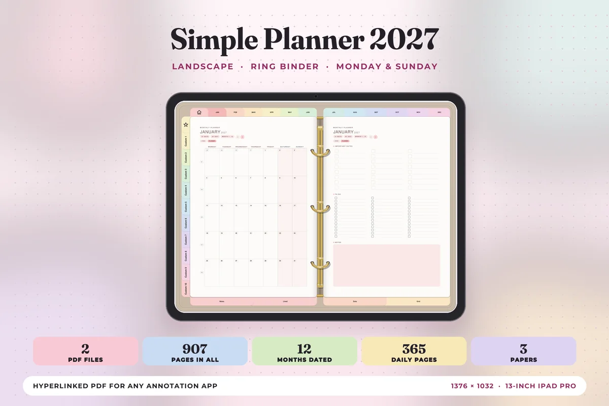
Best dated 2027
3. Simple Digital Planner 2027 Landscape
Orientation: LandscapeLayouts: Monthly, Weekly, Daily (hourly 6 a.m.–9 p.m.)Dates: 2027Week start: Monday or Sunday
Best for: 2027 planners, simple planners, two-page spread fans. Designed by Print Magic StudioX.
- Dated January to December 2027: month at a glance, monthly, weekly and 365 daily pages
- Daily page: hourly schedule from 6 a.m. to 9 p.m., top 3, to-do and notes
- 10 sections you name yourself, plus lined, dot grid and square grid paper
- Two hyperlinked PDFs (Monday or Sunday start), sized for the iPad in landscape
If undated pages feel like homework, this one does the dates for you. The tabs are soft pastels, so it's simple rather than strictly monochrome, but each page holds only what it needs: the week is one row a day with a checklist and one thing to focus on. Drawn gold rings make it open like a two-page spread.
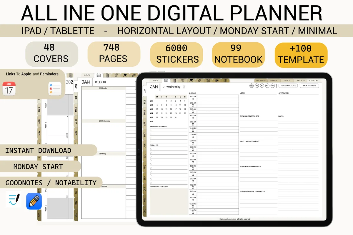
Best all-in-one that stays calm
4. Beige Digital Planner, Minimal Layout
Orientation: LandscapeLayouts: Weekly, Daily + finance, wellness, travel, project pagesWeek start: Monday
Best for: all-in-one planners, neutral color fans, life admin. Designed by Plamarplanners.
- Horizontal weekly pages and minimal daily pages, Monday start
- Budget, bill and subscription trackers, habit, mood and sleep logs, meal, travel and project planners
- Hyperlinked tabs plus links to Apple Calendar and Reminders
- Bonus covers and a big set of stickers (over 700 pages per the cover)
This is the honest compromise: it has as many sections as a maximalist planner, but the pages are beige and gray with a lot of white space. Skip the sticker pack and it reads as minimal. Pick it if you want one file for life admin and don't want it to look busy.
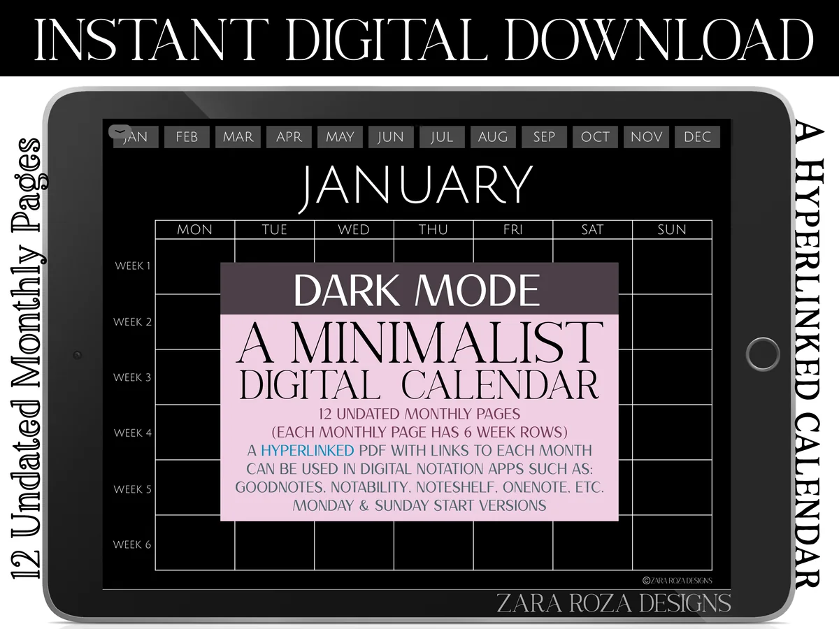
Best dark mode
5. Dark Mode Minimalist Digital Calendar
Orientation: LandscapeLayouts: Monthly (12 pages, 6 weeks)Dates: UndatedWeek start: Monday or Sunday
Best for: dark mode fans, night planners, month-at-a-glance planners. Designed by ZaraRozaDesigns.
- 12 undated monthly pages, 6 week rows each
- Dark background with light text and lines
- Month buttons along the top of every page
- Two PDFs: Monday start and Sunday start
This is the most minimal pick on the list: twelve months, a grid and nothing else. That's exactly why it works as a month-at-a-glance file next to a daily planner. Use a white or light pen so your writing shows on black.
Best minimalist daily
6. Digital Minimalist Daily Planner
Layouts: DailyDates: Undated
Best for: minimalists, daily planners. Designed by ThePlannersDelight.
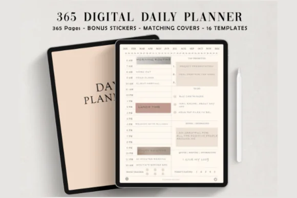
- 365 undated daily pages, fully hyperlinked (384 pages in total)
- Two versions: schedule starting at 5 a.m. or 6 a.m.
- Ivory white design with thin lines; 16 extra page templates
- Bonus: 5 covers and 100+ pre-cropped stickers
The most popular planner in this list, and it earns the word minimalist: ivory paper, small type and an hourly column next to priorities and to-dos. I'd pair it with the dark calendar above if you also want a monthly view. It's also in my undated and daily planner lists, because it fits all three.
Best lightweight setup
7. Undated Minimal Digital Planner
Orientation: PortraitLayouts: Monthly, Weekly, DailyDates: Undated
Best for: minimalists, budget shoppers, note takers. Designed by CotswoldCoDesigns.
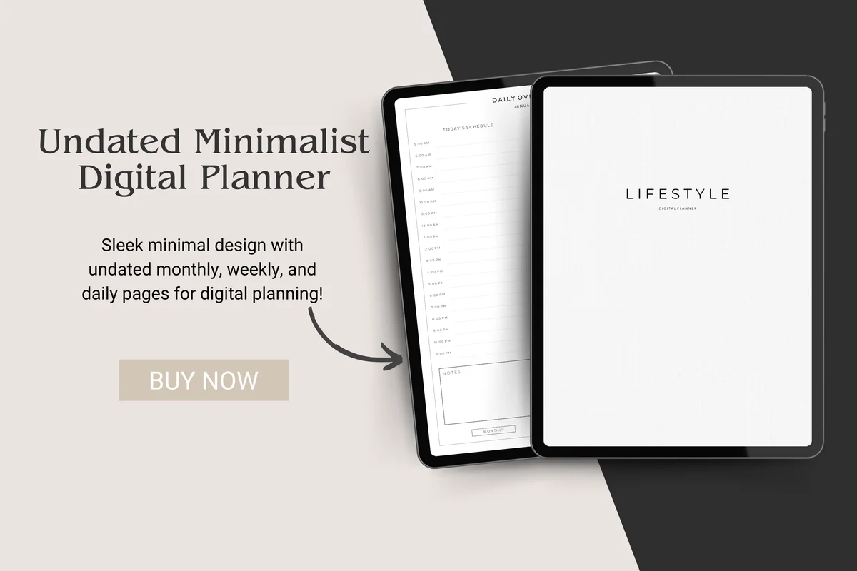
- Undated monthly tabs, weekly spread and daily spread, all hyperlinked
- Hyperlinked index page and notebook sections
- White pages with fine lines and a plain "Lifestyle" cover
- One PDF made for GoodNotes
If the others feel like too much, start here. White pages, fine lines, a single plain cover, and only the four sections you really use. It's a good test of whether you're a minimalist planner or just like how they look.
Quick Comparison
| Planner | Look | Best for | Stand-out detail |
|---|---|---|---|
| 1. Black and White Digital Planner | Black and white, landscape | Monochrome fans | Health, productivity and finance tabs |
| 2. Undated Reusable Digital Planner | White pages, light grid, portrait | Split-screen planners | Any page in two taps |
| 3. Simple Digital Planner 2027 Landscape | Soft pastel tabs, landscape | Dated 2027 planners | One focus per week |
| 4. Beige Digital Planner, Minimal Layout | Beige and gray, landscape | All-in-one planners | Finance, wellness and travel sections |
| 5. Dark Mode Minimalist Digital Calendar | Black, landscape | Night planners | Just 12 months |
| 6. Digital Minimalist Daily Planner | Ivory, portrait | Daily planners | 365 linked days |
| 7. Undated Minimal Digital Planner | White and taupe, portrait | First digital planner | Only the basics |
A Minimalist Planner Is Not an Empty Planner
Minimalism in a planner isn’t about blank pages. It’s about keeping only what you use every week and making that part easy to reach. In practice, a minimalist planner has three things in common:
- Fewer sections: month, week, day and notes cover most lives. Trackers only if you already track that thing.
- A calm palette: black and white, beige, ivory, gray. Color comes from your pen, not the page.
- The same week every time: one layout you can fill in on autopilot, so planning takes minutes.
What to Keep and What to Cut
| Part of the planner | Keep it if… | Cut it if… |
|---|---|---|
| Monthly calendar | You have appointments, bills or deadlines | Your phone calendar already holds them and you never look back |
| Weekly spread | You plan on Sunday or Monday (most people) | You only ever plan day by day |
| Daily pages | Your days are full or you time block | The weekly page has enough room |
| Trackers | You track one or two habits already | You add them hoping they’ll create the habit |
| Stickers and covers | One functional set (icons, labels) | Decorating takes longer than planning |
The nice part of a digital planner: cutting is reversible. In GoodNotes you can delete a whole section and keep the original PDF, so nothing is lost if you want it back in March.
Minimalist Weekly Planner or Daily Planner?
Pick by how much your days change. If most days look alike, a minimalist weekly planner is enough: seven short rows, a to-do list and one priority for the week, which is how the 2027 Simple Planner above is built. If every day is different, or you like to block hours, go for a page per day, like the ivory Digital Minimalist Daily Planner.
A setup that stays light: a monthly view for dates, a weekly page for tasks, and daily pages only on busy days. You can duplicate a daily template in GoodNotes when you need one instead of carrying 365 empty days. For more ways to lay out a week, see my weekly planner designs and planner layout ideas.
Black and White, Neutral or Dark Mode?
- Black and white: the most graphic look, and any pen color stands out. Good if you color-code tasks.
- Beige, ivory, gray: softer and warmer, easier to look at for a long session. Muted pens (sage, rust, navy) suit it best.
- Dark mode: black pages with light lines for evening planning. You’ll need white or pastel pens; dark ink disappears.
For ready hex codes in neutral and muted shades, see my GoodNotes color palettes. If you like a softer, prettier look than this list, my cute aesthetic digital planners are the other end of the scale.
Minimalist Planner Ideas
Pages and habits that fit a minimalist planner without filling it up:
- One priority per week
- Top 3 for the day
- A single brain dump page
- Monthly bills list
- One habit, one row
- Weekly review: 3 questions
- A “not this week” list
- Meal ideas in 7 lines
- One quote per month
- A list of open loops
- Notes in one section only
- An empty Sunday on purpose
Why a Minimalist Digital Planner Works on the iPad
Paper minimalist planners have one problem: once you buy the big one, you carry every page you’ll never use. A digital planner can be as small as you want. You delete sections, duplicate the pages you do use, and switch the cover without buying a new book. Hyperlinks also matter more than they seem: on a quiet layout with few tabs, the page you need is always one or two taps away.
Template or Planner App?
Planner apps sync with your calendar, send reminders and share events with other people. A PDF planner in GoodNotes doesn’t do any of that; some planners, like the beige one above, only add buttons that open Apple Calendar or Reminders. What a template does better is focus: one page, your handwriting, no notifications. Many minimalists keep appointments in the calendar app and use the planner only for the week’s tasks and priorities.
Less Clutter, More Plan: a 10-Minute Setup in GoodNotes
- Save the planner from Creative Fabrica, unzip it in the Files app and open it in GoodNotes with New → Import. Keep the original PDF in Files.
- Pick one version (Monday or Sunday start) and delete the other.
- Go through the tabs and delete every section you won’t open this month. Trackers you might want later can wait.
- Choose two pens and one highlighter, save them as favorites, and use only those.
- Bookmark this week’s page, so the planner opens where you plan.
- Set one weekly slot (Sunday evening or Monday morning) to fill in the week. Ten minutes is enough.
If you prefer starting on any day of the year without wasted pages, see my undated digital planners; for a page per day, the daily digital planners.
FAQ
What is the best minimalist planner?
The one with the fewest sections you’d still use. For a full undated planner in black and white, I’d pick the Black and White Digital Planner; for a page per day, the Digital Minimalist Daily Planner; for dates already filled in, the Simple Planner 2027.
What makes a planner minimalist?
Clean layouts with white space, a neutral or monochrome palette, simple fonts and only the core sections: month, week, day and notes. Extra trackers and decorations are optional, not built into every page.
Is there a free minimalist digital planner?
Some designers share free samples, and GoodNotes has basic built-in templates (lined, grid, dotted) you can turn into a very simple planner. The planners in this list are paid products on Creative Fabrica; many of them are also included in its All Access plan.
Undated or dated: which is better for a minimalist?
Undated planners waste nothing when you skip a week, which fits the minimalist idea well. Dated planners save you from writing dates, which is less work every week. Five of the seven planners here are undated; the 2027 Simple Planner is dated, and the beige one doesn’t say, so check its product page if dates matter to you.
Can I make my own minimalist digital planner?
Yes. A notebook in GoodNotes with a lined page per week and a grid page per month is already a minimalist planner. What you lose is the hyperlinked tabs, so with more than a few weeks of pages, a ready planner is faster to move around in.
Does a minimalist digital planner work with Apple Calendar?
A PDF planner doesn’t sync. You copy dates in by hand. Some planners add a button that opens the Calendar or Reminders app, which is handy but not a real sync.
Which apps do these planners work in?
All of them are PDFs for GoodNotes on the iPad, and most also open in Notability, Noteshelf and other PDF apps that support hyperlinks. Check each card for the exact list.
Final Thoughts
A good minimalist digital planner is the one you open every week without dread. Start with fewer sections than you think you need, two pens and one weekly planning slot, and add only what you miss. For a bigger file with everything in it, see my all-in-one life planners or the monthly digital planners, or browse all everyday planners. If you plan late in the evening, the dark mode digital planners keep the same calm layouts on a black page. Want the calm layout with a bit of color? See my pink digital planners for iPad in soft blush and rose.
Want dated pages for next year? See my top digital planner picks for 2027.
You May Also Like
This post contains affiliate links. If you buy through them, I may earn a small commission at no extra cost to you. Learn more.