The default pens in GoodNotes are fine, but they’re not pretty: bright primary blue, pure red, a highlighter yellow that shouts. The fix takes two minutes. Pick a GoodNotes color palette, paste its hex codes into the color picker once, and every page you write after that looks like it belongs to the same notebook.
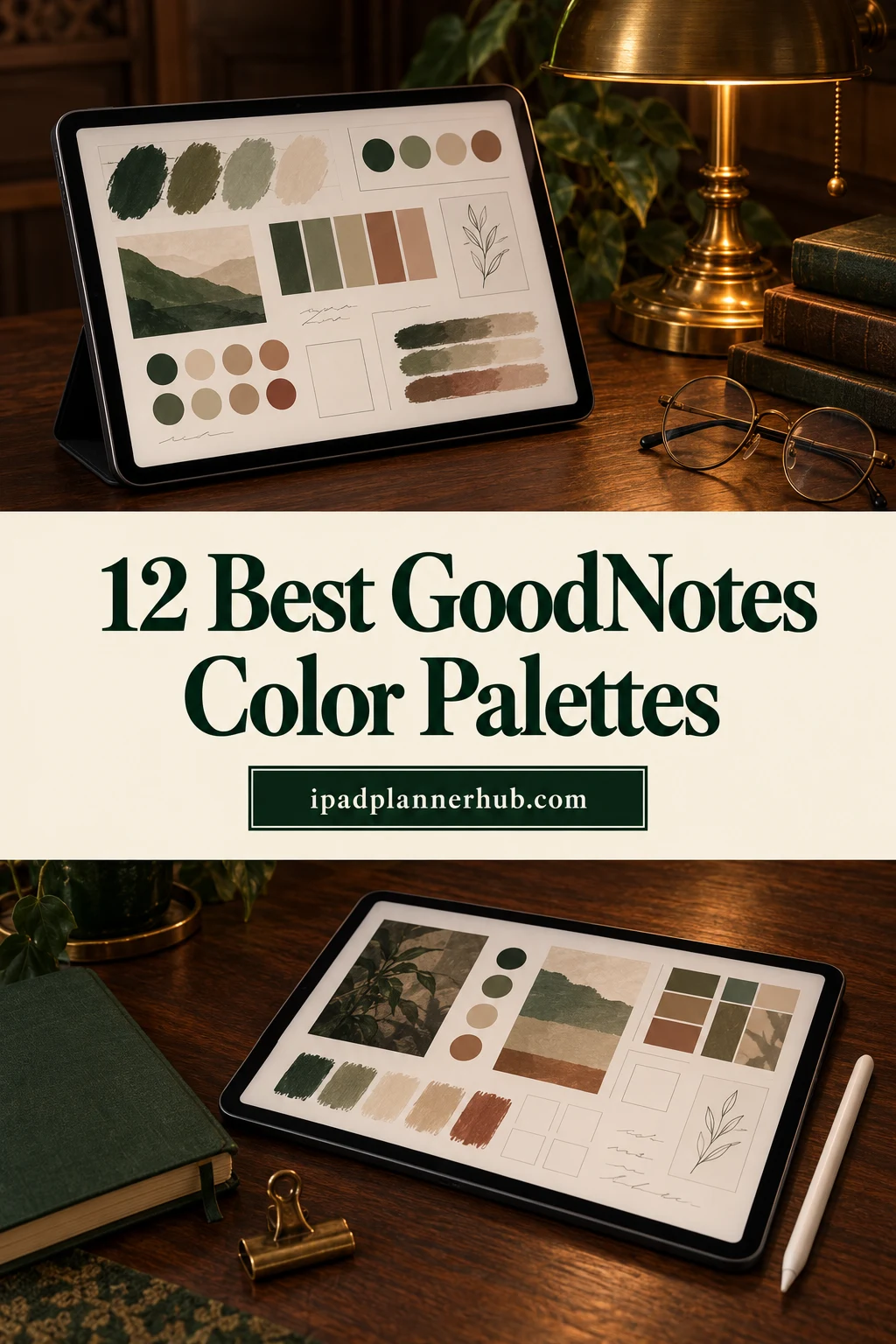
Below are 12 palettes with hex codes you can copy: pastel, neutral, green, blue, pink, fall colors, a set for black paper and one for color-coding subjects. Each one has an ink color, a heading color, an accent and two highlighters. After the palettes: how to choose one (pastel sets included), how to add hex codes in GoodNotes, a simple color-coding system, the best highlighter colors and a few iPad planners that match these palettes.
12 GoodNotes Color Palettes with Hex Codes
Every palette follows the same idea: one dark color for writing, one medium color for headings, one accent for key words, and two light tones for the highlighter. Tap a code to select it and copy it straight into GoodNotes.
1. Soft Pastel Study
Pastel highlights with a soft plum ink that stays readable on white paper.
2. Latte Neutral
Coffee browns and cream: calm, warm and easy on the eyes for long notes.
3. Sage Garden
Muted greens for a quiet, natural page; works well with beige paper.
4. Ocean Blue
Navy ink with teal and sky blue; a clean look for science and work notes.
5. Berry Pink
Deep berry ink with pink accents for a girly page that is still legible.
6. Lavender Dream
Shades of purple from almost-black to lilac; one color family, no clashes.
7. Autumn Terracotta
Rust, amber and wheat: cozy fall notes and planner spreads.
8. Black Paper Glow
Light ink and bright pastels made for black or dark gray paper.
9. Classic Highlighters
Five softened highlighter tones that don’t hide the text underneath.
10. Monochrome Minimal
Black to light gray for clean, distraction-free notes.
11. Vintage Muted
Dusty brown, slate and faded sage; an old-notebook feel.
12. Bright Subject Coding
Six clear colors, one per subject or project, for color-coded folders and notes.
Can’t decide? Start with Latte Neutral for everyday notes and Classic Highlighters for studying. They go with almost any planner or paper template.
How to Choose a GoodNotes Color Palette
Whether you call it a GoodNotes color or colour palette, picking one comes down to three questions. I’d answer them in this order:
- What paper do you write on? White paper takes almost any palette with a dark ink. Beige or cream paper looks best with warm, muted sets like Latte Neutral, Sage Garden or Vintage Muted. Black paper needs its own light set, Black Paper Glow.
- What are the notes for? Long study notes need calm colors and soft highlighters. Planner pages can take a bit more color, and subject folders need clearly different colors, like Bright Subject Coding.
- What does your planner look like? If your planner or cover already has a color scheme, pick the palette closest to it so the pages and the handwriting look like one set.
Before you commit, write one line of text and one heading in the new colors on your usual paper. If the ink is hard to read at a glance, choose a darker ink and keep the rest.
Pastel GoodNotes Color Palettes That Stay Readable
Pastels are the most popular look for GoodNotes, and also the easiest to get wrong: light pink or mint text is pretty but hard to read. The trick is to keep pastels for highlights and accents and write in a deep color from the same family. The Berry Pink palette works well in the pink digital planners from my roundup.
Carry that pink accent into decoration without sacrificing the dark writing color. These pink digital stickers offer optional page accents to compare against the palette you have already chosen.
- Soft and mixed: Soft Pastel Study writes in plum (#3E3A4F) with butter yellow (#FDE9A2) and mint (#BFE3D6) highlights.
- One color family: Lavender Dream goes from #3A2E4F ink to lilac #D9CCF0, so nothing clashes.
- Pink: Berry Pink pairs berry ink (#4A1E35) with blush highlights #F9C6D3 and #FBE3E8.
- Pastel on dark: on black paper the rule flips, and pastels like #F7C6D9 and #9AD4E8 become the headings and accents of Black Paper Glow.
How to Add Hex Codes in GoodNotes
GoodNotes keeps a row of colors for each pen and highlighter, and you can replace any of them with your own. The steps are the same in GoodNotes 5 and GoodNotes 6:
- Choose the pen (or highlighter) in the toolbar.
- Tap one of its color circles, then tap it again to open the color editor.
- Switch to the custom color view and paste the hex code into the hex field (six characters, the “#” is optional).
- Repeat for the other colors of the palette: ink, headings, accent.
- Do the same for the highlighter with the two light tones.
The new colors stay in the toolbar for every notebook, so you only do this once. If you switch palettes often, save the codes in a note page at the back of your planner; copying from there is faster than looking them up again.
Using Notability? It also lets you add custom colors to its pens and highlighters, so the same hex codes work there too.
How to Color-Code Your Notes (Without Making a Rainbow)
The goal of color-coding is to find things faster, not to decorate every line. The rule I’d follow: each color has one job, and you never use more than four on a page.
- Ink (the darkest color): everything you write by default.
- Headings: titles, dates and section names, so you can scan a page in two seconds.
- Accent: key terms, formulas, deadlines, anything you’d want to find again.
- Highlighter 1: definitions or the main idea.
- Highlighter 2: examples, questions, or “check this before the exam”.
For school, the Bright Subject Coding set works the other way around: one color per subject, used for the notebook cover, the folder and the headings inside it. Everything else stays in the same dark ink. If you plan your study weeks on the iPad, the same colors can go into your timetable; my digital study planners and study planner ideas show how.
Color Coding a Planner: Color Ideas by Area of Life
In a color coding planner system, colors work best by area of life rather than by importance:
- Work: blue or navy
- Home and family: sage green
- Health and workouts: coral
- Money: gold or amber
- Personal and fun: pink or lavender
- Deadlines: one strong accent, nothing else
The Best Highlighter Hex Codes for GoodNotes
The GoodNotes highlighter is semi-transparent and sits behind the ink, so a color that looks soft in the picker often comes out stronger on the page. Light, slightly muted tones read best. My go-to set is Classic Highlighters: #FFE78A (yellow), #FFB8A1 (coral), #B5E8C8 (green), #A9D6F5 (blue) and #D9C2F0 (purple).
- Pastel highlighters (the last two colors of palettes 1, 5 and 6) are the gentlest choice for long reading notes.
- Neutral highlighters like #EBD9C3 or #E6CBA8 look almost like paper tape: good for planners, too faint for marking exam material.
- Avoid pure neon (#FFFF00, #00FF00): it tires the eyes and drowns the handwriting.
- Use the straight-line option of the highlighter so marks stay neat even when your hand isn’t.
A GoodNotes Color Palette for Black Paper
Dark paper flips the rules: the ink has to be the lightest color, and dark colors almost disappear. The Black Paper Glow palette uses a warm off-white (#F5F1E8) for writing instead of pure white, which is softer on the eyes at night, plus pink, sky blue, butter yellow and mint for headings and highlights.
Two tips: write a little thicker on black paper (one size up from what you use on white), and keep highlights for single words, because big blocks of bright color look much heavier on a dark page. Dark mode planners pair well with this palette; there are two among the planners below.
GoodNotes Pen Settings for Neat Notes
Colors are half the look; the pen is the other half. GoodNotes has three pen types, and each changes how your palette comes across:
- Ball pen: even line width, the cleanest choice for small handwriting and dense notes.
- Fountain pen: the line changes with pressure, which makes handwriting look more elegant. My pick for headings.
- Brush pen: big contrast between thick and thin; best for titles and hand lettering, not for whole pages.
Keep the body text thin and the headings one or two steps thicker. Turn on the shape tool when you draw boxes and arrows, so the page stays tidy even with five colors on it.
iPad Planners That Match These Palettes
A palette looks best on a planner with the same mood. I matched one digital planner from Creative Fabrica to most of the palettes above: pastel, coffee neutrals, beige, pink, bright colors and dark mode. All of them work in GoodNotes on the iPad.
TL;DR: 7 iPad planners matched to the palettes above: pastel, coffee neutral, beige, pink, bright colors and two dark mode planners for the black paper palette. Each card lists orientation, layouts and dates, plus who it suits.
Quick Picks
- Best for matches Soft Pastel Study: Digital Planner Cute Pastel ( Undated )
- Best for matches Latte Neutral: Daily Planner • Coffee Latte
- Best for matches Black Paper Glow: Digital Daily Planner
- Best for matches Vintage Muted: Neutral Undated Yearly Digital Planner
- Best for matches Berry Pink: Pinksy Work Planner
- Best for matches Bright Subject Coding: The Joy Undated Digital Planner
- Digital Planner Cute Pastel ( Undated ) – Matches Soft Pastel Study
- Daily Planner • Coffee Latte – Matches Latte Neutral
- Digital Daily Planner – Matches Black Paper Glow
- Neutral Undated Yearly Digital Planner – Matches Vintage Muted
- Pinksy Work Planner – Matches Berry Pink
- The Joy Undated Digital Planner – Matches Bright Subject Coding
- Boho Hyperlinked Digital Monthly Planner – Matches Black Paper Glow
Matches Soft Pastel Study
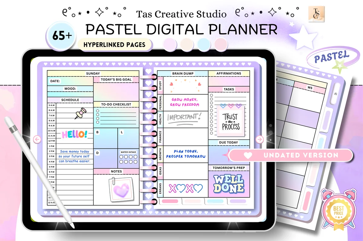
1. Digital Planner Cute Pastel ( Undated )
Orientation: LandscapeLayouts: Monthly, Weekly, DailyDates: Undated
Best for: pastel lovers, wellness planners, challenge fans. Designed by Tas Creative Studio.
- 68 hyperlinked pages, horizontal (11" x 8.3")
- Daily pages for every weekday, weekly and monthly planners
- Habit tracker, reading log, workout plan, budget and savings trackers
- Undated, so it can be reused every year
Soft pastel pages next to a plum ink and pastel highlighters look like one set. It's also a full planner, not just pretty pages: self-care, money and fitness sections are all inside.
Matches Latte Neutral
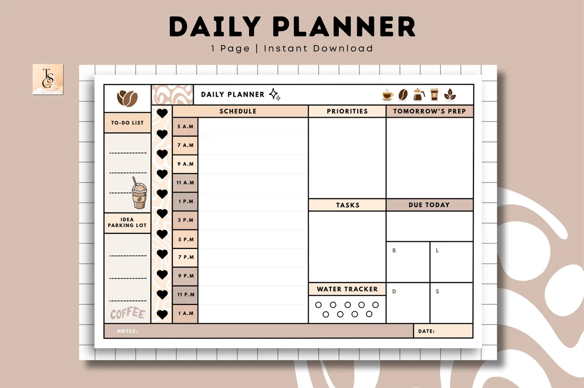
2. Daily Planner • Coffee Latte
Orientation: LandscapeLayouts: Daily (1 page, hourly)Dates: Undated
Best for: time blockers, coffee lovers, one-page planners. Designed by Tas Creative Studio.
- Undated daily planner, landscape
- Digital PDF version (a printable PDF is included too)
- Works in GoodNotes, Notability, Noteshelf and other PDF apps
- Simple, cute design
This is the page the Latte Neutral palette was made for: brown ink, caramel headings, cream highlights. It's a single daily layout, so it suits anyone who plans one day at a time and doesn't want tabs and sections.
Matches Black Paper Glow
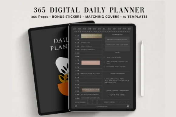
3. Digital Daily Planner
Layouts: DailyDates: Undated
Best for: night owls, dark mode fans. Designed by ThePlannersDelight.
- 365 undated daily pages, fully hyperlinked
- Dark mode on a coal black base, minimalist design
- 5AM and 6AM start versions
- Bonus: 5 notebook covers and matching digital stickers
A coal black daily page is where the Black Paper Glow palette shines: off-white ink, pink headings, a butter yellow highlight. A full year of daily pages, and the dark background is much kinder to the eyes when you plan late at night.

Matches Vintage Muted
4. Neutral Undated Yearly Digital Planner
Orientation: LandscapeLayouts: Yearly, Half-year, Quarterly, Monthly, Weekly, DailyDates: Undated
Best for: big-picture planners, neutral lovers, moodboard fans. Designed by Felicia Notes.
- Undated yearly, monthly, weekly and daily pages, horizontal
- Hyperlinked tabs to jump to any category or month
- 550+ pages and 40+ templates (per the cover), bonus stickers and covers
- Pages can be duplicated or removed and reused next year
Beige and dusty mauve leave room for color, so this one works with Vintage Muted, Latte Neutral or Sage Garden. A good base if you like to change palettes and don't want the planner to clash with any of them.
Matches Berry Pink
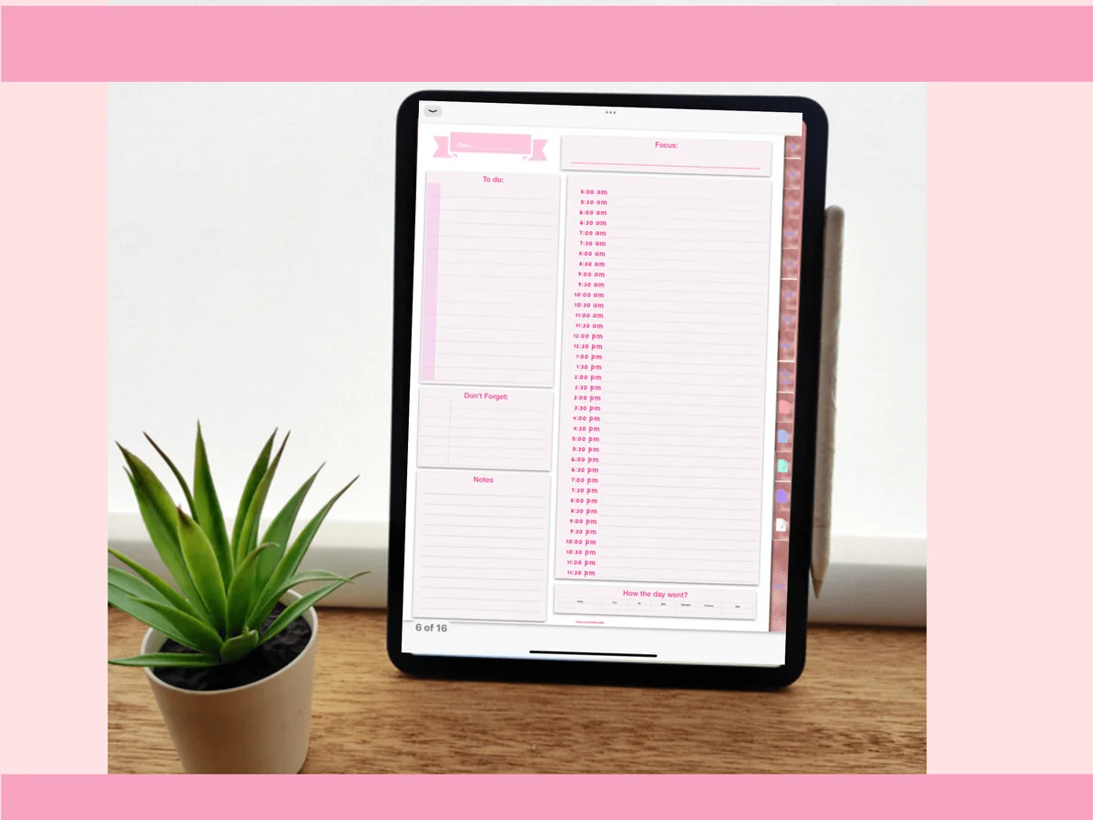
5. Pinksy Work Planner
Orientation: PortraitLayouts: Monthly, Weekly (2 layouts), Daily (3 layouts), Meeting minutesDates: Undated
Best for: remote workers, meeting-heavy jobs, pink lovers. Designed by Pinksy by HimeMarieMC.
- 16 templates for work, with an index
- Undated monthly calendar, 2 weekly and 3 daily layouts
- Meeting minutes and password pages
- PDF and GoodNotes files
Berry ink and pink highlights on a pink work planner: the meeting notes finally look as good as the rest of your iPad. I like the meeting minutes template; it's the page most planners forget.
Matches Bright Subject Coding
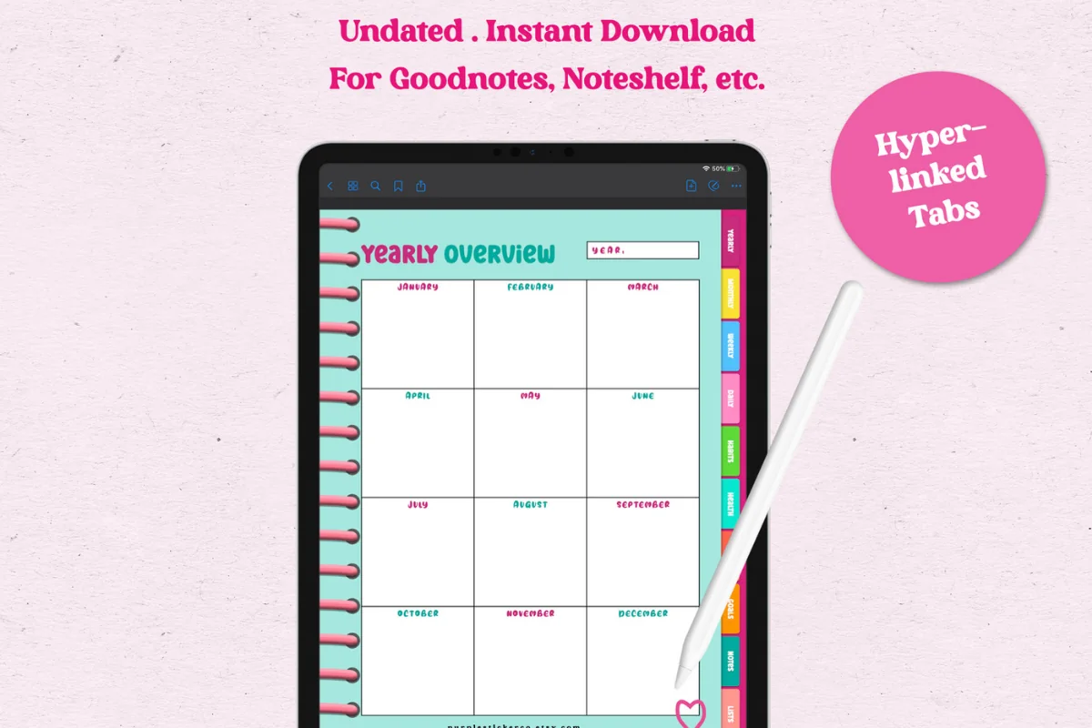
6. The Joy Undated Digital Planner
Orientation: PortraitLayouts: Yearly, Monthly, Weekly, DailyDates: UndatedWeek start: Monday
Best for: color lovers, side hustlers, habit trackers. Designed by GIRLIESPREADS.
- 86 pages, Monday-start calendars, hyperlinked
- Yearly overview, 12 undated calendars, weekly and daily pages
- Habits, health, money (revenue, expenses, budget) and goals pages
- Made for GoodNotes, Notability or any PDF app
Colorful pages call for a colorful system: give each area of life its own color from the Bright Subject Coding set and keep the ink dark. The money pages with revenue and expenses make it handy for side hustles too.
Matches Black Paper Glow
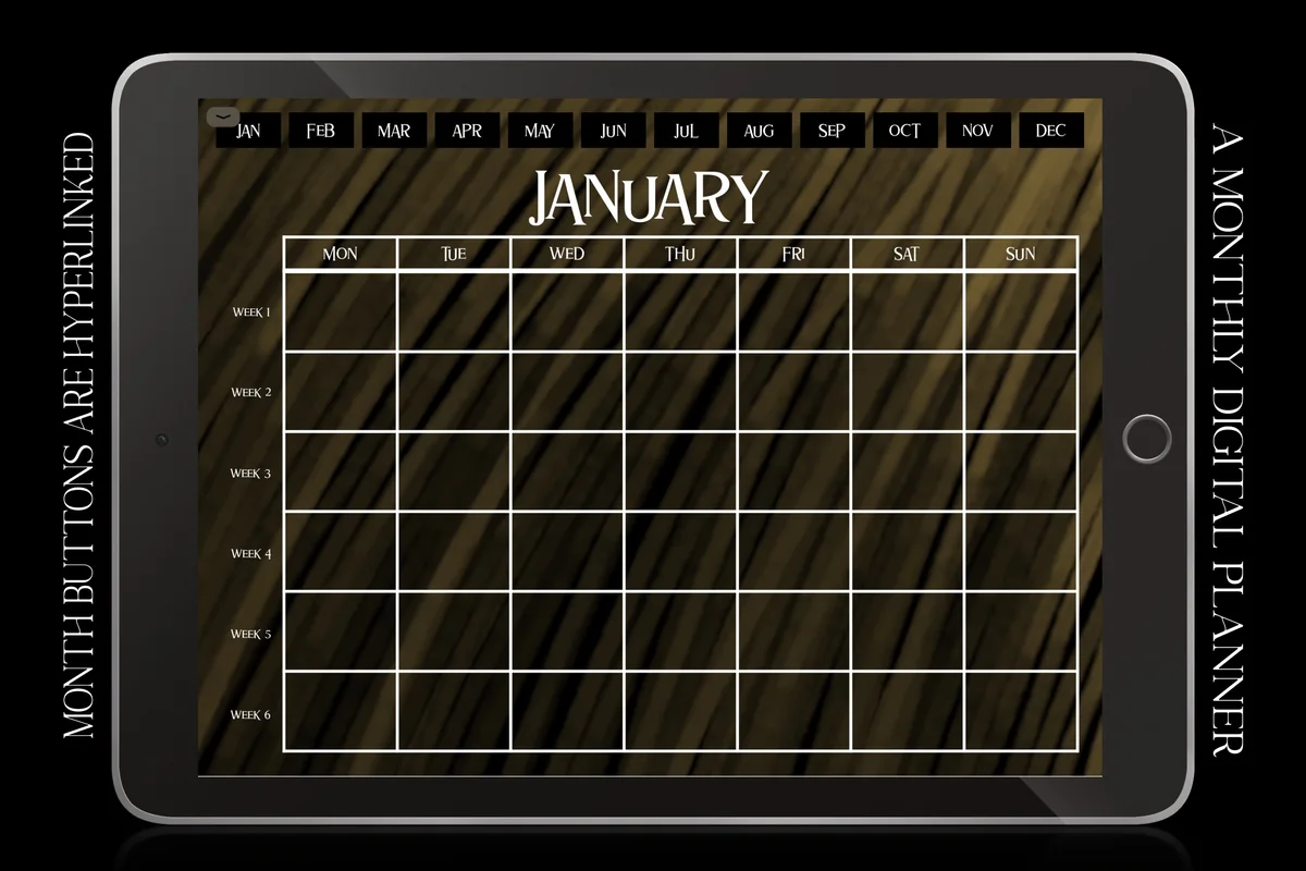
7. Boho Hyperlinked Digital Monthly Planner
Orientation: LandscapeLayouts: MonthlyDates: UndatedWeek start: Monday
Best for: dark mode fans, monthly planners, boho lovers. Designed by ZaraRozaDesigns.
- Undated monthly calendar with 6 weeks per month
- Dark night mode background with a retro, vintage boho look
- Monday start, landscape
- Works in GoodNotes, Notability, Noteshelf, Xodo and more
A dark month at a glance with white lines: off-white ink and bright highlights from Black Paper Glow read well here, and the amber of Autumn Terracotta works as an accent. It's only monthly pages, so pair it with a daily planner if you need more room.
Quick Comparison
| Planner | Matching palette | Page colors | Stand-out extra |
|---|---|---|---|
| 1. Digital Planner Cute Pastel ( Undated ) | Soft Pastel Study | Pastel | 68 pages with trackers |
| 2. Daily Planner • Coffee Latte | Latte Neutral | Coffee browns | One-page daily layout |
| 3. Digital Daily Planner | Black Paper Glow | Coal black | 365 daily pages |
| 4. Neutral Undated Yearly Digital Planner | Vintage Muted, Sage Garden | Beige and mauve | Category tabs |
| 5. Pinksy Work Planner | Berry Pink | Pink | Meeting minutes page |
| 6. The Joy Undated Digital Planner | Bright Subject Coding | Bright colors | Revenue and expense pages |
| 7. Boho Hyperlinked Digital Monthly Planner | Black Paper Glow + Autumn Terracotta | Dark, vintage | 6-week months |
FAQ
Can I make my own color palette in GoodNotes?
Yes. Every color circle of the pen and highlighter can be replaced with a custom color, either picked by eye or entered as a hex code. Once saved, your colors show up in every notebook.
How do I choose a GoodNotes color palette for notes?
The ones with a dark, readable ink color and soft highlighters. Neutral (Latte Neutral, Vintage Muted) and cool palettes (Ocean Blue, Sage Garden) are the easiest to read over long sessions. Bright palettes are better for headings and color-coding subjects than for whole pages.
How do I match a color in GoodNotes?
The reliable way is the hex code: find the color’s code (on a palette like the ones above, in a planner’s description or with any color picker app) and paste it into the custom color field. That gives you exactly the same color every time.
Does GoodNotes have a paint bucket or fill tool?
There’s no paint bucket for filling any area. Shapes drawn with the shape tool can get a fill color, and for anything else the usual workaround is a wide highlighter stroke behind the text.
How many colors should I use in my notes?
Three to five. One ink, one heading color, one accent and one or two highlighters cover almost everything. More than that and the colors stop meaning anything.
Which highlighter colors work best in GoodNotes?
Light, slightly muted tones such as #FFE78A, #B5E8C8 or #A9D6F5. Because the highlighter is transparent, strong colors look darker on the page than in the picker.
What are good pastel colors for GoodNotes?
For highlights: butter yellow #FDE9A2, mint #BFE3D6, blush #F9C6D3 and lilac #D9CCF0. Pair them with a dark ink from the same family, such as plum #3E3A4F or berry #4A1E35, so the text stays readable. Palettes 1, 5 and 6 above are ready-made pastel sets.
How do I make my handwriting look pretty in GoodNotes?
Use one palette per notebook, write the body text with a thin ball pen and the headings with a slightly thicker fountain pen. Keep highlights to single words or lines with the straight-line highlighter, and draw boxes and arrows with the shape tool. A consistent set of colors and pens makes even ordinary handwriting look neat. For headings that look as good as the colors, try a few lettering practice sheets.
Final Thoughts
Pick one GoodNotes color palette, set it up once and use it for a month before you change anything. A consistent set of colors does more for the look of your notes than any new pen. For the pages themselves, see my best digital planners for iPad, the cute and aesthetic digital planners, GoodNotes covers in the same colors, or browse all how-to guides. To put the palette to work, see my aesthetic notes ideas for headers, highlights and layouts. To paint with these colors in Procreate, see my Procreate brushes for planners. Drawing in Procreate too? My Procreate color palettes come in muted, pastel and bright sets you can match to the same planner.
Still deciding on the app itself? See how much GoodNotes costs and how it compares with Notability.
You May Also Like
This post contains affiliate links. If you buy through them, I may earn a small commission at no extra cost to you. Learn more.